Chemistry Plotting Guide: From Titrations to Kinetics

Chemistry is the study of change - and visualizing that change is central to the field. Whether tracking the speed of a reaction, the shift in pH during a titration, or the activation energy from an Arrhenius plot, clear figures are essential for communicating your findings.
This guide covers the essential visualizations for chemists with live Python code editors you can modify and run instantly.
What You'll Learn
0.Live Code Lab: Reaction Kinetics
1.Reaction Kinetics & Order Determination
2.Titration Curves with Derivative Overlay
3.Arrhenius Plots & Activation Energy
4.UV-Vis & NMR Spectroscopy
5.Chromatography (HPLC/GC)
6.Color Conventions in Chemistry
0. Live Code Lab: Reaction Kinetics
This code creates a 3-panel diagnostic plot that determines reaction order automatically. It plots [A] vs t, ln[A] vs t, and 1/[A] vs t - the panel with the best R-squared reveals the order.
Try modifying the rate constant k or adding noise to see how robust the determination is.
Preparing preview
Running once automatically on first load
Learn by Experimenting
This is a safe playground for learning! Try changing:
- • Colors: Modify color values to see different palettes
- • Numbers: Adjust sizes, positions, or data ranges
- • Labels: Update titles, axis names, or legends
Edit the code, run it, then open the full data visualization tool to continue with your own dataset.
1. Reaction Kinetics & Order Determination
Plotting concentration vs. time is only the first step. To determine the reaction order, you need to transform your data and compare linearized forms.
Zero-Order
[A] vs t is linear
Rate = k (constant)
First-Order
ln[A] vs t is linear
Rate = k[A]
Second-Order
1/[A] vs t is linear
Rate = k[A]^2
Pro Tip
Always show all three panels even if you already know the order. Reviewers want to see why you chose a particular model, not just the final result.
2. Titration Curves with Derivative Overlay
The classic sigmoidal pH curve with a derivative overlay for precise equivalence-point identification. The code uses dual Y-axes and marks the equivalence point automatically.
Preparing preview
Running once automatically on first load
Learn by Experimenting
This is a safe playground for learning! Try changing:
- • Colors: Modify color values to see different palettes
- • Numbers: Adjust sizes, positions, or data ranges
- • Labels: Update titles, axis names, or legends
Edit the code, run it, then open the full data visualization tool to continue with your own dataset.
3. Arrhenius Plots & Activation Energy
Try it
Try it now: review your figure before submission
Upload your current plot and get an AI critique with concrete fixes for clarity, typography, color, and journal readiness.
Open AI Figure Reviewer →Newsletter
Get a weekly Python plotting tip
One concise tip each week for cleaner, faster scientific figures. Built for researchers who publish.
Determining activation energy requires an Arrhenius plot: ln(k) vs 1/T. The slope equals -Ea/R, giving the activation energy directly.
Secondary Temperature Axis
The X-axis (1/T in K) is mathematically correct but not intuitive. Add a secondary top axis showing actual temperature in Celsius for easier interpretation.
Error Propagation
Rate constant uncertainty propagates through the logarithm. Show error bars on ln(k) computed as delta_ln_k = delta_k / k. This affects the slope uncertainty and therefore Ea.
Try it: Upload rate constant data and ask "Create an Arrhenius plot with linear fit and annotation of the activation energy".
4. UV-Vis & NMR Spectroscopy
Spectroscopic data has specific visualization conventions that vary by technique.
UV-Vis Absorption
- X-axis: wavelength (nm), increasing left to right
- Y-axis: absorbance (a.u.) or molar absorptivity
- Annotate lambda-max values directly on the peaks
- For Beer-Lambert studies, use an inset showing A vs concentration
NMR Spectra
- X-axis: chemical shift (ppm), decreasing left to right
- Invert the X-axis with
ax.invert_xaxis() - Include integration curves above peaks when relevant
- Label peak assignments with structural fragments
5. Chromatography (HPLC/GC)
Chromatograms can get crowded with overlapping peaks. Proper baseline handling and peak annotation are critical.
Best Practices for Chromatograms
- Baseline correction: subtract baseline before comparing peak areas between samples
- Retention time labels: annotate identified peaks with compound names and retention times
- Stacked comparison: offset multiple chromatograms vertically (like stacked spectra) for easy comparison
- Shaded peaks: use semi-transparent fills under peaks for visual clarity when peaks overlap
Tired of manually formatting chemistry plots?
Describe your chemistry data in plain English and get publication-ready figures instantly. Plotivy handles kinetics panels, dual-axis titration plots, and Arrhenius fits automatically.
6. Color Conventions in Chemistry
Chemistry has established color conventions that your audience expects. Respecting them makes your plots instantly more intuitive.
CPK Atom Colors
Carbon: black/gray, Oxygen: red, Nitrogen: blue, Sulfur: yellow, Hydrogen: white. Use these when color-coding by element type.
Structure Consistency
Match your ChemDraw structure fonts and line weights to your data figure fonts. Inconsistent styling within a manuscript looks unprofessional.
Chart gallery
Chemistry-ready chart templates
Start from these gallery examples and customize for your kinetics, spectral, or titration data.

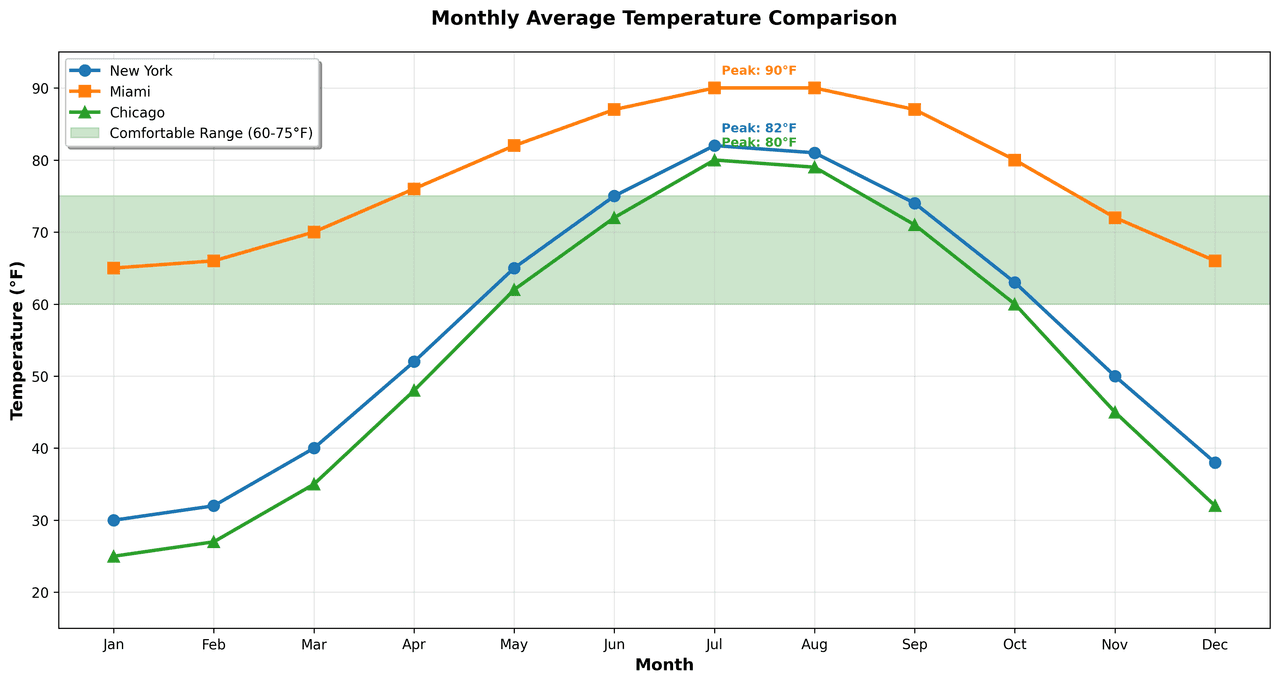
Line Graph
Displays data points connected by straight line segments to show trends over time.
Sample code / prompt
import matplotlib.pyplot as plt
import numpy as np

# Generate temperature data for 3 major US cities over 12 months
months = ['Jan', 'Feb', 'Mar', 'Apr', 'May', 'Jun', 'Jul', 'Aug', 'Sep', 'Oct', 'Nov', 'Dec']
nyc = [30, 32, 40, 52, 65, 75, 82, 81, 74, 63, 50, 38]
miami = [65, 66, 70, 76, 82, 87, 90, 90, 87, 80, 72, 66]
chicago = [25, 27, 35, 48, 62, 72, 80, 79, 71, 60, 45, 32]

# Create figure with enhanced styling
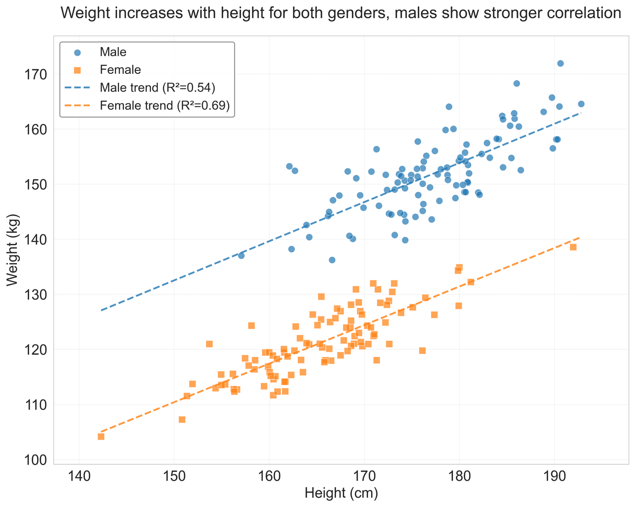
Scatterplot
Displays values for two variables as points on a Cartesian coordinate system.
Sample code / prompt
import matplotlib.pyplot as plt
import numpy as np
from scipy import stats
import pandas as pd

# Generate sample data
np.random.seed(42)
n_samples = 200
height = np.random.normal(170, 8, n_samples)
weight = height * 0.6 + np.random.normal(0, 8, n_samples) - 50
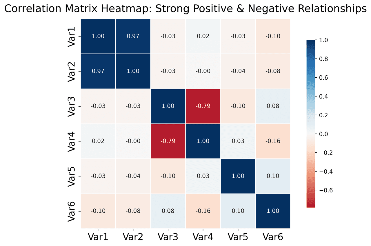
Heatmap
Represents data values as colors in a two-dimensional matrix format.
Sample code / prompt
import matplotlib.pyplot as plt
import seaborn as sns
import pandas as pd
import numpy as np

# Create correlation matrix for financial metrics
metrics = ['Revenue', 'Profit', 'Expenses', 'ROI', 'Customers', 'AOV', 'Marketing', 'Employees']
correlation_data = np.array([
    [1.00, 0.85, -0.45, 0.72, 0.88, 0.65, 0.72, 0.55],
    [0.85, 1.00, -0.78, 0.92, 0.75, 0.58, 0.63, 0.48],
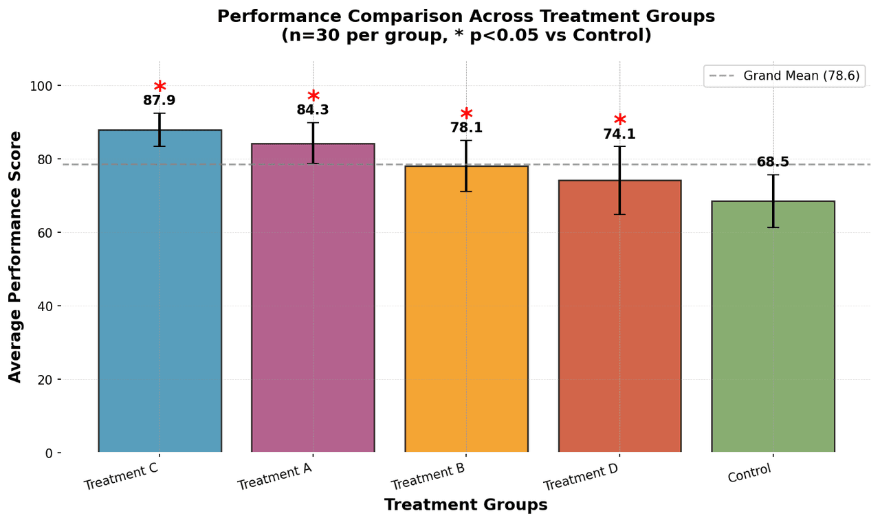
Bar Chart
Compares categorical data using rectangular bars with heights proportional to values.
Sample code / prompt
import numpy as np
import pandas as pd
import matplotlib.pyplot as plt
import seaborn as sns
from scipy import stats

# Generate performance scores for 5 treatment groups
np.random.seed(42)
groups = ['Control', 'Treatment A', 'Treatment B', 'Treatment C', 'Treatment D']
n_samples = 30Visualize Your Chemistry Data Now
Upload kinetics, titration, or spectroscopy data. Describe the plot you want and get publication-ready Python code instantly.
Technique guides scientists read next
scipy.signal.find_peaks guide
Tune prominence and width parameters for robust peak extraction.
Savitzky-Golay smoothing
Reduce noise while preserving peak shape and position.
PCA visualization workflow
Move from high-dimensional measurements to interpretable components.
ANOVA with post-hoc brackets
Add statistically correct pairwise significance annotations.
Found this helpful? Share it with your network.
Experimental Physicist & Photonics Researcher
Hands-on experience in silicon photonics, semiconductor fabrication (DRIE/ICP-RIE), optical simulation, and data-driven analysis. Built Plotivy to help researchers focus on discoveries instead of data struggles.
More about the authorVisualize your own data
Apply the techniques from this article to your own datasets. Upload CSV, Excel, or paste data directly.