Scientific Data Visualization: The Complete Guide (2026)

Great visuals help researchers, students, and educators think faster. Whether you are exploring raw data for class, preparing a lab meeting, or polishing a manuscript, clear charts reduce confusion and surface the actual signal.
This guide teaches you every principle - from choosing the right chart to meeting Nature's exact specs for papers - and lets you practice each one immediately inside Plotivy. No installation, no boilerplate. Just your data and a prompt.
Guide Navigation
What You'll Learn
0.Live Plotivy Code Lab (Interactive)
1.Why Figures Decide Your Paper's Fate
2.Exploratory vs Explanatory Analysis
3.Where to Start: The Bird's-Eye View
4.Gestalt Principles of Visual Perception
5.Clutter, Cognitive Load & Data-Ink Ratio
6.How to Choose the Right Chart
7.Color Palettes & Accessibility
8.Spot the Error: Common Pitfalls
9.The Caption That Wins the Review
10.Typography & Technical Best Practices
11.The Compelling Figure Workflow
12.Journal-Specific Standards
13.Reproducibility & FAIR Principles
14.Resources & Recommended Reading
0. Live Plotivy Code Lab
Every section below explains concepts, but this lab shows the exact Python Plotivy generates in practice. As you move through the guide, you will see live code editors inserted at key moments so each concept is demonstrated in-context, not just described.
First live example appears in Section 2, then additional examples appear later for decluttering and publication-ready chart decisions.
1. Why Figures Decide Your Fate
In an era of information overload, figures serve as the primary filter for scientific relevance. When researchers scan a paper, they look at the figures first. A well-designed figure allows the reader to grasp the core message immediately - without wading through dense text.
Peer Review
Reviewers form their initial impression of quality based on figures. Poorly crafted visuals suggest a lack of rigor, increasing the probability of rejection - regardless of scientific merit.
Conferences
Attendees make split-second decisions about which posters to engage with. If your figures communicate findings quickly, peers are more likely to stop, discuss, and collaborate.
Credibility
A polished figure signals care and attention to detail. In principle, a reader should be able to understand the narrative of the entire paper just by browsing the figures.
Myth: "Scientists Don't Have Time for Aesthetics"
Good design is not about "prettiness" - it's about reducing cognitive load. A well-designed chart communicates the result faster and with less ambiguity. Taking time to refine your visualizations shows respect for your audience's limited time and attention. And with tools like Plotivy, it takes seconds, not hours.
Want to see rather than read?
Upload a CSV and describe the chart you want in plain English. Plotivy generates the plot and the Python code - applying every best practice from this guide automatically.
Free account required - export publication-ready figures instantly.
Key Takeaway
Figures are not decoration. They are the first proof of rigor readers and reviewers see, so clarity directly affects trust and outcomes.
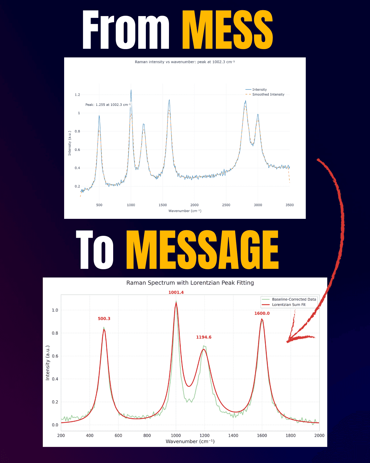
2. From Mess to Message: Exploratory vs Explanatory
Before creating any chart, you must distinguish between two fundamentally different modes of analysis. Mixing these up is the single most common cause of ineffective visualizations - for example, presenting a raw exploratory dump to an audience that needs a refined summary.
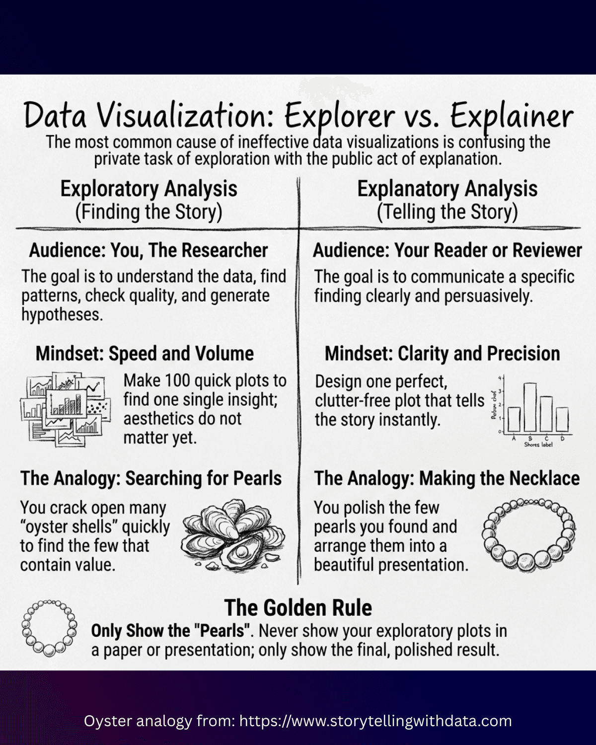
Exploratory Analysis (EDA)
- Audience: You (the researcher)
- Goal: Understand the data, find patterns, check quality, generate hypotheses
- Mindset: Speed & Volume - make 100 quick plots to find 1 insight
- Use default settings; aesthetics do not matter yet
- Zoom, pan, filter interactively (Plotly, Plotivy)
- Look at everything - outliers, missing values, distributions
Explanatory Analysis
- Audience: The reader, reviewer, decision-maker
- Goal: Communicate a specific finding or narrative clearly and persuasively
- Mindset: Clarity & Precision - design one perfect plot that tells the story instantly
- Remove clutter, refine colors, adjust fonts
- Highlight the "signal" and minimize the "noise"
- Present only the view that supports the conclusion
The Oyster Analogy
Doing research is like hunting for pearls in oysters. During EDA, you crack open hundreds of shells quickly, discarding the empty ones to find the few that contain value. When you present your work, only show the pearls - polished and arranged into a beautiful necklace. Never dump a pile of empty shells on the table and expect the audience to care.
The Misstep
Keeping dense pair plots, default palettes, and every variable in the final manuscript figure.
The Fix
Use EDA to find the signal, then publish one focused explanatory figure with clear annotations and reduced clutter.
Key Takeaway
Keep exploratory charts for discovery and explanatory charts for communication. Mixing them is a major source of confusing figures.
3. Where to Start: The Bird's-Eye View
When beginning EDA, you often have a high-dimensional dataset and no clear starting point. Instead of plotting individual variables one by one, start with visualizations that provide a comprehensive overview of the entire dataset at once.
Plotivy includes a dedicated exploratory analysis mode that follows this exact logic: profile the dataset, surface missingness/outliers, and suggest high-value first charts automatically.
Open Exploratory Analysis ModePair Plots (Scatterplot Matrix)
A grid where every variable is plotted against every other variable. The diagonal shows distributions (histogram/KDE), off-diagonal shows bivariate relationships (scatter).
- Instantly spot linear correlations, non-linear patterns, clusters, and outliers
- Color points by a categorical variable to check group separability
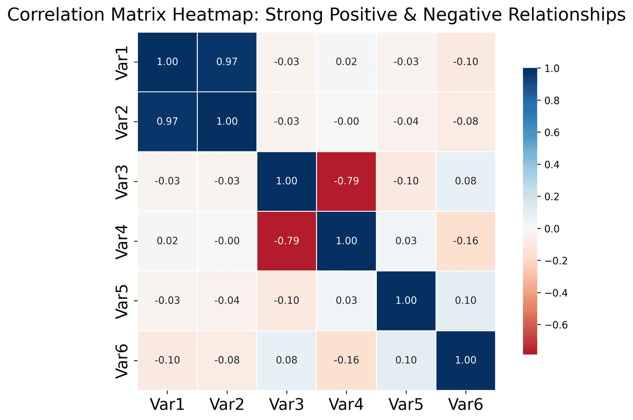
Correlation Heatmaps
Each cell represents a correlation coefficient (Pearson's r), colored on a diverging scale - red for +1, blue for -1, white for 0.
- Quickly identify redundant/collinear variables
- Direct your attention to the most significant relationships for deeper analysis
Live Example: EDA Pair Plot
Use this right after the oyster analogy to scan relationships and distributions across many variables at once.
Bird's-Eye EDA Workflow You Can Run in 5 Minutes
Use this sequence every time you open a new dataset: first data quality, then distribution/outliers, then relationship triage. This keeps EDA focused and prevents random plot hopping.
- Scan the global structure using pair plots and correlation summaries.
- Inspect spread and outliers by key groups.
- Prioritize the strongest relationships for deeper follow-up.
Step 2 - Outlier And Spread Check
Live Example: Outlier Screen with Box + Strip Plot
What this is: a box plot plus jittered raw points so you can see both summary statistics and every individual observation.
Why this live example is here: after bird's-eye pattern scanning, this is the fastest way to decide whether a group difference is real structure or driven by a few extreme points.
Step 3 - Relationship Prioritization
Live Example: Correlation Triage (Top Relationships First)
What this is: a lower-triangle correlation heatmap with the strongest absolute relationships listed for immediate follow-up.
Why this live example is here: once outliers are screened, this helps you choose which variable pairs deserve modeling or explanatory figures instead of testing everything blindly.
Try bird's-eye EDA now: Upload any dataset and ask Plotivy to "Create a pair plot, outlier screen, and correlation triage summary in one pass".
Key Takeaway
Start broad, then narrow: overview plots, outlier checks, and relationship triage prevent random chart hopping and speed insight discovery.
Advanced EDA Techniques
Dimensionality Reduction (PCA, t-SNE, UMAP)
When your dataset has dozens or hundreds of variables (gene expression, spectroscopy, multi-sensor systems), plotting every pair is impossible. These techniques project high-dimensional data into 2D/3D for visualization.
- PCA: Linear technique finding axes of maximum variance. The PC1 vs PC2 scatter plot is a staple of exploratory analysis.
- t-SNE / UMAP: Non-linear techniques that reveal complex clusters, but shouldn't be used for quantitative distance comparisons.
How to read it: If groups separate in PC space, your original high-dimensional variables likely encode real structure. If everything overlaps, either classes are not separable or your features need refinement.
Live Example: PCA Projection (PC1 vs PC2)
Project many variables into two principal components to see group structure before deeper modeling.
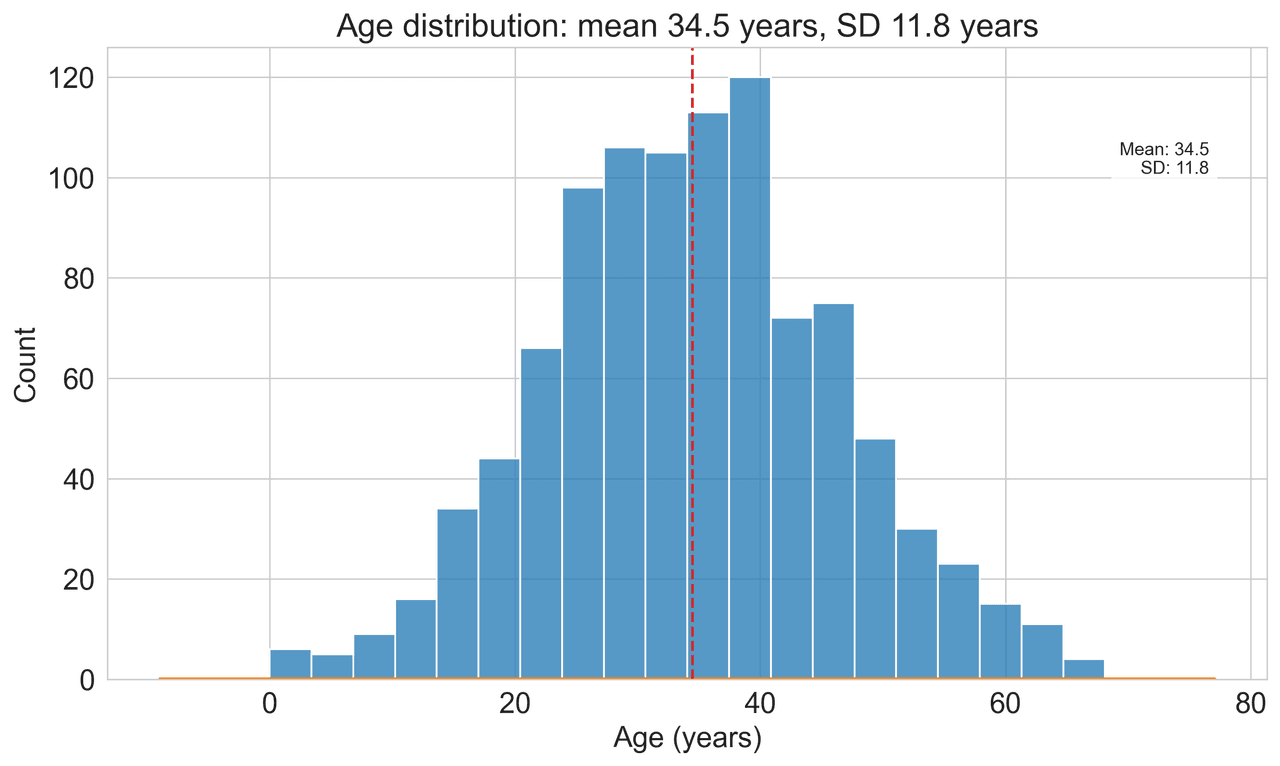
Q-Q Plots: Checking Statistical Assumptions
Many statistical tests (t-tests, ANOVA, linear regression) assume normal distribution. A Q-Q plot is the standard rigorous method to check this.
- Data points along the diagonal line = normality
- Deviations at tails = skewness, heavy tails, or outliers
- Essential before reporting p-values from parametric tests
Visual cue: center points close to the line but tails bending away means your test assumptions are weakest exactly where extreme values matter.
Live Example: Q-Q Plot for Normality Check
Check whether sample values align with a theoretical normal distribution before parametric tests.
Visualizing Data Quality & Missingness
Missing data is rarely random. A Nullity Matrix treats each row as a horizontal bar, coloring present values and leaving missing values blank - revealing systematic patterns (e.g., "Sensor B always fails when temperature exceeds 100°C"). Discovering this pattern is more valuable than any model you might build on incomplete data.
- Vertical white stripes usually indicate a variable that is globally unreliable.
- Block-like missing regions often signal process failures tied to time, batch, or conditions.
- Always inspect missingness before imputing values or training models.
Mini nullity matrix: dark cells = observed, light cells = missing. Notice the repeated gaps in one variable near the bottom rows.
Live Example: Missingness Matrix + Percent Missing
Start EDA by checking data quality first. This reveals whether missing values are random or patterned before any modeling.
4. Gestalt Principles of Visual Perception
The Gestalt School of Psychology (early 1900s) established principles explaining how humans perceive order in visual stimuli. Understanding these lets you design charts that communicate instantly instead of requiring the reader to decode them.
Proximity
Objects physically close to each other are perceived as a group.
Application: In tables or scatterplots, whitespace alone separates groups. You don't need heavy borders if the spacing clearly delineates the data.
Similarity
Objects of similar color, shape, size, or orientation are perceived as related.
Application: Use color to draw the eye across data groups without needing explicit labels on every point. All 'Control Group' points in blue naturally group together.
Enclosure
Objects enclosed by a boundary are seen as a group.
Application: A light background shading is often sufficient to separate a 'Forecast' region from 'Actuals'. Heavy borders are rarely necessary.
Closure
The eye fills in gaps to create complete shapes.
Application: Chart borders and backgrounds are often unnecessary. The axes and data themselves imply the boundary. Removing the box lets data breathe.
Continuity
The eye seeks the smoothest path and creates continuity.
Application: You can often remove the vertical Y-axis line. The alignment of labels and gridlines creates a virtual line the eye follows automatically.
Connection
Physically connecting objects creates the strongest grouping, overpowering similarity or proximity.
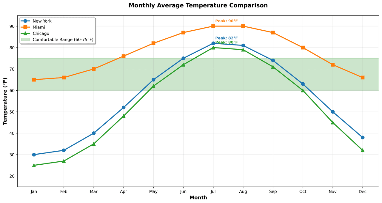
Application: This is the power of the line graph. Connecting points signals sequence more powerfully than scattered dots. Use line thickness for visual hierarchy.
The Scientific Visualization
Visualization Guide
We're finalizing a practical PDF guide for researchers who need clearer scientific figures, reusable Python plotting templates, and publication-ready visualization workflows without starting from a blank notebook.
What the guide will help you improve
Figure readability, chart selection, annotation discipline, export quality, and repeatable Python workflows for lab reports, papers, and internal research updates.
Visualization
Key Takeaway
Gestalt principles are practical tools: proximity, similarity, and continuity guide attention before the reader consciously processes the data.
5. Clutter, Cognitive Load & Data-Ink Ratio
Every element you add to a visualization increases the cognitive load - the mental effort your audience must exert. The goal is to ruthlessly eliminate clutter.
Data-Ink Ratio (Tufte)
Edward Tufte's concept: maximize the share of ink dedicated to the data itself. Borders, gridlines, background colors - anything that isn't data should be removed unless it provides critical context.
Signal-to-Noise Ratio (Duarte)
The "signal" is your insight; the "noise" is the clutter that obscures it. If a visual feels complicated, the audience may disengage. By minimizing noise, you ensure readers spend brainpower understanding the message, not decoding the chart.
The Declutter Checklist
Live Example: Explanatory Emphasis
Use this in sections 4-5 to practice removing noise and highlighting the signal.
See the difference: Ask Plotivy to plot any dataset, then say "Remove gridlines, chart border, and background color. Use direct labels instead of a legend."
Key Takeaway
Reduce cognitive load first. Remove non-data ink aggressively, then add only the annotations that strengthen the story.
Try it
Try it now: review your figure before submission
Upload your current plot and get an AI critique with concrete fixes for clarity, typography, color, and journal readiness.
Open AI Figure Reviewer →Newsletter
Get a weekly Python plotting tip
One concise tip each week for cleaner, faster scientific figures. Built for researchers who publish.
6. How to Choose the Right Chart
Selecting the correct visualization is 80% of the work. The decision follows a consistent logic: Data Category → Variable Type → Number of Variables → Chart Options.
Numeric Data
2 Variables (Correlation)
Scatter plot (few points), 2D Density / Hexbin (many points)
Try scatter + fit3 Variables
Bubble Plot, Connected Scatter
Many Variables
Correlogram, Scatterplot Matrix, Parallel Coordinates
Categoric + Numeric Data
Time Series Data
Map Data
Choropleth, Hexbin Map, Bubble Map, Connection Map
Network / Relational Data
Network Diagram, Sankey Diagram, Chord Diagram, Hive Plot, Adjacency Matrix
Explore Scientific Chart Types
Click any chart to see examples, code, and learn when to use it.
Bar Chart
.png&w=1280&q=75)
Box and Whisker Plot
.png&w=1280&q=75)
Bubble Chart
Line Graph
Histogram
Heatmap
Violin Plot
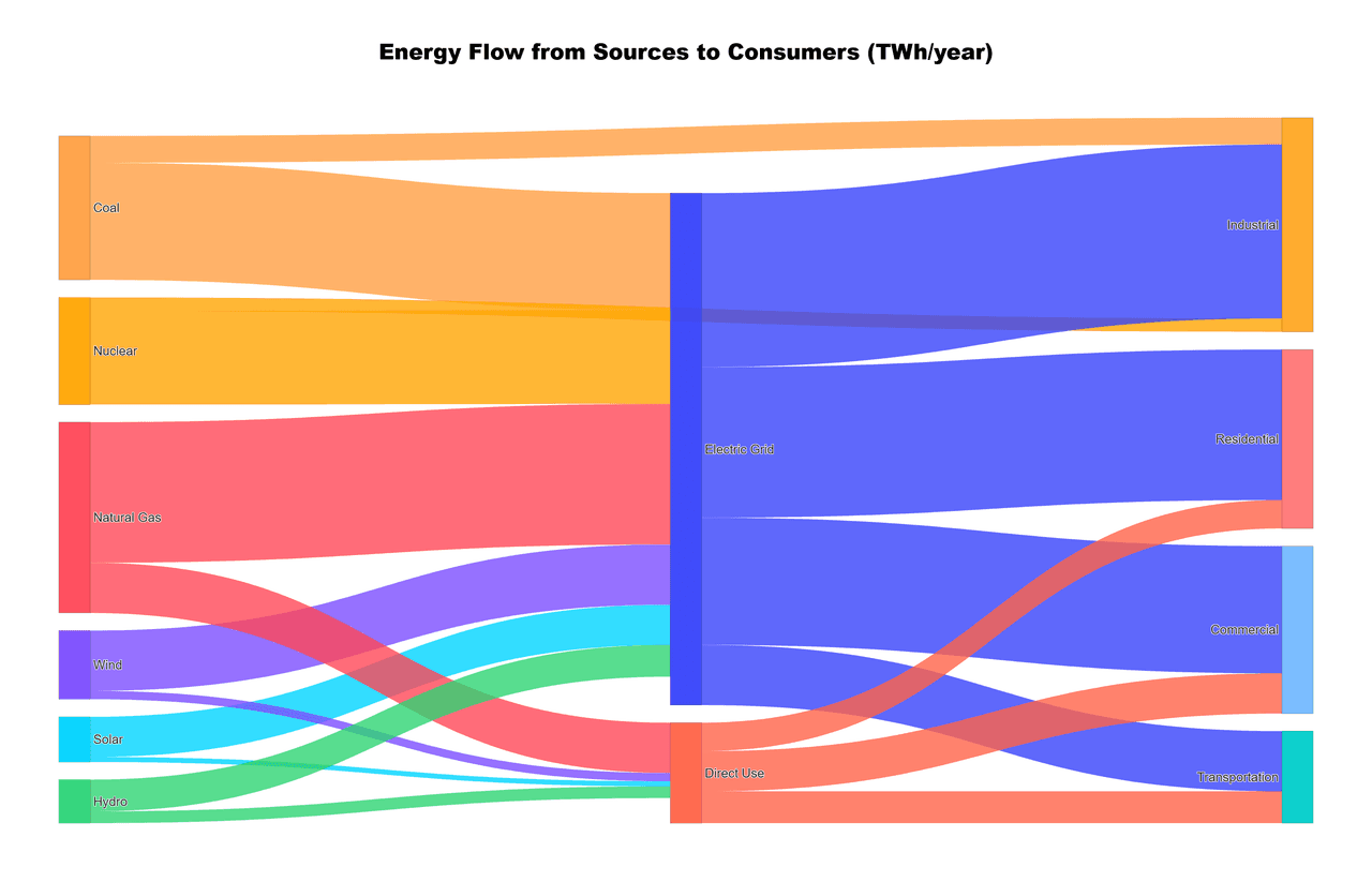
Sankey Diagram
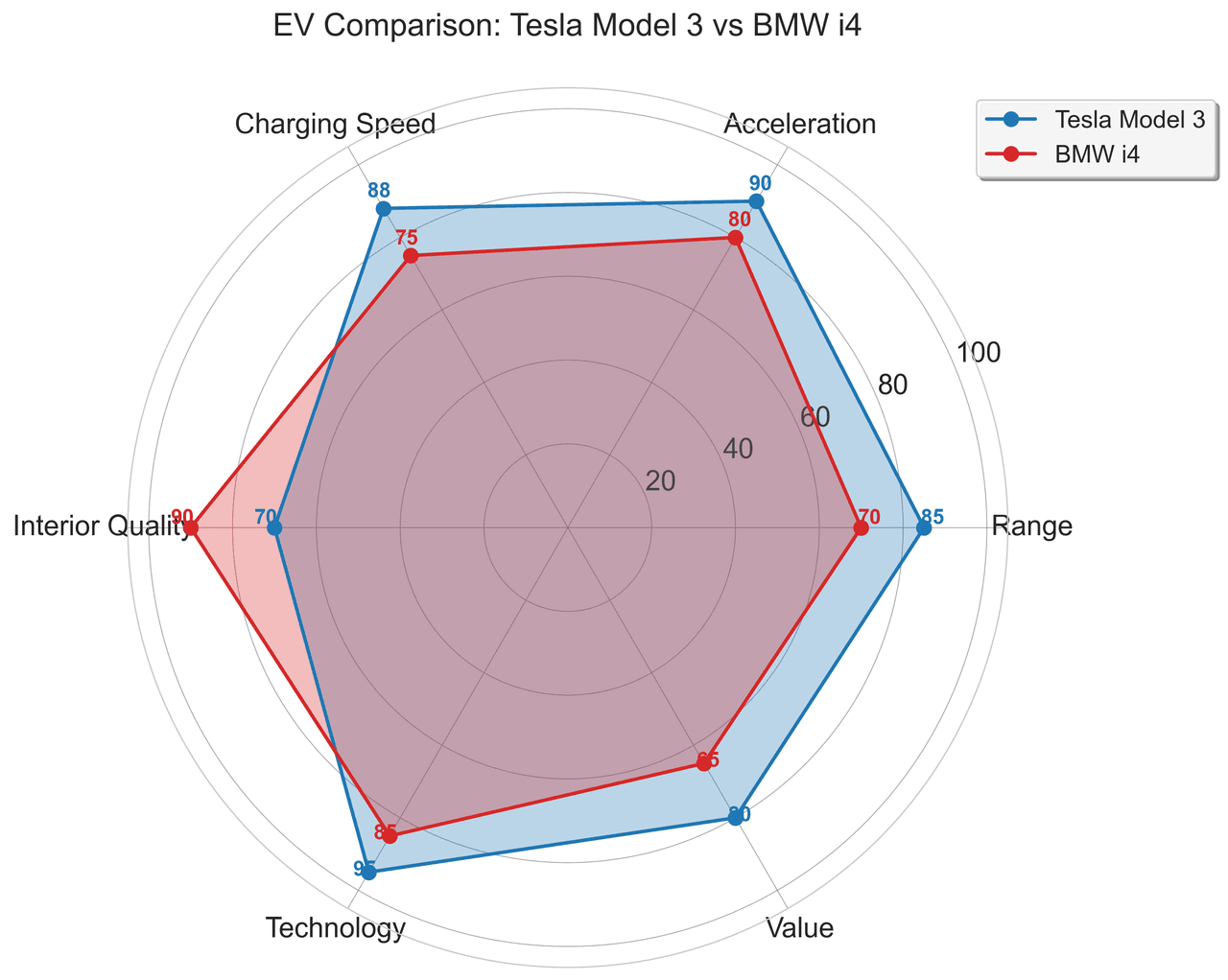
Radar Chart
.png&w=1280&q=75)
Density Plot
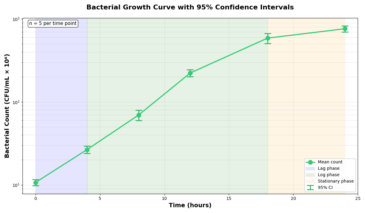
Error Bars
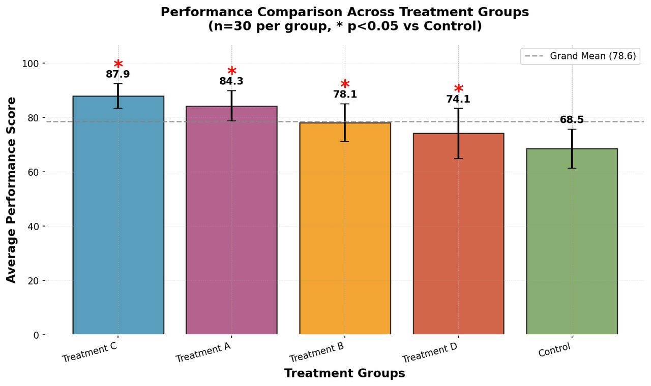
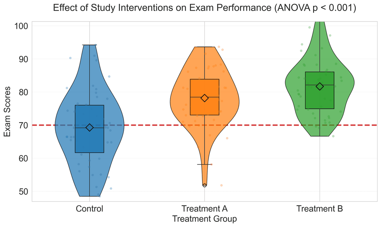
Live Example: Publication-Ready Group Comparison
Use this in sections 6-7 to refine grouped comparisons with clear uncertainty and labeling.
Not sure which chart fits? Upload your data and describe your goal in plain English. Plotivy suggests and generates the best chart type automatically.
The Misstep
Using bar charts for everything, including distributions and correlations, because they feel familiar.
The Fix
Map question type to chart type first: relationship, distribution, comparison, or time evolution.
Key Takeaway
Chart selection is a decision framework, not a preference. Match the chart to the question type before styling anything.
7. Color Palettes & Accessibility
Color is the most powerful visual channel - and the most frequently misused. Here's how to get it right.
Sequential
For ordered data. Light → dark.
Diverging
For data with a meaningful midpoint.
Categorical
For unordered groups (max 6–8 hues).
Two Critical Color Mistakes
Avoid the Rainbow (Jet) Colormap
The rainbow scale introduces "false boundaries" - visual bands that do not exist in the data. It is not perceptually uniform. Use Viridis, Magma, or Inferno instead.
Avoid Red/Green Pairs
The most common form of color blindness (8% of men). Using red/green for "Good/Bad" is a critical error. Use Blue/Orange or Teal/Red instead.
Try colorblind-safe palettes: Ask Plotivy to "Use a colorblind-friendly palette" or "Apply the Viridis colormap" on any plot.
Key Takeaway
Color should encode information, not decoration. Use perceptually safe palettes and never rely on red-green contrast alone.
8. Spot the Error: Common Pitfalls
Data visualization is an ethical responsibility. A misleading chart can drive incorrect decisions, spread misinformation, or invalidate valid research. The "Lie Factor" (ratio of visual effect to data effect) should always be 1.
Scenario: A bar chart of ROI for three projects: A (5.1%), B (5.2%), C (5.3%). The Y-axis starts at 5.0% and ends at 5.4%, making the differences look massive.
Problem
Truncating the Y-axis on a bar chart exaggerates minor variances. The visual length of the bar no longer represents the actual value.
Fix
Bar charts must always start at 0. If the small difference is key, use a dot plot or plot the deviation from a baseline.
Scenario: A line chart tracking 50 companies. Every line is a different rainbow color. A 50-entry legend sits on the side.
Problem
The eye cannot distinguish 50 hues. Lines overlap ("spaghetti"). Looking back and forth between lines and legend is mentally exhausting.
Fix
Use Small Multiples (one panel per group) or Emphasis (highlight 1–2 key lines in color, make the rest gray).
Scenario: A 3D pie chart showing market share across 15 competitors, with all slices "exploded" and the largest slice at the back of the perspective.
Problem
3D perspective distorts area. Front slices look bigger. "Exploding" all slices destroys part-to-whole. 15 categories is too many to compare angles.
Fix
Never use 3D effects for 2D data. Use a sorted horizontal bar chart instead.
Scenario: A chart with two Y-axes at different scales, making unrelated metrics appear correlated.
Problem
Dual axes can be manipulated by changing scales to imply correlations. Readers often assume both axes share a baseline.
Fix
Use separate panels (subplots) with clear individual axes. If a dual axis is truly necessary, label units explicitly.
Key Takeaway
Most visualization mistakes are avoidable and high-impact. Use honest axes, avoid 3D distortion, and simplify comparisons.
9. The Caption That Wins the Review
A common mistake is treating the caption as a mere label. In high-impact journals, the caption must allow the figure to stand alone - fully interpretable without reading the main text.
The 4-Part Formula
A brief, bolded summary of the main finding. "Temperature increases reaction rate" - not "Reaction rate vs Temperature".
What is plotted? Mention the variables on X and Y axes, and the experimental conditions.
Include sample size (n), error bars (SD vs SEM), and significance levels (p-values) if applicable.
Explain abbreviations or symbols used in the chart.
Example Caption
Figure 1: Effect of fertilizer on plant height. Average height (cm) of Zea mays after 4 weeks of treatment with Nitrogen (N), Phosphorus (P), or Control. Error bars represent Standard Error (n=20). * indicates p < 0.05 vs Control (t-test).
Key Takeaway
A strong caption makes the figure standalone: lead with the finding, then describe variables, statistics, and definitions clearly.
10. Typography & Technical Best Practices
Typography
- Font size: minimum 10–12pt for labels, 14–16pt for titles
- Sans-serif fonts (Arial, Helvetica, Roboto) for screen
- Consistent font family across all elements
- Ensure readability at the journal's final print size
Titles & Labels
- Title: Explanatory, not descriptive - "Sales Decline 15% in Q3" not "Q3 Sales Chart"
- Axis labels: Always include units - "Revenue (Million USD)", "Time (seconds)"
- Legend: Use direct labels on lines when possible; order legend to match data order
For uncertainty communication details in publication charts, read the error bars and confidence intervals guide.
Axes vs Direct Labels
- Focus on trends: Keep the axis but deemphasize it (light gray) to highlight the data shape
- Focus on exact values: Label data points directly and remove the axis to prevent redundancy
File Formats
- Vector (PDF, SVG): Preferred. Zoom infinitely without quality loss
- Raster (PNG, TIFF): 300 DPI minimum for print, 600+ for line art
- Avoid: JPG (compression artifacts) and BMP (large file size)
Key Takeaway
Typography and technical formatting are not polish-only details. They directly determine readability at final publication size.
11. The Compelling Figure Workflow
Follow this systematic approach to transform raw data into a publication-ready figure. Each step can be done in Plotivy with a single prompt.
1. Identify the Message
Before coding, write down the single key insight you want the reader to take away.
2. Select the Right Chart
Choose a visualization that matches your data structure - comparison, distribution, relationship, or composition.
3. Draft with Plotivy
Upload your data and describe the chart in plain English. Plotivy handles boilerplate, colors, fonts, and sizes.
Open Plotivy4. Declutter (Subtract)
Ask: "Remove gridlines, borders, background, and redundant legend." Strip everything that isn't data.
5. Emphasize (Add)
Highlight key data points with a specific color (e.g., orange) while keeping context data neutral (gray). Add direct labels.
6. Refine Typography
Ensure all text is legible (min 10pt), no overlapping, consistent font family. Ask Plotivy: "Set font to Arial 12pt."
7. Write the Caption
Draft a standalone caption with a lead-in title that summarizes the finding (See Section 9).
8. Export High-Res
Save as PDF/SVG for vector fidelity. Plotivy's export includes publication-quality options.
Pre-Submission Checklist
Clarity & Story
- ☐ Answer a specific research question?
- ☐ Key insight obvious within 5 seconds?
- ☐ Axes labeled with clear units?
Aesthetics & Design
- ☐ No 3D effects, shadows, or dark bgs?
- ☐ Color palette limited to 2–3 + grays?
- ☐ Font consistent with document text?
Accessibility & Code
- ☐ Colorblind-safe (no red/green)?
- ☐ Saved as vector (PDF/SVG)?
- ☐ Python code saved for reproducibility?
Key Takeaway
Reliable figure quality comes from process discipline: message first, correct chart second, declutter third, then export and verify.
12. Journal-Specific Standards
Each journal has distinct requirements for figure format, resolution, color mode, and typography. Failing to meet these specifications is a common reason for desk rejections.
Nature
- • Colors: No Red/Green or Rainbow. Preferred: Green/Magenta, Turquoise/Red, Yellow/Blue
- • Labels: Sub-panels labeled bold lowercase (a, b). Sentence case
- • Typography: Arial, Helvetica, or Times New Roman. Optimum 8pt at print size. Min line width 0.25pt
- • Format: Initial: JPEG. Final: Vector (.pdf, .svg, .eps). Raster: 300+ DPI (RGB)
Science
- • Format: PDF or EPS vector formats preferred
- • Color: RGB for online, CMYK for print
- • Typography: Helvetica/Arial
- • Caption: Strict formatting requirements for structure and length
IEEE
- • Format: EPS or PDF (vector preferred)
- • Color: Grayscale-friendly palette for proceedings
- • Typography: Times New Roman (serif) permitted
- • Markers: Use distinct shapes in addition to color
PLOS ONE
- • Format: TIFF, EPS, or PDF
- • Accessibility: Sufficient contrast, legend clarity
- • License: Open-access, Creative Commons
- • Resolution: 300 DPI minimum for raster
Plotivy includes journal presets. Ask "Apply Nature style" or "Format for IEEE submission" and the fonts, sizes, and export settings are configured automatically.
Key Takeaway
Journal compliance is a technical gate, not an optional extra. Align dimensions, typography, color policy, and export format before submission.
13. Reproducibility & FAIR Principles
A figure is only as good as its reproducibility. If a colleague (or future-you) can't recreate it, it's a ticking time bomb during peer review.
FAIR Data Principles
- Findable: Unique identifiers (DOI), rich metadata, indexed repositories
- Accessible: Open or authenticated access, persistent URLs
- Interoperable: Standard formats, vocabularies, and APIs
- Reusable: Clear licenses, provenance, and usage documentation
Practical Tips
- Bundle everything: Code, data, plots, and metadata in a single archive
- Use plain-text formats: CSV/TSV for data, Python scripts or Jupyter notebooks for code
- 3-2-1 backup rule: 3 copies, 2 different media, 1 offsite
- Public repositories: Zenodo, Figshare, or Dryad for long-term archival
Plotivy & Reproducibility
Every chart Plotivy generates comes with the full Python source code. The tool is not a "black box" - you can verify, modify, and share the code. This ensures your figures are transparent, reproducible, and fully under your control.
Key Takeaway
Reproducibility is part of figure quality. Keep code, data, metadata, and version history together so others can validate your results.
14. Resources & Recommended Reading
Essential Books
- Tufte, E. R. - The Visual Display of Quantitative Information (2001)
- Wilke, C. O. - Fundamentals of Data Visualization (2019)
- Knaflic, C. N. - Storytelling with Data (2015)
- Cairo, A. - The Truthful Art (2016)
Online Tools & Data
- ColorBrewer - Colorblind-safe palettes (colorbrewer2.org)
- Kaggle Datasets - Community-uploaded datasets
- Our World in Data - High-quality charts & global data
- Google Dataset Search - Search engine for open datasets
Stop Debugging Plots. Start Publishing.
Plotivy applies every principle from this guide automatically - Gestalt principles, colorblind-safe palettes, journal presets, and clean typography. Upload your data, describe the chart, and get both the figure and the Python code in seconds.
Free account required - launch Analyze instantly.
Technique guides scientists read next
scipy.signal.find_peaks guide
Tune prominence and width parameters for robust peak extraction.
Savitzky-Golay smoothing
Reduce noise while preserving peak shape and position.
PCA visualization workflow
Move from high-dimensional measurements to interpretable components.
ANOVA with post-hoc brackets
Add statistically correct pairwise significance annotations.
Found this helpful? Share it with your network.
Experimental Physicist & Photonics Researcher
Hands-on experience in silicon photonics, semiconductor fabrication (DRIE/ICP-RIE), optical simulation, and data-driven analysis. Built Plotivy to help researchers focus on discoveries instead of data struggles.
More about the authorVisualize your own data
Apply the techniques from this article to your own datasets. Upload CSV, Excel, or paste data directly.