Error Bars and Confidence Intervals: The Definitive Guide for Scientists

"Show me the error bars!" is the battle cry of every rigorous scientist. But not all error bars are created equal. Are you plotting Standard Deviation (SD), Standard Error of the Mean (SEM), or Confidence Intervals (CI)?
Choosing the wrong error bar can mislead your readers and even get your paper rejected. This guide clears up the confusion - and lets you practice each type instantly with live code editors.
What You'll Learn
0.Live Code Lab: Error Bars in Action
1.SD vs SEM vs CI - The Big Three
2.When to Use Which Error Bar
3.Common Mistakes to Avoid
4.The Rule of Eye for Significance
5.Live Example: Grouped Bars with SEM
6.How to Add Error Bars in Plotivy
7.Advanced: Asymmetric & Custom Intervals
0. Live Code Lab: Error Bars in Action
This editor shows Python code that creates the same data plotted three ways - with SD, SEM, and 95% CI error bars side by side. Notice how different the bars look even though the underlying data is identical.
Edit the code to change group means, sample sizes, or variability - then click Run to see the result instantly.
Preparing preview
Running once automatically on first load
Learn by Experimenting
This is a safe playground for learning! Try changing:
- • Colors: Modify color values to see different palettes
- • Numbers: Adjust sizes, positions, or data ranges
- • Labels: Update titles, axis names, or legends
Edit the code, run it, then open the full data visualization tool to continue with your own dataset.
1. SD vs SEM vs CI - The Big Three
Each type of error bar answers a fundamentally different question about your data. Understanding the distinction is essential for honest scientific communication.
Standard Deviation (SD)
Question it answers: "How spread out are the individual data points?"
- Describes the variability of the population
- Does NOT shrink as sample size increases
- 68% of data falls within mean +/- 1 SD (normal distribution)
SD = sqrt(sum((xi - mean)^2) / (n-1))
Standard Error (SEM)
Question it answers: "How precisely do we know the mean?"
- Describes the precision of the mean estimate
- Gets smaller as you add more samples (SEM = SD / sqrt(n))
- Always smaller than SD for n > 1
SEM = SD / sqrt(n)
Confidence Interval (CI)
Question it answers: "Where does the true mean likely lie?"
- Usually 95% CI: "We are 95% confident the true mean is in this range"
- Best for inferential statistics and group comparisons
- Width depends on both variability and sample size
95% CI = mean +/- 1.96 * SEM
2. When to Use Which Error Bar
Descriptive Statistics - Use SD
When you are describing your sample (e.g., "Patients ranged in age from 20 to 60"), SD conveys natural variability.
Typical caption: "Values are mean +/- SD (n = 30 per group)."
Comparing Groups - Use CI (preferred) or SEM
If you want to argue that Group A differs from Group B, CI provides the strongest visual evidence because non-overlapping 95% CIs imply statistical significance.
Typical caption: "Error bars represent 95% confidence intervals."
Regression & Model Uncertainty - Use CI Bands
For fitted curves, show a shaded 95% CI band around the line. This communicates both the trend and the model's uncertainty at every point along the curve.
Not sure which error bar to use?
Describe your data to Plotivy and it will recommend the appropriate statistical representation and generate the chart code automatically.
3. Common Mistakes to Avoid
Not labeling your error bars
Always state in the figure legend which type of error bar is shown: "Error bars represent mean +/- SEM" or "mean +/- SD (n = 10 per group)". Reviewers will reject figures with unlabeled error bars.
Using SEM to hide variability
SEM is always smaller than SD. Some researchers use SEM just to make their data look "tighter" - this is misleading. If variability is high, show it honestly with SD.
Plotting error bars on n=1 or n=2
You need at least n=3 to calculate a meaningful SD. For very small n, show individual data points instead of summary bars with error bars.
Mixing error bar types across panels
If one panel uses SD and another uses SEM, readers will unconsciously compare bar lengths and draw wrong conclusions. Be consistent throughout a figure.
Try it
Try it now: review your figure before submission
Upload your current plot and get an AI critique with concrete fixes for clarity, typography, color, and journal readiness.
Open AI Figure Reviewer →Newsletter
Get a weekly Python plotting tip
One concise tip each week for cleaner, faster scientific figures. Built for researchers who publish.
4. The "Rule of Eye" for Significance
When comparing two groups visually, the overlap of error bars provides a rough guide to statistical significance - without running a formal test.
Quick Rules
- 95% CI bars do NOT overlap - the difference is statistically significant (p < 0.05).
- SEM bars overlap - the difference is NOT significant. If SEM bars do not overlap, you still cannot be sure without a formal test.
- SD bars - provide no information about statistical significance. They only describe variability.
This is exactly why many journals prefer 95% CI for group comparisons - the visual overlap directly maps to statistical inference.
Try CI Error Bars5. Live Example: Grouped Bar Chart with SEM
A common real-world scenario: comparing treatment groups across multiple timepoints. This code computes SEM from raw replicates and builds a publication-ready grouped bar chart.
Try changing the number of replicates (currently 15 per condition) to see how SEM shrinks with larger samples.
Preparing preview
Running once automatically on first load
Learn by Experimenting
This is a safe playground for learning! Try changing:
- • Colors: Modify color values to see different palettes
- • Numbers: Adjust sizes, positions, or data ranges
- • Labels: Update titles, axis names, or legends
Edit the code, run it, then open the full data visualization tool to continue with your own dataset.
6. How to Add Error Bars in Plotivy
Plotivy makes it easy to add statistically correct error bars without manual calculations. Here is the three-step workflow:
Upload your raw data
Upload a CSV with individual replicates (not pre-computed means). Plotivy calculates SD, SEM, and CI from the raw measurements automatically.
Describe what you want
Type a natural-language prompt like: "Create a bar chart of Treatment vs Response with 95% Confidence Interval error bars and significance stars."
Switch error bar type instantly
After generating, ask Plotivy to "Switch the error bars to SD" or "Show SEM instead" - the chart updates in seconds, preserving all other styling.
Try it now: Upload any dataset with replicates and ask "Plot a bar chart with SEM error bars" or "Show 95% CI error bars with significance brackets".
7. Advanced: Asymmetric & Custom Intervals
Asymmetric Error Bars
When your data is skewed (e.g., reaction times, concentrations), symmetric error bars misrepresent the distribution. Use asymmetric bars computed from percentiles or bootstrap CIs.
Prompt: "Plot median with asymmetric error bars from 25th to 75th percentile"
Bootstrap Confidence Intervals
When you cannot assume normality, bootstrap CIs provide a distribution-free alternative. Resample your data thousands of times and take the 2.5th and 97.5th percentiles of the resampled means.
Prompt: "Create a bar chart with bootstrap 95% CI error bars (10,000 resamples)"
Pro Tip: Show Individual Data Points
For small sample sizes (n < 15), overlay individual data points (jittered dots) on your bar/box plots. This gives readers the full picture: summary statistics and the raw data distribution. Many journals now require this.
Chart gallery
Error-bar ready gallery examples
Fully built chart types that already show SD, SEM, or CI correctly - open the detail page or run the prompt directly.

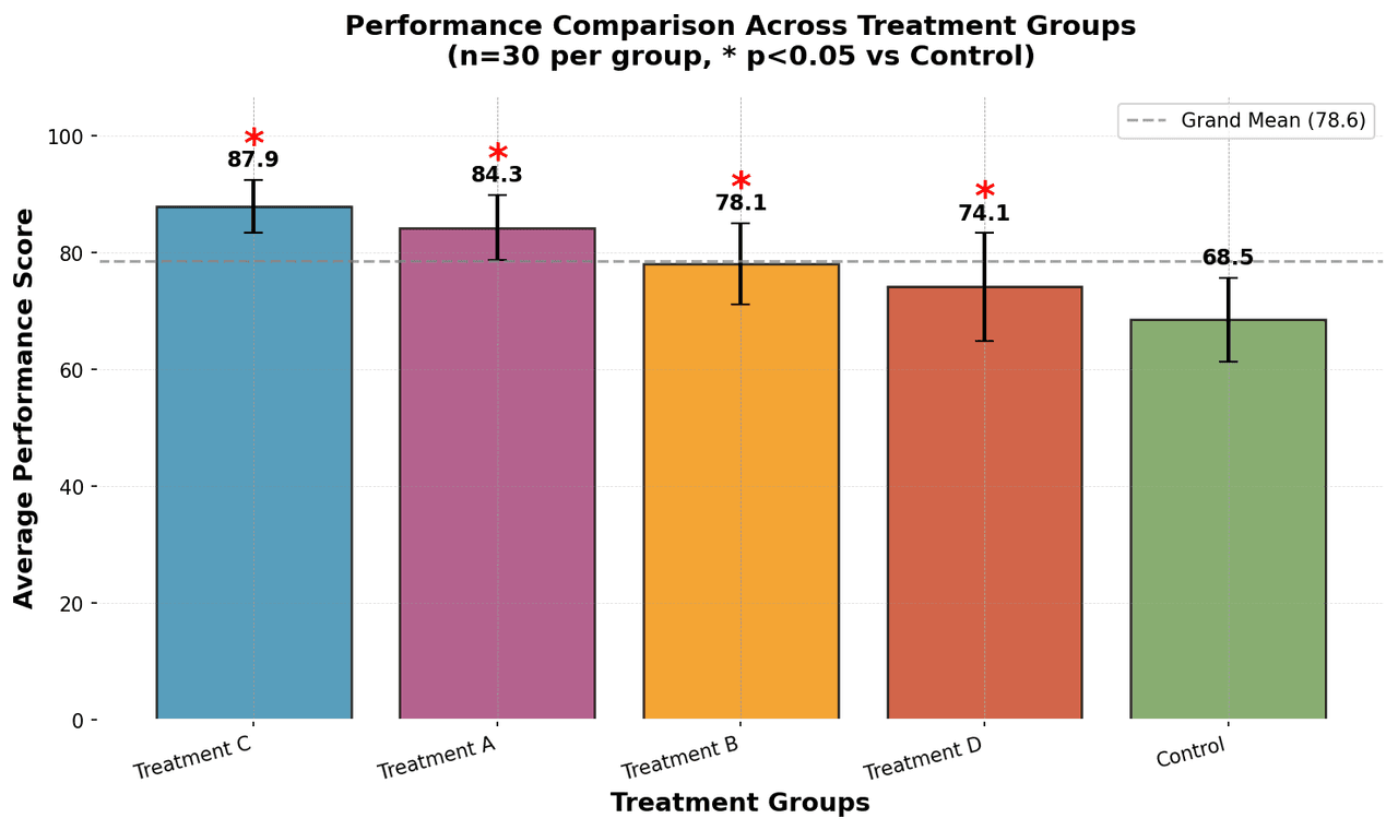
Bar Chart
Compares categorical data using rectangular bars with heights proportional to values.
Sample code / prompt
import numpy as np
import pandas as pd
import matplotlib.pyplot as plt
import seaborn as sns
from scipy import stats

# Generate performance scores for 5 treatment groups
np.random.seed(42)
groups = ['Control', 'Treatment A', 'Treatment B', 'Treatment C', 'Treatment D']
n_samples = 30.png&w=1280&q=70)
Box and Whisker Plot
Displays data distribution using quartiles, median, and outliers in a standardized format.
Sample code / prompt
import numpy as np
import pandas as pd
import matplotlib.pyplot as plt
import seaborn as sns
from scipy import stats

# Generate gene expression data for 4 genotypes
np.random.seed(42)
genotypes = ['WT', 'KO1', 'KO2', 'Mutant']
n_per_group = 20
Error Bars
Graphical representations of the variability of data indicating error or uncertainty in measurements.
Sample code / prompt
import numpy as np
import matplotlib.pyplot as plt
from scipy import stats

# Generate bacterial growth data with replicates
np.random.seed(42)
time_points = np.array([0, 4, 8, 12, 18, 24])
mean_values = np.array([10, 25, 80, 250, 600, 800])

# Generate 5 replicates per time point with noise
Violin Plot
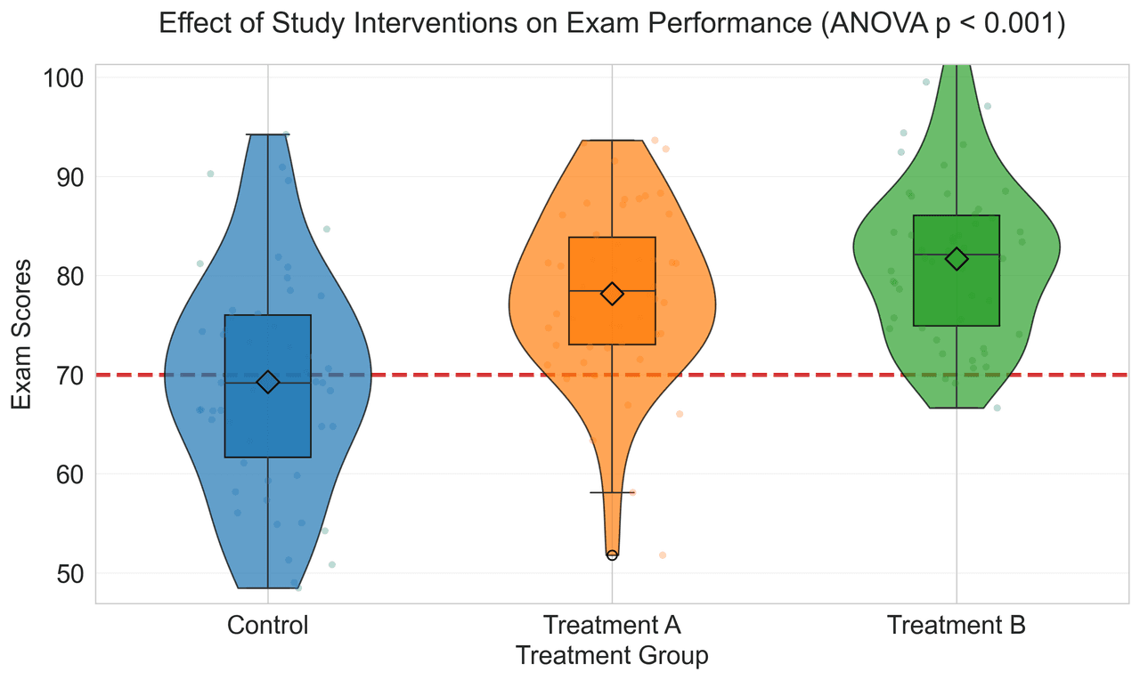
Combines box plots with kernel density to show distribution shape across groups.
Sample code / prompt
import matplotlib.pyplot as plt
import seaborn as sns
import pandas as pd
import numpy as np
from scipy.stats import f_oneway

# Generate exam score data for 3 groups
np.random.seed(42)
control = np.random.normal(72, 12, 50)
treatment_a = np.random.normal(78, 10, 50)Create Publication-Ready Error Bars Now
Upload your data, describe the chart you want, and Plotivy generates the correct error bars - SD, SEM, or CI - with proper labeling. No manual calculations needed.
Related chart guides
Apply this tutorial directly in the chart gallery with ready-to-run prompts and examples.
Technique guides scientists read next
scipy.signal.find_peaks guide
Tune prominence and width parameters for robust peak extraction.
Savitzky-Golay smoothing
Reduce noise while preserving peak shape and position.
PCA visualization workflow
Move from high-dimensional measurements to interpretable components.
ANOVA with post-hoc brackets
Add statistically correct pairwise significance annotations.
Found this helpful? Share it with your network.
Experimental Physicist & Photonics Researcher
Hands-on experience in silicon photonics, semiconductor fabrication (DRIE/ICP-RIE), optical simulation, and data-driven analysis. Built Plotivy to help researchers focus on discoveries instead of data struggles.
More about the authorVisualize your own data
Apply the techniques from this article to your own datasets. Upload CSV, Excel, or paste data directly.