From Excel to Publication: How I Finally Stopped Hating My Own Figures

Excel is the lingua franca of data entry. It is intuitive, ubiquitous, and excellent for organizing tabular data. But when it comes to creating figures for scientific publications, it falls short.
This guide shows the hybrid workflow: keep Excel for data, use Plotivy for figures. No Python required - but you get code-backed reproducibility.
What You Will Learn
0.Live Code: Excel Data to Journal Figure
1.Why Excel Figures Fall Short
2.The Hybrid Workflow
3.Step-by-Step: Excel to Publication
4.Before and After
0. Live Code: Excel Data to Journal Figure
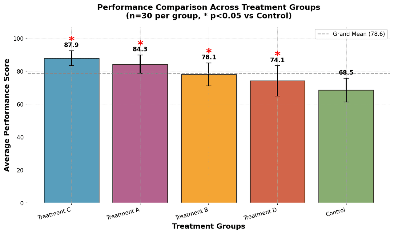
This is what Plotivy generates behind the scenes when you upload an Excel file. A grouped bar chart with error bars and significance markers - the kind of figure that gets past peer review.
Preparing preview
Running once automatically on first load
Learn by Experimenting
This is a safe playground for learning! Try changing:
- • Colors: Modify color values to see different palettes
- • Numbers: Adjust sizes, positions, or data ranges
- • Labels: Update titles, axis names, or legends
Edit the code, run it, then open the full data visualization tool to continue with your own dataset.
1. Why Excel Figures Fall Short
While Excel handles basic charting, it lacks the specialized features required for high-impact publishing:
Raster Export Issues
Exporting 300+ DPI images from Excel is notoriously difficult. Screenshots result in pixelation unacceptable for print journals.
Limited Customization
Fine-tuning error bar caps, tick mark direction, or specific font kerning can be frustrating or impossible.
No Reproducibility
Excel figures are manual clicks. If you need to recreate a plot six months later with new data, you must remember every formatting step.
Try it
Try it now: review your figure before submission
Upload your current plot and get an AI critique with concrete fixes for clarity, typography, color, and journal readiness.
Open AI Figure Reviewer →Newsletter
Get a weekly Python plotting tip
One concise tip each week for cleaner, faster scientific figures. Built for researchers who publish.
2. The Hybrid Workflow
You do not need to abandon Excel entirely. Use it for what it is good at - data organization - and let Plotivy handle visualization. The best of both worlds.
Key Insight
Plotivy translates your natural-language request into Python code (Matplotlib), giving you the power of a programming language without the syntax struggle. And the code is yours to keep.
3. Step-by-Step: Excel to Publication
Prepare Tidy Data in Excel
Each variable gets its own column. Each observation gets its own row. Use clear header names like 'Time_min' or 'Absorbance_AU'.
Import to Plotivy
Drag and drop your .xlsx or .csv file into the Plotivy interface. The AI parses the file structure automatically.
Describe Your Figure
Type a natural language prompt like 'Create a scatter plot of Time vs Absorbance with error bars. Fit a kinetic curve. Style for a chemistry journal.'
Export Vector Graphics
Download as SVG or PDF - resolution-independent formats that stay crisp from phone screens to poster prints.
4. Before and After
Excel Default Chart
- - Low-res raster export
- - Default color scheme
- - No error bars or statistics
- - Cannot reproduce later
- - No journal compliance
Plotivy Output
- + 300 DPI vector export (SVG/PDF)
- + Journal style templates
- + Error bars, significance markers
- + Fully reproducible Python code
- + Nature/Science compliant
Chart gallery
Popular chart types for Excel data
These are the most common figure types researchers create from their spreadsheet data.

Bar Chart
Compares categorical data using rectangular bars with heights proportional to values.
Sample code / prompt
import numpy as np
import pandas as pd
import matplotlib.pyplot as plt
import seaborn as sns
from scipy import stats

# Generate performance scores for 5 treatment groups
np.random.seed(42)
groups = ['Control', 'Treatment A', 'Treatment B', 'Treatment C', 'Treatment D']
n_samples = 30
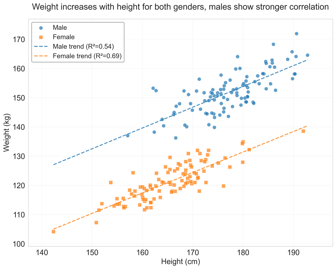
Scatterplot
Displays values for two variables as points on a Cartesian coordinate system.
Sample code / prompt
import matplotlib.pyplot as plt
import numpy as np
from scipy import stats
import pandas as pd

# Generate sample data
np.random.seed(42)
n_samples = 200
height = np.random.normal(170, 8, n_samples)
weight = height * 0.6 + np.random.normal(0, 8, n_samples) - 50
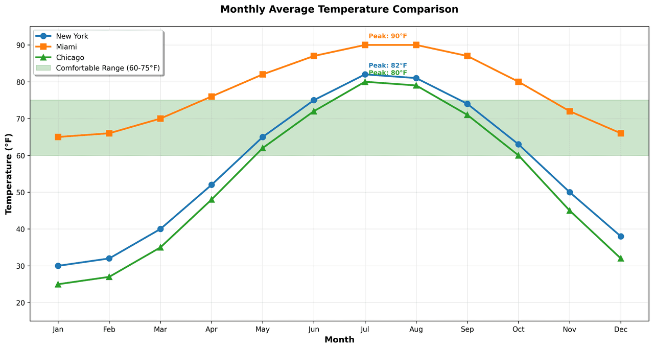
Line Graph
Displays data points connected by straight line segments to show trends over time.
Sample code / prompt
import matplotlib.pyplot as plt
import numpy as np

# Generate temperature data for 3 major US cities over 12 months
months = ['Jan', 'Feb', 'Mar', 'Apr', 'May', 'Jun', 'Jul', 'Aug', 'Sep', 'Oct', 'Nov', 'Dec']
nyc = [30, 32, 40, 52, 65, 75, 82, 81, 74, 63, 50, 38]
miami = [65, 66, 70, 76, 82, 87, 90, 90, 87, 80, 72, 66]
chicago = [25, 27, 35, 48, 62, 72, 80, 79, 71, 60, 45, 32]

# Create figure with enhanced styling.png&w=1280&q=70)
Box and Whisker Plot
Displays data distribution using quartiles, median, and outliers in a standardized format.
Sample code / prompt
import numpy as np
import pandas as pd
import matplotlib.pyplot as plt
import seaborn as sns
from scipy import stats

# Generate gene expression data for 4 genotypes
np.random.seed(42)
genotypes = ['WT', 'KO1', 'KO2', 'Mutant']
n_per_group = 20
Error Bars
Graphical representations of the variability of data indicating error or uncertainty in measurements.
Sample code / prompt
import numpy as np
import matplotlib.pyplot as plt
from scipy import stats

# Generate bacterial growth data with replicates
np.random.seed(42)
time_points = np.array([0, 4, 8, 12, 18, 24])
mean_values = np.array([10, 25, 80, 250, 600, 800])

# Generate 5 replicates per time point with noiseStop Fighting with Excel Charts
Upload your spreadsheet and describe the figure you need. Plotivy generates code-backed, publication-quality plots.
Technique guides scientists read next
scipy.signal.find_peaks guide
Tune prominence and width parameters for robust peak extraction.
Savitzky-Golay smoothing
Reduce noise while preserving peak shape and position.
PCA visualization workflow
Move from high-dimensional measurements to interpretable components.
ANOVA with post-hoc brackets
Add statistically correct pairwise significance annotations.
Found this helpful? Share it with your network.
Experimental Physicist & Photonics Researcher
Hands-on experience in silicon photonics, semiconductor fabrication (DRIE/ICP-RIE), optical simulation, and data-driven analysis. Built Plotivy to help researchers focus on discoveries instead of data struggles.
More about the authorVisualize your own data
Apply the techniques from this article to your own datasets. Upload CSV, Excel, or paste data directly.