How to Make a Violin Plot in Excel (And Why You Shouldn't)
Excel does not have a native violin plot. You can fake one with a 6-step KDE workaround - but it takes 20+ minutes and the result is fragile. Here is the workaround, and then the 30-second Python alternative.
In This Article
0.Live Code: A Proper Violin Plot
1.The Excel Workaround (6 Steps)
2.Why It Is Not Worth It
3.The 30-Second Alternative
4.When to Use Violin Plots
0. Live Code: A Proper Violin Plot
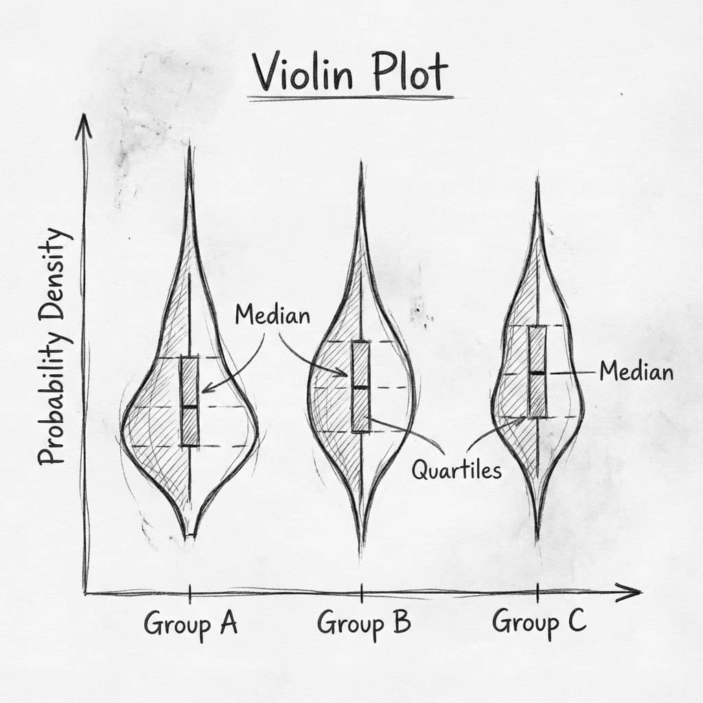
This is what a real violin plot looks like: KDE-smoothed distributions, overlaid box plots, individual data points, and a bimodal distribution that Excel simply cannot show. Edit the code to try your own data.
1. The Excel Workaround (6 Steps)
If you must use Excel, here is the workaround. It creates a mirrored area chart that approximates a violin shape using kernel density estimation you calculate manually.
Calculate KDE
Create a column of evenly spaced y-values. For each, count nearby data points using NORM.DIST to approximate kernel density.
Mirror the density
Create a negative copy of your KDE column. This gives the symmetric violin shape when plotted as area.
Create area chart
Select the y-values and both KDE columns. Insert a stacked area chart.
Switch axes
Swap X and Y axes so the violin is vertical. This requires editing the chart data series manually.
Remove fills
Make the bottom area transparent and color only the top area. Remove gridlines and chart borders.
Repeat per group
Do all of the above for each group in your data. Then manually align the charts side by side.
2. Why It Is Not Worth It
Try it
Try it now: compare your groups with the right chart
Generate box, violin, or bar charts directly from your dataset and choose the clearest visual for your paper.
Generate comparison charts →Newsletter
Get a weekly Python plotting tip
One concise tip each week for cleaner, faster scientific figures. Built for researchers who publish.
20+ Minutes Per Group
Each additional group means repeating all 6 steps.
No KDE Built In
You manually approximate kernel density with formulas.
No Data Points Overlay
Cannot add individual observations or box plot statistics.
Breaks on Data Changes
Update data and your chart formulas need manual fixing.
3. The 30-Second Alternative
Upload Your CSV
Drag and drop your Excel data file.
Type: 'Make a violin plot'
AI generates the complete Python code.
Edit if Needed
Customize colors, labels, overlays in the code editor.
Export at 600 DPI
Download TIFF/PNG/PDF for journal submission.
Key Advantage
Unlike Excel, Python violin plots show the actual data distribution including bimodality, skew, and outliers. Notice the bimodal "High Dose" group in the live code above - Excel's workaround completely misses this.
4. When to Use Violin Plots
Comparing distributions across groups
Showing bimodal or skewed data (bar charts hide this)
Replacing bar+error bar plots in manuscripts
Small sample sizes (n < 10)
Categorical counts or proportions
Time series data (use line charts instead)
Chart gallery
Related Chart Types
Explore alternatives to violin plots for different data scenarios.

Violin Plot
Combines box plots with kernel density to show distribution shape across groups.
Sample code / prompt
import matplotlib.pyplot as plt
import seaborn as sns
import pandas as pd
import numpy as np
from scipy.stats import f_oneway

# Generate exam score data for 3 groups
np.random.seed(42)
control = np.random.normal(72, 12, 50)
treatment_a = np.random.normal(78, 10, 50).png&w=1280&q=70)
Box and Whisker Plot
Displays data distribution using quartiles, median, and outliers in a standardized format.
Sample code / prompt
import numpy as np
import pandas as pd
import matplotlib.pyplot as plt
import seaborn as sns
from scipy import stats

# Generate gene expression data for 4 genotypes
np.random.seed(42)
genotypes = ['WT', 'KO1', 'KO2', 'Mutant']
n_per_group = 20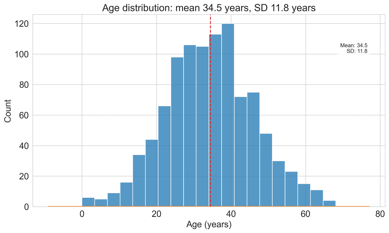
Histogram
Displays the distribution of numerical data by grouping values into bins.
Sample code / prompt
import matplotlib.pyplot as plt
import numpy as np
from scipy.stats import gaussian_kde, skewnorm

# Generate age data with slight right skew
np.random.seed(42)
ages = skewnorm.rvs(a=2, loc=42, scale=15, size=500)
ages = np.clip(ages, 18, 80)  # Clip to realistic range

fig, ax = plt.subplots(figsize=(12, 7))
Bar Chart
Compares categorical data using rectangular bars with heights proportional to values.
Sample code / prompt
import numpy as np
import pandas as pd
import matplotlib.pyplot as plt
import seaborn as sns
from scipy import stats

# Generate performance scores for 5 treatment groups
np.random.seed(42)
groups = ['Control', 'Treatment A', 'Treatment B', 'Treatment C', 'Treatment D']
n_samples = 30
Scatterplot
Displays values for two variables as points on a Cartesian coordinate system.
Sample code / prompt
import matplotlib.pyplot as plt
import numpy as np
from scipy import stats
import pandas as pd

# Generate sample data
np.random.seed(42)
n_samples = 200
height = np.random.normal(170, 8, n_samples)
weight = height * 0.6 + np.random.normal(0, 8, n_samples) - 50Frequently Asked Questions
Does Excel have a built-in violin plot chart type?
When should I use a violin plot instead of a box plot?
What is the fastest way to create a violin plot for a research paper?
Can I make a violin plot in Google Sheets?
What DPI should I export my violin plot at for a journal?
Related chart guides
Apply this tutorial directly in the chart gallery with ready-to-run prompts and examples.
Technique guides scientists read next
scipy.signal.find_peaks guide
Tune prominence and width parameters for robust peak extraction.
Savitzky-Golay smoothing
Reduce noise while preserving peak shape and position.
PCA visualization workflow
Move from high-dimensional measurements to interpretable components.
ANOVA with post-hoc brackets
Add statistically correct pairwise significance annotations.
Found this helpful? Share it with your network.
Experimental Physicist & Photonics Researcher
Hands-on experience in silicon photonics, semiconductor fabrication (DRIE/ICP-RIE), optical simulation, and data-driven analysis. Built Plotivy to help researchers focus on discoveries instead of data struggles.
More about the authorVisualize your own data
Apply the techniques from this article to your own datasets. Upload CSV, Excel, or paste data directly.