Matplotlib Python Tutorial: The Complete Guide (2026)

Matplotlib is Python's most powerful data visualization library. Used by millions of researchers, it is the industry standard for creating publication-quality figures. But here is what most tutorials will not tell you: you do not need to master every line of code to create great plots.
This guide teaches you the essentials with live Python code editors you can modify and run right here on this page.
Quick Answer: What is Matplotlib?
Matplotlib is the foundational Python library for creating static, animated, and interactive visualizations. It gives you pixel-perfect control over every aspect of a figure, making it the #1 choice for scientific publications.
What You Will Learn
0.Live Code Lab: Your First Plot
1.What is Matplotlib?
2.Anatomy of a Figure
3.Common Plot Types
4.Advanced Customization
5.Common Pain Points & Fixes
6.Live Code Lab: Multi-Panel
7.Summary & Key Takeaways
0. Live Code Lab: Your First Plot
This code creates a scatter plot with linear regression using the Object-Oriented interface. Every line is commented so you can understand exactly what each parameter does.
Try changing the marker color, adding more data points, or switching to a polynomial fit.
1. What is Matplotlib?
Here is the truth: You should know how Matplotlib works, even if you do not write it from scratch. When you use Plotivy, AI generates complex publication-ready code in seconds. But generating code is only half the battle - you need to be able to read it.
The Modern Workflow
- Describe your plot in plain English ("Scatter plot of A vs B with error bars")
- AI generates the Matplotlib code
- You review the code (using this guide) to verify accuracy
- You export the figure for publication
2. Anatomy of a Figure
Understanding the hierarchy is key to customizing any Matplotlib plot. Every figure contains these nested elements:
Figure
The top-level container. Controls overall size (figsize), DPI, and background color. Created with plt.figure() or plt.subplots().
Axes
The actual plot area. Contains the data, labels, title, and legend. A figure can contain multiple axes (subplots). Created with fig, ax = plt.subplots().
Axis
The X and Y number lines. Controls ticks, tick labels, limits, and scale (linear/log). Accessed via ax.xaxis / ax.yaxis.
Artists
Everything drawn on the figure: lines, markers, text, patches. Every visual element is an Artist that you can style individually.
Try it
Try it now: turn this method into your next figure
Apply the same approach to your own dataset and generate clean, publication-ready code and plots in minutes.
Open in Plotivy Analyze →Newsletter
Get a weekly Python plotting tip
One concise tip each week for cleaner, faster scientific figures. Built for researchers who publish.
Pro Tip
Always use the Object-Oriented interface (fig, ax = plt.subplots()) instead of the pyplot interface (plt.plot()). The OO interface gives you explicit control and avoids the "which axes am I plotting on?" confusion.
3. Common Plot Types
Scatter Plot
ax.scatter(x, y, s=50, alpha=0.7)Correlations between two continuous variables. Use s for size, c for color mapping.
Bar Chart
ax.bar(categories, values, yerr=errs)Comparing categories. Always include error bars (yerr) for scientific data.
Histogram
ax.hist(data, bins=20, alpha=0.6)Distribution of a single variable. Use bins to control resolution.
Error Bars
ax.errorbar(x, y, yerr=err, capsize=4)Critical for scientific data. Use capsize to show caps on error bars.
4. Advanced Customization
This is where beginners get stuck. Making a plot "look good" requires tweaking many parameters. Here are the essentials:
Publication Fonts
plt.rcParams["font.family"] = "Arial"plt.rcParams["font.size"] = 12Removing Clutter (Spines)
ax.spines["top"].set_visible(False)ax.spines["right"].set_visible(False)High-Resolution Export
plt.savefig("figure.png", dpi=300, bbox_inches="tight")5. Common Pain Points & Fixes
Labels Getting Cut Off
Axis labels or title disappear when saving.
plt.savefig("fig.png", bbox_inches="tight")Legend Covering Data
The legend obscures important data points.
ax.legend(bbox_to_anchor=(1.05, 1), loc="upper left")Subplot Spacing
Titles and labels of subplots overlap.
fig.tight_layout(pad=2.0)Skip the manual tweaking
Instead of writing 50 lines of styling code, tell Plotivy: "Make this publication-ready with Arial font and 300 DPI" and get the code instantly.
6. Live Code Lab: Multi-Panel Figure
This code creates a 2x2 figure with four different plot types, each with consistent journal-ready styling. This is the most common layout for scientific papers.
Try changing the layout (e.g., plt.subplots(1, 4)) or swapping one panel for a different plot type.
7. Summary & Key Takeaways
- Use the Object-Oriented interface (
fig, ax = plt.subplots()) for full control - Always label axes and include units
- Export as PDF or SVG for vector quality in publications
- Remove top and right spines to reduce clutter
- Use
tight_layout()to prevent label cutoff - Use AI tools to generate boilerplate code, then review and tweak as needed
Chart gallery
50+ Matplotlib examples
Explore publication-ready examples for every chart type - each with complete Python code.

Scatterplot
Displays values for two variables as points on a Cartesian coordinate system.
Sample code / prompt
import matplotlib.pyplot as plt
import numpy as np
from scipy import stats
import pandas as pd

# Generate sample data
np.random.seed(42)
n_samples = 200
height = np.random.normal(170, 8, n_samples)
weight = height * 0.6 + np.random.normal(0, 8, n_samples) - 50
Line Graph
Displays data points connected by straight line segments to show trends over time.
Sample code / prompt
import matplotlib.pyplot as plt
import numpy as np

# Generate temperature data for 3 major US cities over 12 months
months = ['Jan', 'Feb', 'Mar', 'Apr', 'May', 'Jun', 'Jul', 'Aug', 'Sep', 'Oct', 'Nov', 'Dec']
nyc = [30, 32, 40, 52, 65, 75, 82, 81, 74, 63, 50, 38]
miami = [65, 66, 70, 76, 82, 87, 90, 90, 87, 80, 72, 66]
chicago = [25, 27, 35, 48, 62, 72, 80, 79, 71, 60, 45, 32]

# Create figure with enhanced styling
Bar Chart
Compares categorical data using rectangular bars with heights proportional to values.
Sample code / prompt
import numpy as np
import pandas as pd
import matplotlib.pyplot as plt
import seaborn as sns
from scipy import stats

# Generate performance scores for 5 treatment groups
np.random.seed(42)
groups = ['Control', 'Treatment A', 'Treatment B', 'Treatment C', 'Treatment D']
n_samples = 30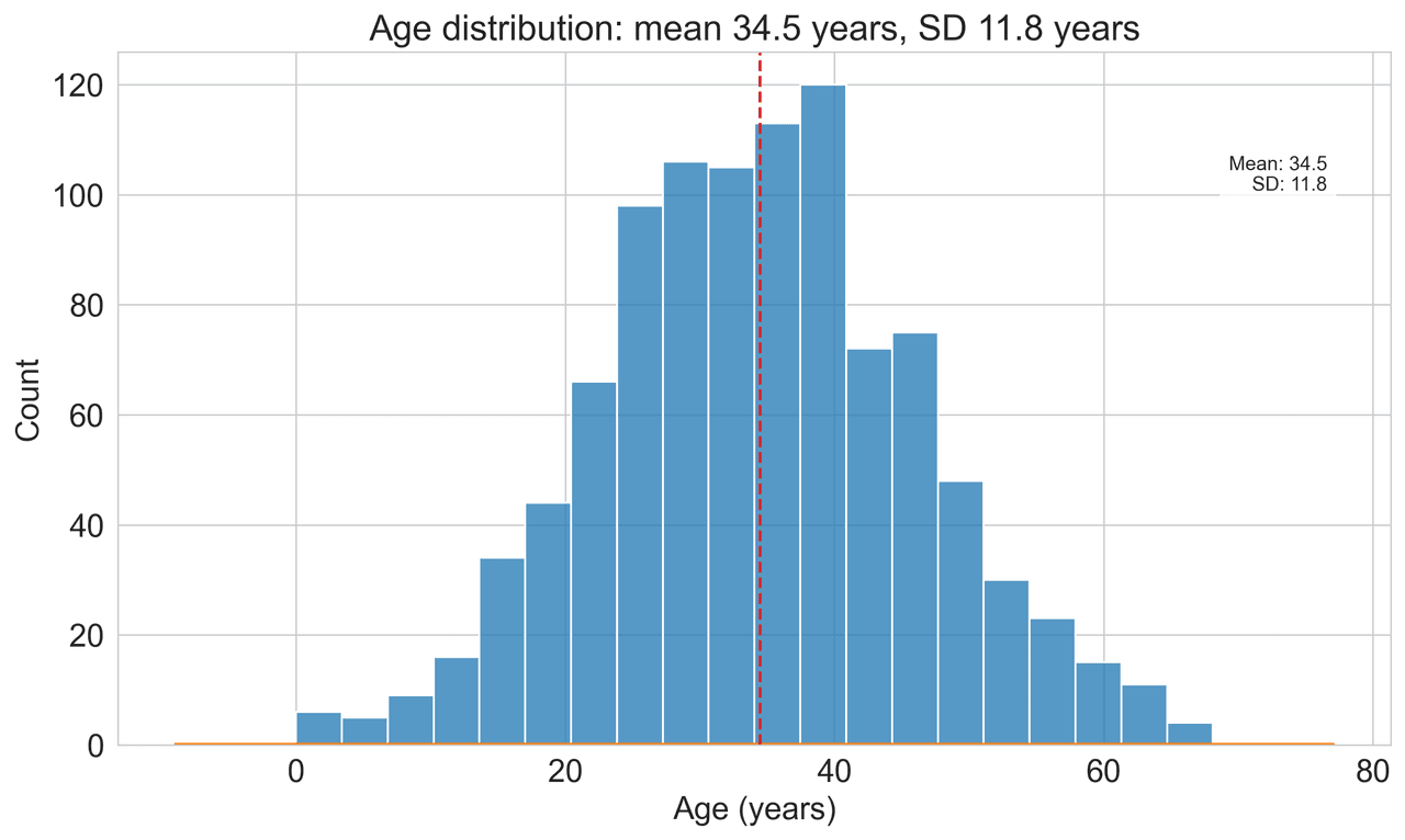
Histogram
Displays the distribution of numerical data by grouping values into bins.
Sample code / prompt
import matplotlib.pyplot as plt
import numpy as np
from scipy.stats import gaussian_kde, skewnorm

# Generate age data with slight right skew
np.random.seed(42)
ages = skewnorm.rvs(a=2, loc=42, scale=15, size=500)
ages = np.clip(ages, 18, 80)  # Clip to realistic range

fig, ax = plt.subplots(figsize=(12, 7))
Error Bars
Graphical representations of the variability of data indicating error or uncertainty in measurements.
Sample code / prompt
import numpy as np
import matplotlib.pyplot as plt
from scipy import stats

# Generate bacterial growth data with replicates
np.random.seed(42)
time_points = np.array([0, 4, 8, 12, 18, 24])
mean_values = np.array([10, 25, 80, 250, 600, 800])

# Generate 5 replicates per time point with noise
Heatmap
Represents data values as colors in a two-dimensional matrix format.
Sample code / prompt
import matplotlib.pyplot as plt
import seaborn as sns
import pandas as pd
import numpy as np

# Create correlation matrix for financial metrics
metrics = ['Revenue', 'Profit', 'Expenses', 'ROI', 'Customers', 'AOV', 'Marketing', 'Employees']
correlation_data = np.array([
    [1.00, 0.85, -0.45, 0.72, 0.88, 0.65, 0.72, 0.55],
[0.85, 1.00, -0.78, 0.92, 0.75, 0.58, 0.63, 0.48],Generate Matplotlib Code Instantly
Describe your plot in plain English and get publication-ready Python code. No more fighting with font sizes and spine visibility.
Technique guides scientists read next
scipy.signal.find_peaks guide
Tune prominence and width parameters for robust peak extraction.
Savitzky-Golay smoothing
Reduce noise while preserving peak shape and position.
PCA visualization workflow
Move from high-dimensional measurements to interpretable components.
ANOVA with post-hoc brackets
Add statistically correct pairwise significance annotations.
Found this helpful? Share it with your network.
Experimental Physicist & Photonics Researcher
Hands-on experience in silicon photonics, semiconductor fabrication (DRIE/ICP-RIE), optical simulation, and data-driven analysis. Built Plotivy to help researchers focus on discoveries instead of data struggles.
More about the authorVisualize your own data
Apply the techniques from this article to your own datasets. Upload CSV, Excel, or paste data directly.