Fixing Common Violin Plot Errors in R and ggplot2

ggplot2 violin plot errors are always cryptic. Here are the four most common ones, their one-line fixes, and a Python alternative that avoids them entirely.
Error Reference
0.Live Code: Python Violin Plot
1.Error: object not found
2.Error: need at least 2 data points
3.Error: geom_violin requires continuous y
4.Blank or Flat Violins
0. Live Code: Python Violin Plot (No Errors)
Skip ggplot2 errors entirely. This Python violin plot works every time with violin shapes, overlaid box plots, and individual data points.
1. Error: object 'x' not found
Bad:
ggplot(df, aes(x = group, y = value)) + geom_violin()
# "group" not in colnames(df)
Fix:
# Check column names first
colnames(df)
# Use the actual column name (case-sensitive!)
ggplot(df, aes(x = Group, y = Value)) + geom_violin()
2. Error: need at least 2 data points
Try it
Try it now: compare your groups with the right chart
Generate box, violin, or bar charts directly from your dataset and choose the clearest visual for your paper.
Generate comparison charts →Newsletter
Get a weekly Python plotting tip
One concise tip each week for cleaner, faster scientific figures. Built for researchers who publish.
Fix: Filter small groups
library(dplyr)
df_filtered <- df %>%
  group_by(group) %>%
  filter(n() >= 5) %>%   # keep groups with 5+ observations
  ungroup()

ggplot(df_filtered, aes(x = group, y = value)) + geom_violin()
Why This Happens
Violin plots use kernel density estimation (KDE), which needs enough data points to compute a smooth distribution. Groups with 1-2 points cannot produce a meaningful density curve. Use a box plot or strip chart for small groups instead.
3. Error: geom_violin requires continuous y
Fix: Ensure y is numeric
# Check data types
str(df$value)  # Should be "num" or "int"

# Convert if character/factor
df$value <- as.numeric(as.character(df$value))

ggplot(df, aes(x = group, y = value)) + geom_violin()
4. Blank or Flat Violins
Flat line instead of shape
Increase bandwidth: geom_violin(adjust = 2)
Default bandwidth too narrow for your data range.
Violins extend beyond data range
Trim violins: geom_violin(trim = TRUE)
KDE extrapolates beyond observed values by default.
All violins same width
Scale by count: geom_violin(scale = 'count')
Default normalizes all violins to same max width.
Missing groups in plot
Convert x to factor: aes(x = factor(group))
Numeric x is treated as continuous axis.
Chart gallery
Explore Violin Plot Alternatives
Sometimes a different chart type tells the story better.

Violin Plot
Combines box plots with kernel density to show distribution shape across groups.
Sample code / prompt
import matplotlib.pyplot as plt
import seaborn as sns
import pandas as pd
import numpy as np
from scipy.stats import f_oneway

# Generate exam score data for 3 groups
np.random.seed(42)
control = np.random.normal(72, 12, 50)
treatment_a = np.random.normal(78, 10, 50).png&w=1280&q=70)
Box and Whisker Plot
Displays data distribution using quartiles, median, and outliers in a standardized format.
Sample code / prompt
import numpy as np
import pandas as pd
import matplotlib.pyplot as plt
import seaborn as sns
from scipy import stats

# Generate gene expression data for 4 genotypes
np.random.seed(42)
genotypes = ['WT', 'KO1', 'KO2', 'Mutant']
n_per_group = 20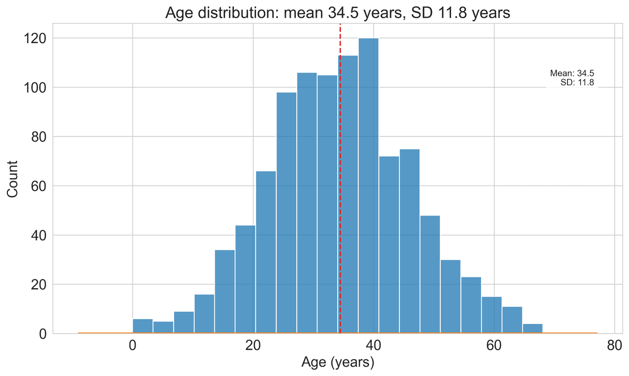
Histogram
Displays the distribution of numerical data by grouping values into bins.
Sample code / prompt
import matplotlib.pyplot as plt
import numpy as np
from scipy.stats import gaussian_kde, skewnorm

# Generate age data with slight right skew
np.random.seed(42)
ages = skewnorm.rvs(a=2, loc=42, scale=15, size=500)
ages = np.clip(ages, 18, 80)  # Clip to realistic range

fig, ax = plt.subplots(figsize=(12, 7))
Bar Chart
Compares categorical data using rectangular bars with heights proportional to values.
Sample code / prompt
import numpy as np
import pandas as pd
import matplotlib.pyplot as plt
import seaborn as sns
from scipy import stats

# Generate performance scores for 5 treatment groups
np.random.seed(42)
groups = ['Control', 'Treatment A', 'Treatment B', 'Treatment C', 'Treatment D']
n_samples = 30
Scatterplot
Displays values for two variables as points on a Cartesian coordinate system.
Sample code / prompt
import matplotlib.pyplot as plt
import numpy as np
from scipy import stats
import pandas as pd

# Generate sample data
np.random.seed(42)
n_samples = 200
height = np.random.normal(170, 8, n_samples)
weight = height * 0.6 + np.random.normal(0, 8, n_samples) - 50Automate R and ggplot2 Code Fixes
Upload your data, toggle to R language mode, and describe your violin plot. Plotivy handles package checks, converts types, and outputs error-free ggplot2 plots instantly.
Related chart guides
Apply this tutorial directly in the chart gallery with ready-to-run prompts and examples.
Technique guides scientists read next
scipy.signal.find_peaks guide
Tune prominence and width parameters for robust peak extraction.
Savitzky-Golay smoothing
Reduce noise while preserving peak shape and position.
PCA visualization workflow
Move from high-dimensional measurements to interpretable components.
ANOVA with post-hoc brackets
Add statistically correct pairwise significance annotations.
Found this helpful? Share it with your network.
Experimental Physicist & Photonics Researcher
Hands-on experience in silicon photonics, semiconductor fabrication (DRIE/ICP-RIE), optical simulation, and data-driven analysis. Built Plotivy to help researchers focus on discoveries instead of data struggles.
More about the authorVisualize your own data
Apply the techniques from this article to your own datasets. Upload CSV, Excel, or paste data directly.