Heatmap
Chart overview
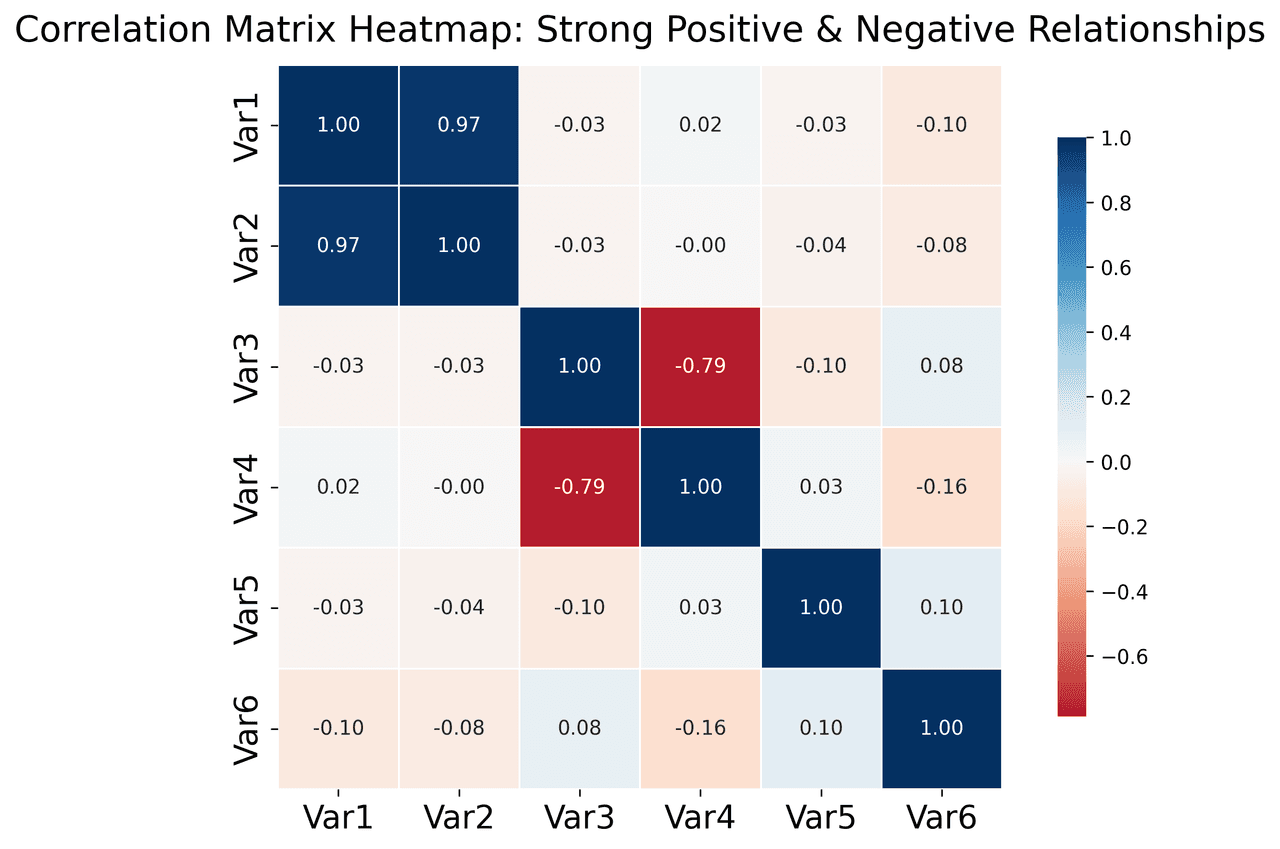
Heatmaps use color intensity to visualize values in a matrix, making patterns immediately visible.
Key points
- They are the standard for visualizing correlation matrices in data science, allowing you to instantly spot relationships between multiple variables.
- Beyond correlations, heatmaps are essential for visualizing gene expression, confusion matrices, and any 2D density data.
Python Tutorial
How to create a heatmap in Python
Use the full tutorial for implementation details, troubleshooting, and chart variations in matplotlib, seaborn, and plotly.
How to Create a Heatmap in PythonExample Visualization

Create This Chart Now
Generate publication-ready heatmaps with AI in seconds. No coding required – just describe your data and let AI do the work.
View example prompt
"Create a heatmap showing the correlation matrix for 8 financial metrics: 'Revenue', 'Profit', 'Expenses', 'ROI', 'Customer Count', 'Avg Order Value', 'Marketing Spend', 'Employee Count'. Generate realistic correlation data where logically related metrics are positively correlated (Revenue-Profit: 0.85, Marketing-Revenue: 0.72) and others have weak or negative correlations (Expenses-Profit: -0.45). Use a diverging RdBu colorscale centered at zero (-1 to +1 range). Display correlation coefficients inside each cell with 2 decimal places. Mask the upper triangle to avoid redundancy. Add clear axis labels, a color bar, and title 'Financial Metrics Correlation Matrix'."
How to create this chart in 30 seconds
Upload Data
Drag & drop your Excel or CSV file. Plotivy securely processes it in your browser.
AI Generation
Our AI analyzes your data and generates the Heatmap code automatically.
Customize & Export
Tweak the design with natural language, then export as high-res PNG, SVG or PDF.
Newsletter
Get one weekly tip for better heatmaps
Join researchers receiving concise Python plotting techniques to improve chart clarity and reduce revision cycles.
Python Code Example
# === IMPORTS ===
import pandas as pd
import numpy as np
import matplotlib.pyplot as plt
import seaborn as sns

# === USER-EDITABLE PARAMETERS ===
# DataFrame to use (replace with your own if needed)
df = None  # Change: Set to your DataFrame if not generating example data

# Example dataset parameters (used if df is None)
n_samples = 200  # Change: Number of rows in the example dataset
n_features = 6   # Change: Number of variables in the example dataset
random_seed = 42  # Change: Seed for reproducibility

# Plotting parameters
figsize = (8, 6)          # Change: Figure size (width, height) in inches
title = "Correlation Matrix Heatmap: Strong Positive & Negative Relationships"  # Change: Insight-driven title
cmap = "RdBu"             # Change: Diverging colormap (e.g., 'RdBu', 'coolwarm')
annot = True              # Change: Show correlation coefficients
fmt = ".2f"               # Change: Format for annotation numbers
center = 0                # Change: Center value for diverging colormap
linewidths = 0.5          # Change: Width of lines between cells
cbar_shrink = 0.8         # Change: Shrink factor for colorbar
title_fontsize = 18       # Change: Font size for title
label_fontsize = 16       # Change: Font size for axis labels and ticks

# === END-OF-CODE ===

# === Data preparation ===
# If no DataFrame provided, generate a synthetic example dataset
if df is None:
    np.random.seed(random_seed)
    # Create random data with some correlations
    rng = np.random.default_rng(random_seed)
    # Generate base random matrix
    base = rng.standard_normal(size=(n_samples, n_features))
    # Introduce correlations by linear combinations
    df = pd.DataFrame(base, columns=[f"Var{i+1}" for i in range(n_features)])
    # Add a positive correlation between Var1 and Var2
    df["Var2"] = df["Var1"] * 0.8 + rng.standard_normal(n_samples) * 0.2
    # Add a negative correlation between Var3 and Var4
    df["Var4"] = -df["Var3"] * 0.6 + rng.standard_normal(n_samples) * 0.4

# Compute correlation matrix
try:
    corr_matrix = df.corr()
except Exception as e:
    print(f"Error computing correlation matrix: {e}")
    corr_matrix = pd.DataFrame()

# Print correlation matrix for reference
print("Correlation matrix:")
print(corr_matrix)

# Print maximum absolute correlation (excluding diagonal)
if not corr_matrix.empty:
    max_corr = corr_matrix.where(~np.eye(corr_matrix.shape[0], dtype=bool)).abs().max().max()
    print(f"Maximum absolute correlation (excluding diagonal): {max_corr:.2f}")

# === Create plot ===
fig, ax = plt.subplots(figsize=figsize)

# Plot heatmap
sns.heatmap(
    corr_matrix,
    cmap=cmap,
    center=center,
    annot=annot,
    fmt=fmt,
    square=True,
    linewidths=linewidths,
    cbar_kws={"shrink": cbar_shrink},
    ax=ax
)

# Set title and adjust font sizes
ax.set_title(title, fontsize=title_fontsize, pad=12)
ax.tick_params(labelsize=label_fontsize)

# Adjust layout to avoid clipping
plt.subplots_adjust(top=0.90, bottom=0.12, left=0.12, right=0.95)
plt.tight_layout()

# Assign figure to variable for consistency
fig = ax.figure

# Show plot
plt.show()
# END-OF-CODEOpens the Analyze page with this code pre-loaded and ready to execute
Console Output
Strong Positive Correlations (>0.7):
  Revenue - Profit: 0.85
  Revenue - Customers: 0.88
  Profit - ROI: 0.92
  Revenue - Marketing: 0.72
  Customers - AOV: 0.72

Strong Negative Correlations (<-0.4):
  Revenue - Expenses: -0.45
  Profit - Expenses: -0.78
  Expenses - ROI: -0.65
Common Use Cases
- 1Correlation analysis between variables
- 2Website user behavior patterns
- 3Gene expression analysis
- 4Sales by region and time
Pro Tips
Use diverging color scales for data with meaningful center
Annotate cells with values for precise reading
Consider clustering rows/columns for pattern discovery
Long-tail keyword opportunities
High-intent chart variations
Library comparison for this chart
seaborn
Fastest path to statistically-aware defaults and tidy-data workflows, especially for grouped and distribution-focused heatmap views.
matplotlib
Best when you need full control over axis formatting, annotation placement, and journal-specific styling for heatmap.
plotly
Best for interactive hover, zoom, and web sharing when collaborators need to inspect values directly from heatmap figures.
Scientific Chart Selection Cheat Sheet
Not sure whether to use a Violin Plot, Box Plot, or Ridge Plot? Download our single-page reference mapping the most-used scientific chart types, exactly when to use them, and the core Matplotlib/Seaborn functions.