PCA Visualization in Python: Scores, Loadings, and Biplots
Technique overview
Create scree plots, scores plots with confidence ellipses, loadings plots, and biplots for PCA results. Covers interpretation for omics and environmental data.
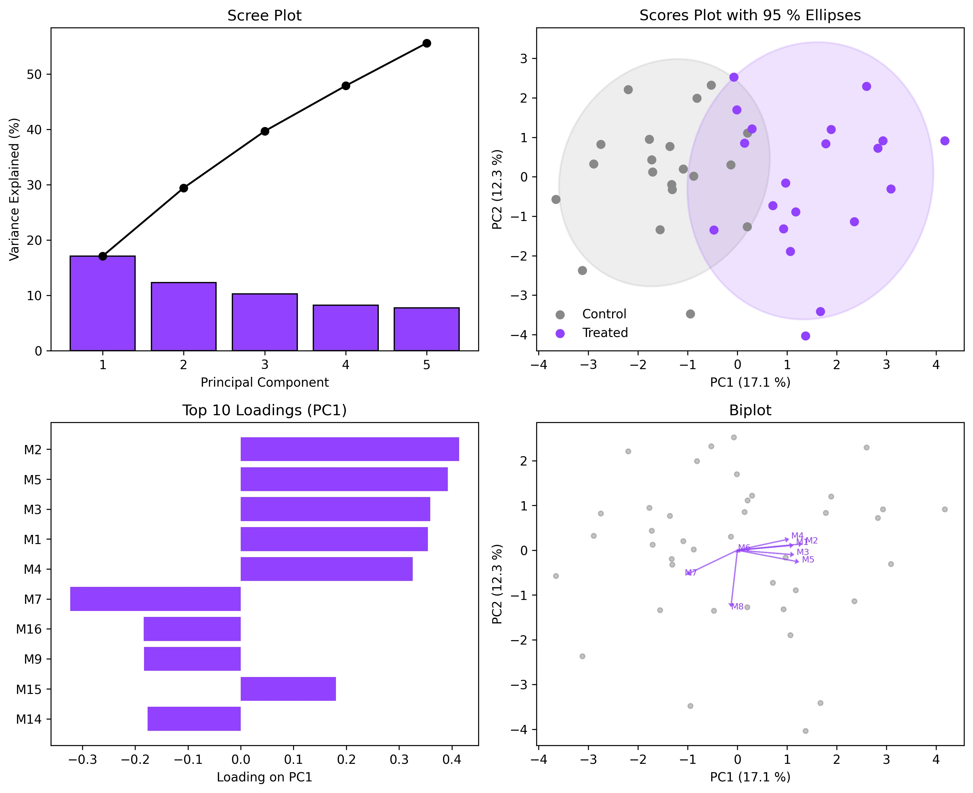
Principal Component Analysis is the default dimensionality-reduction technique when you have a matrix of samples by features and need to visualise the dominant sources of variation. Whether you are exploring metabolomics profiles from an LC-MS experiment, checking for batch effects in RNA-seq counts, or separating geological samples by elemental composition, PCA reduces dozens or hundreds of correlated variables into a few orthogonal components that capture most of the variance. The statistical computation is one line of sklearn code; the real challenge is producing the four-panel figure that reviewers expect: scree plot, scores plot with confidence ellipses, loadings bar chart, and biplot. This page delivers all four.
Key points
- Create scree plots, scores plots with confidence ellipses, loadings plots, and biplots for PCA results. Covers interpretation for omics and environmental data.
- Principal Component Analysis is the default dimensionality-reduction technique when you have a matrix of samples by features and need to visualise the dominant sources of variation.
- Whether you are exploring metabolomics profiles from an LC-MS experiment, checking for batch effects in RNA-seq counts, or separating geological samples by elemental composition, PCA reduces dozens or hundreds of correlated variables into a few orthogonal components that capture most of the variance.
- The statistical computation is one line of sklearn code; the real challenge is producing the four-panel figure that reviewers expect: scree plot, scores plot with confidence ellipses, loadings bar chart, and biplot.
Example Visualization
Review the example first, then use the live editor below to run and customize the full workflow.
Mathematical Foundation
Principal Component Analysis is the default dimensionality-reduction technique when you have a matrix of samples by features and need to visualise the dominant sources of variation.
Equation
X = U * S * V^T (SVD of the centered, scaled data matrix)Parameter breakdown
When to use this technique
Use PCA when you want to reduce dimensionality for visualization, identify outliers, check for batch effects, or pre-process data before clustering or classification. Always scale your data (StandardScaler) unless all features share the same units and dynamic range.
Apply This Technique Now
Run this analysis workflow with AI in seconds. Use the prepared technique prompt or bring your own dataset.
View example prompt
"Run PCA on my dataset, show a scree plot, a 2D scores plot with 95% confidence ellipses colored by group, and a loadings biplot overlay"
How to apply this technique in 30 seconds
Generate
Run the example prompt and let AI generate this technique automatically.
Refine and Export
Adjust code or prompt, then export publication-ready figures.
Implementation Code
The core data processing logic. Copy this block and replace the sample data with your measurements.
import numpy as np
from sklearn.decomposition import PCA
from sklearn.preprocessing import StandardScaler

# --- Simulated metabolomics data: 40 samples, 20 metabolites, 2 groups ---
np.random.seed(42)
n_samples, n_features = 40, 20
group_labels = np.array(['Control'] * 20 + ['Treated'] * 20)

X_ctrl = np.random.normal(0, 1, (20, n_features))
X_trt  = np.random.normal(0, 1, (20, n_features))
X_trt[:, :5] += 1.5  # Shift first 5 metabolites in treated group
X = np.vstack([X_ctrl, X_trt])

# --- Scale and run PCA ---
scaler = StandardScaler()
X_scaled = scaler.fit_transform(X)

pca = PCA(n_components=5)
scores = pca.fit_transform(X_scaled)

print("Explained variance ratios:")
for i, ev in enumerate(pca.explained_variance_ratio_):
    print(f"  PC{i+1}: {ev:.3f} ({ev*100:.1f} %)")
print(f"  Cumulative (PC1-5): {pca.explained_variance_ratio_.sum()*100:.1f} %")

# Loadings
loadings = pca.components_.T  # shape: (n_features, n_components)
feature_names = [f'Metabolite_{i+1}' for i in range(n_features)]Visualization Code
Complete matplotlib code for a publication-ready figure. Copy, paste into your notebook, and adjust labels to match your data.
import numpy as np
import matplotlib.pyplot as plt
from matplotlib.patches import Ellipse
from sklearn.decomposition import PCA
from sklearn.preprocessing import StandardScaler

np.random.seed(42)
X_ctrl = np.random.normal(0, 1, (20, 20))
X_trt  = np.random.normal(0, 1, (20, 20))
X_trt[:, :5] += 1.5
X = np.vstack([X_ctrl, X_trt])
labels = ['Control'] * 20 + ['Treated'] * 20

X_scaled = StandardScaler().fit_transform(X)
pca = PCA(n_components=5)
scores = pca.fit_transform(X_scaled)
loadings = pca.components_.T
feat_names = [f'M{i+1}' for i in range(20)]
ev = pca.explained_variance_ratio_

def confidence_ellipse(x, y, ax, n_std=2.0, **kwargs):
    cov = np.cov(x, y)
    vals, vecs = np.linalg.eigh(cov)
    order = vals.argsort()[::-1]
    vals, vecs = vals[order], vecs[:, order]
    angle = np.degrees(np.arctan2(*vecs[:, 0][::-1]))
    w, h = 2 * n_std * np.sqrt(vals)
    ell = Ellipse(xy=(x.mean(), y.mean()), width=w, height=h,
                  angle=angle, **kwargs)
    ax.add_patch(ell)

fig, axes = plt.subplots(2, 2, figsize=(11, 9))

# 1. Scree plot
axes[0, 0].bar(range(1, 6), ev * 100, color='#9240ff', edgecolor='black')
axes[0, 0].plot(range(1, 6), np.cumsum(ev) * 100, 'o-', color='black')
axes[0, 0].set_xlabel('Principal Component')
axes[0, 0].set_ylabel('Variance Explained (%)')
axes[0, 0].set_title('Scree Plot')

# 2. Scores plot
colors_map = {'Control': '#888888', 'Treated': '#9240ff'}
for grp in ['Control', 'Treated']:
    mask = np.array(labels) == grp
    axes[0, 1].scatter(scores[mask, 0], scores[mask, 1], s=40,
                       color=colors_map[grp], label=grp, zorder=5)
    confidence_ellipse(scores[mask, 0], scores[mask, 1], axes[0, 1],
                       n_std=2, facecolor=colors_map[grp], alpha=0.15,
                       edgecolor=colors_map[grp], lw=1.5)
axes[0, 1].set_xlabel(f'PC1 ({ev[0]*100:.1f} %)')
axes[0, 1].set_ylabel(f'PC2 ({ev[1]*100:.1f} %)')
axes[0, 1].set_title('Scores Plot with 95 % Ellipses')
axes[0, 1].legend(frameon=False)

# 3. Loadings bar chart (PC1)
order = np.argsort(np.abs(loadings[:, 0]))[::-1][:10]
axes[1, 0].barh(range(len(order)), loadings[order, 0], color='#9240ff')
axes[1, 0].set_yticks(range(len(order)))
axes[1, 0].set_yticklabels([feat_names[i] for i in order])
axes[1, 0].set_xlabel('Loading on PC1')
axes[1, 0].set_title('Top 10 Loadings (PC1)')
axes[1, 0].invert_yaxis()

# 4. Biplot
axes[1, 1].scatter(scores[:, 0], scores[:, 1], s=15, color='#888', alpha=0.5)
scale = 3
for i in range(min(8, len(feat_names))):
    axes[1, 1].arrow(0, 0, loadings[i, 0]*scale, loadings[i, 1]*scale,
                     head_width=0.08, head_length=0.05, fc='#9240ff',
                     ec='#9240ff', alpha=0.7)
    axes[1, 1].text(loadings[i, 0]*scale*1.1, loadings[i, 1]*scale*1.1,
                    feat_names[i], fontsize=7, color='#9240ff')
axes[1, 1].set_xlabel(f'PC1 ({ev[0]*100:.1f} %)')
axes[1, 1].set_ylabel(f'PC2 ({ev[1]*100:.1f} %)')
axes[1, 1].set_title('Biplot')

plt.tight_layout()
plt.savefig('pca_4panel.png', dpi=300, bbox_inches='tight')
plt.show()Group-Colored PCA with Custom Legend
When your dataset has three or more experimental groups (e.g., time points, concentrations, cell types), you need a clear color scheme and legend. This extension shows how to assign distinct colors per group, draw separate confidence ellipses, and produce a polished multi-group scores plot.
import numpy as np
import matplotlib.pyplot as plt
from matplotlib.patches import Ellipse
from sklearn.decomposition import PCA
from sklearn.preprocessing import StandardScaler

np.random.seed(42)
groups = ['Wildtype', 'Knockout', 'Rescue']
n_per = 15
X_list, labels = [], []
for i, g in enumerate(groups):
    Xi = np.random.normal(0, 1, (n_per, 15))
    Xi[:, :3] += i * 1.5
    X_list.append(Xi)
    labels += [g] * n_per
X = np.vstack(X_list)

X_sc = StandardScaler().fit_transform(X)
pca = PCA(n_components=2)
scores = pca.fit_transform(X_sc)
ev = pca.explained_variance_ratio_

colors = {'Wildtype': '#888', 'Knockout': '#9240ff', 'Rescue': '#e67e22'}

fig, ax = plt.subplots(figsize=(7, 6))
for grp in groups:
    mask = np.array(labels) == grp
    ax.scatter(scores[mask, 0], scores[mask, 1], s=50,
               color=colors[grp], label=grp, zorder=5, edgecolors='white', lw=0.5)
    cov = np.cov(scores[mask, 0], scores[mask, 1])
    vals, vecs = np.linalg.eigh(cov)
    order = vals.argsort()[::-1]
    vals, vecs = vals[order], vecs[:, order]
    angle = np.degrees(np.arctan2(*vecs[:, 0][::-1]))
    w, h = 2 * 2.0 * np.sqrt(vals)
    ell = Ellipse(xy=(scores[mask, 0].mean(), scores[mask, 1].mean()),
                  width=w, height=h, angle=angle,
                  facecolor=colors[grp], alpha=0.12,
                  edgecolor=colors[grp], lw=1.5)
    ax.add_patch(ell)

ax.set_xlabel(f'PC1 ({ev[0]*100:.1f} %)')
ax.set_ylabel(f'PC2 ({ev[1]*100:.1f} %)')
ax.set_title('PCA Scores - Multi-Group Comparison', fontsize=13)
ax.legend(frameon=False)
ax.spines[['top', 'right']].set_visible(False)
plt.tight_layout()
plt.savefig('pca_multigroup.png', dpi=300, bbox_inches='tight')
plt.show()Common Errors and How to Fix Them
Features dominate PCA because data is not scaled
Why: PCA maximizes variance. If one feature has values in the thousands and another in decimals, the large-valued feature will dominate PC1 regardless of its biological relevance.
Fix: Always use StandardScaler (zero mean, unit variance) before PCA unless all features have the same units and comparable ranges.
Too few samples relative to features (n < p)
Why: With more features than samples, PCA can produce at most n-1 non-zero components, and the results may be dominated by noise.
Fix: Use regularised PCA or pre-filter features (e.g., remove low-variance columns). Many omics datasets are inherently n << p, which is acceptable as long as you interpret cautiously.
Interpreting Euclidean distance in the scores plot as "similarity"
Why: Distances in the PC1-PC2 plane ignore variance in higher PCs. Two points close in PC1/PC2 may be far apart in PC3+.
Fix: Check the cumulative explained variance. If PC1+PC2 < 60 %, distances in the 2D plot can be misleading. Consider a 3D plot or include more components.
Mixing up loadings sign (positive vs negative)
Why: The sign of a loading indicates the direction of the correlation with the PC, but the sign of PCs themselves is arbitrary (PCA is sign-invariant).
Fix: Focus on the magnitude and relative sign of loadings within a component. A feature with loading = -0.4 on PC1 contributes as much as one with +0.4, just in the opposite direction.
Including the target variable in PCA for a classification task
Why: PCA is an unsupervised method. Including the class label as a feature introduces data leakage.
Fix: Remove class labels before running PCA. If you want supervised dimensionality reduction, use Linear Discriminant Analysis (LDA) instead.
Frequently Asked Questions
Learn More Before You Run It
Apply PCA Visualization in Python: Scores, Loadings, and Biplots to Your Data
Upload your dataset and Plotivy generates the Python code, runs the analysis, and produces a publication-ready figure.
Generate Code for This TechniquePython Libraries
Quick Info
- Domain
- Multivariate
- Typical Audience
- Researchers working with high-dimensional data from metabolomics, transcriptomics, environmental monitoring, or spectroscopy who need to reduce and visualize multivariate patterns