Menu
Refer a Friend
Share your link — earn +15 permanent plots for every friend who joins.
Sign in to get your referral linkPlotivy for your research
Specialized visualization and analysis tools tailored for your research domain. Explore how Plotivy accelerates your specific scientific workflow.
Disciplines(24)
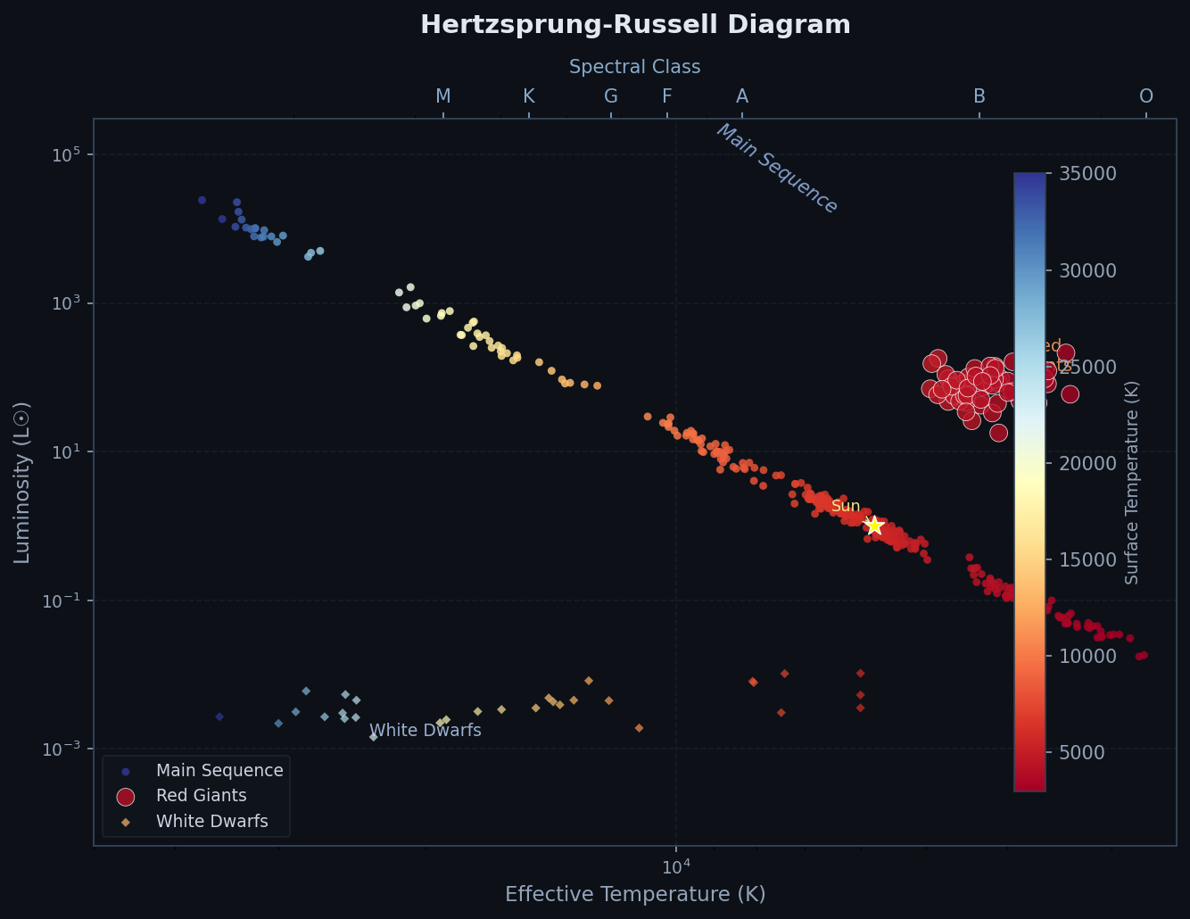
Astronomy & Astrophysics
Stellar classification, celestial mapping, and cosmic data analysis.
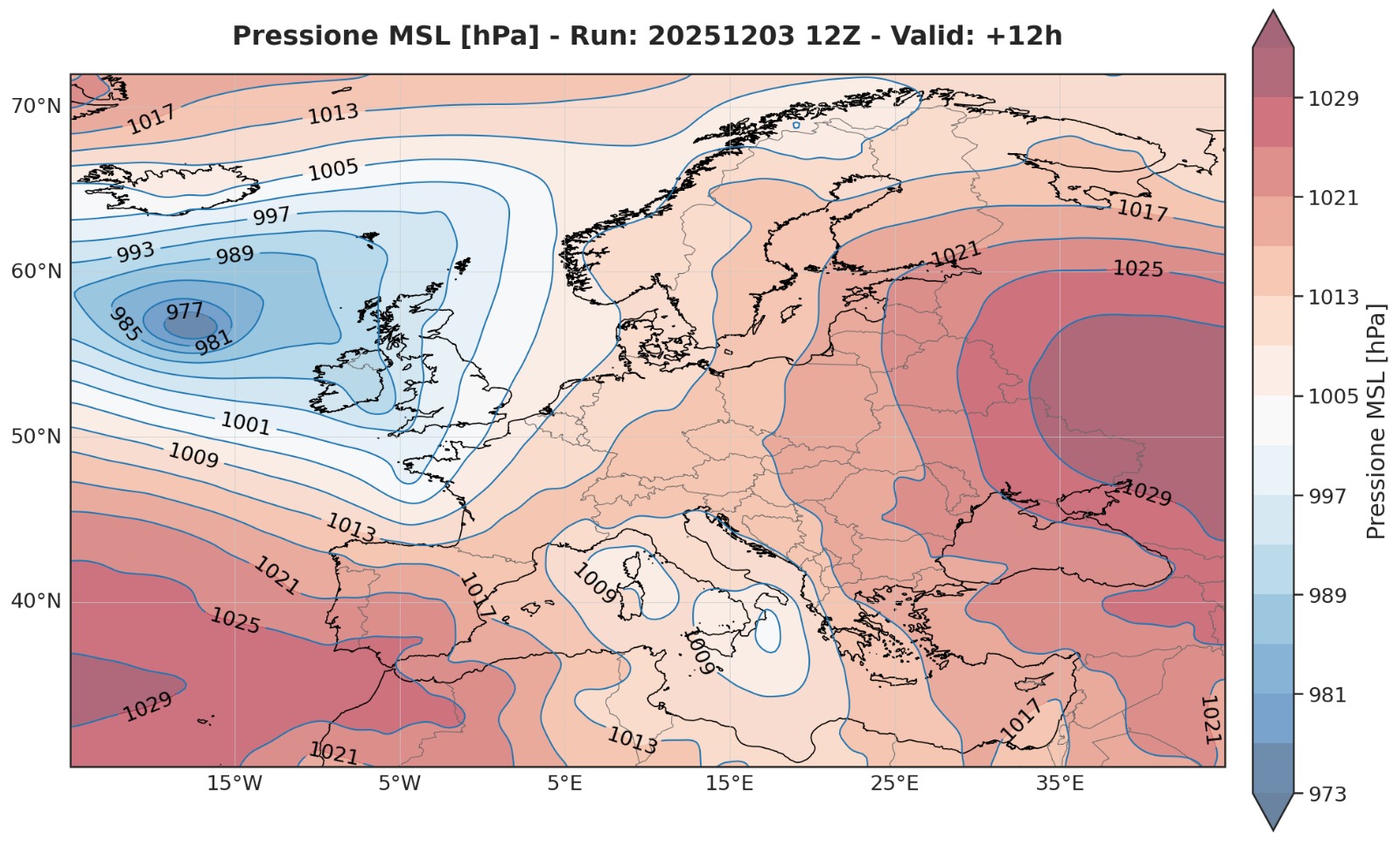
Atmospheric & Climate Science
Expert-curated pressure charts, barometric tendency plots, and weather visualization with real NCEP data.
Bioinformatics & Genomics
Gene expression analysis, GWAS results, and clustering visualizations.
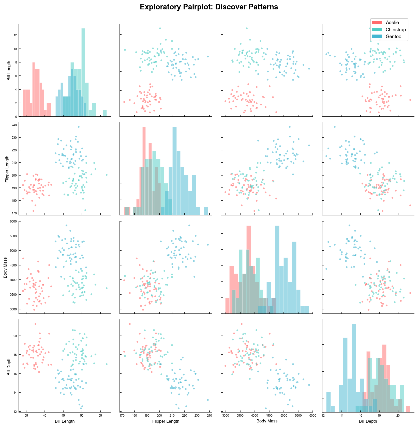
Biology
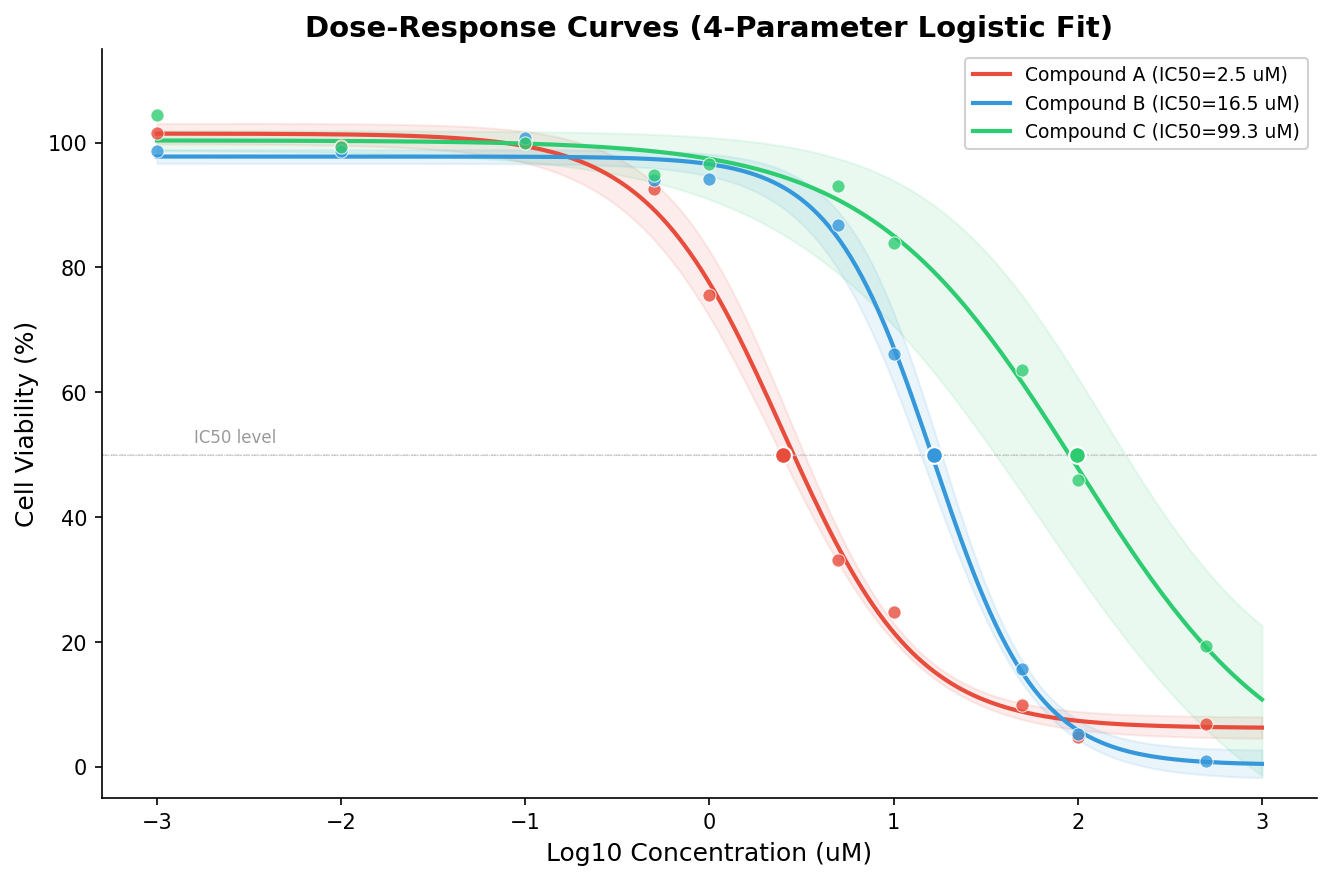
Growth curves, dose-response workflows, and experimental biology visualization.
Chemistry
Spectra, kinetics, titration curves, and analytical chemistry reporting.
Clinical Research
Trial reporting, safety analysis, and clinical trials.
Ecology & Environmental
Biodiversity metrics, species accumulation, and environmental monitoring.
Engineering & Control Systems
System stability analysis, frequency response, and control theory.
Exploration Explanation
Move fast from first-look exploration with guided suggestions to story-ready visuals that communicate the key takeaway.
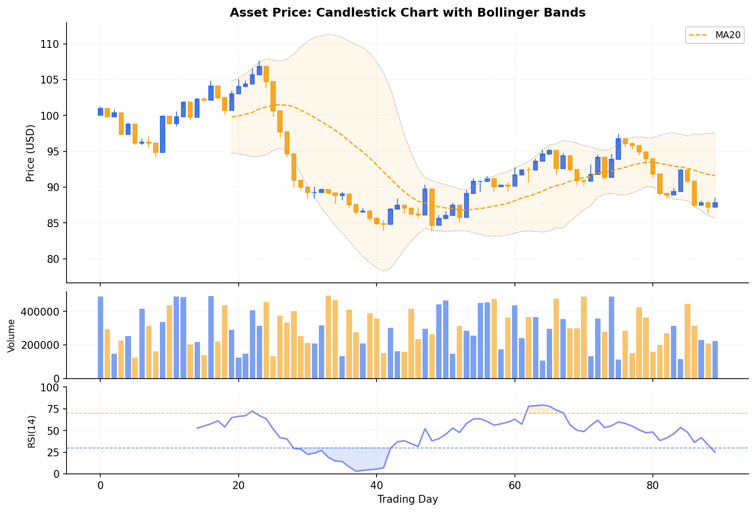
Finance & Quantitative Analysis
Market trend analysis, risk assessment, and financial modeling.
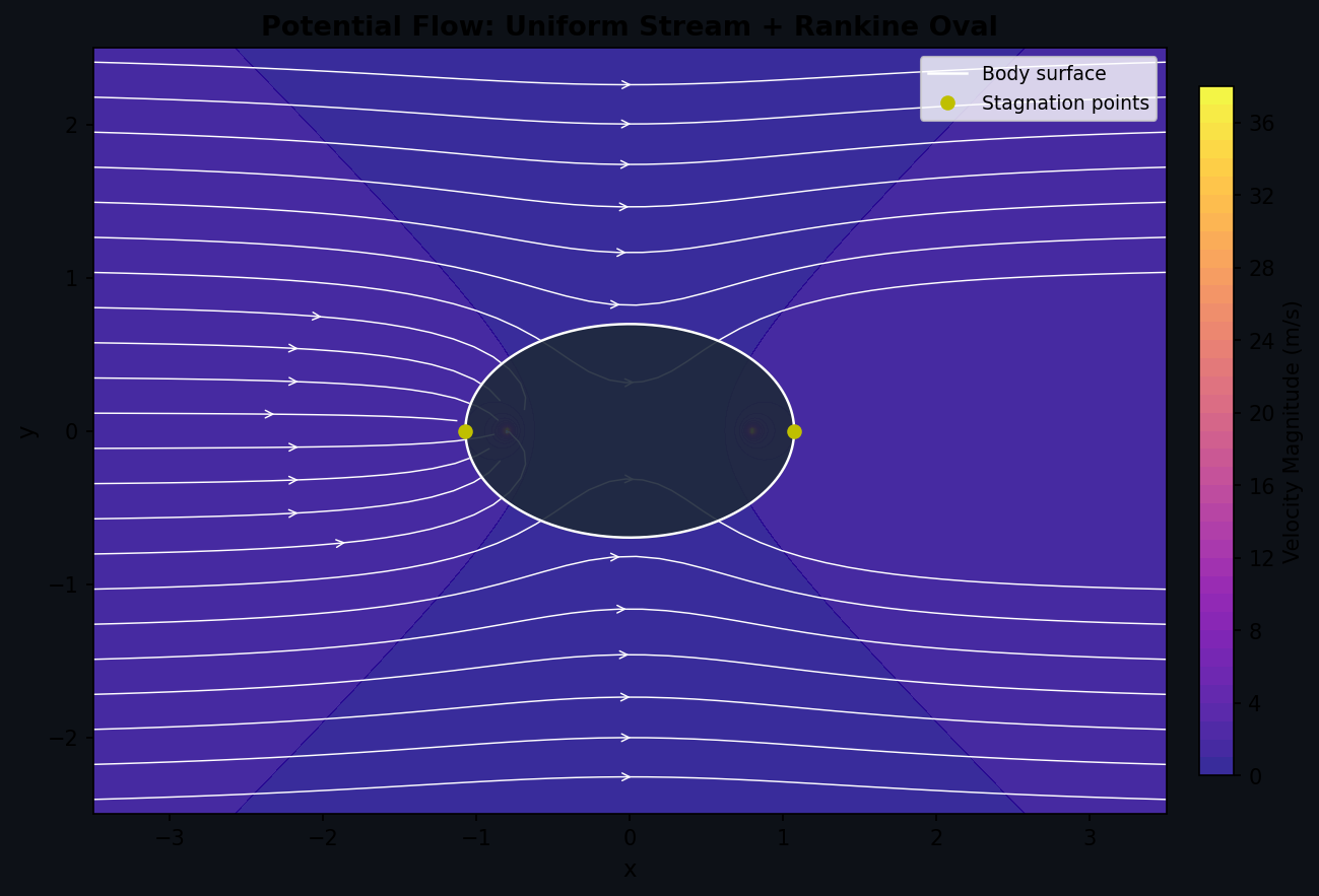
Fluid Dynamics (CFD)
Flow visualization, streamlines, and vector fields.
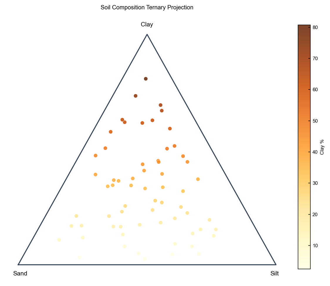
Geology & Earth Science
Stereonets, ternary plots, and soil classification diagrams.
Hydrology
Water resource management, flow duration, and hydrographs.
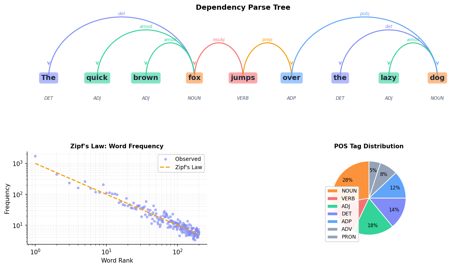
Linguistics & NLP
Syntax trees, dependency parsing, and text structure visualization.
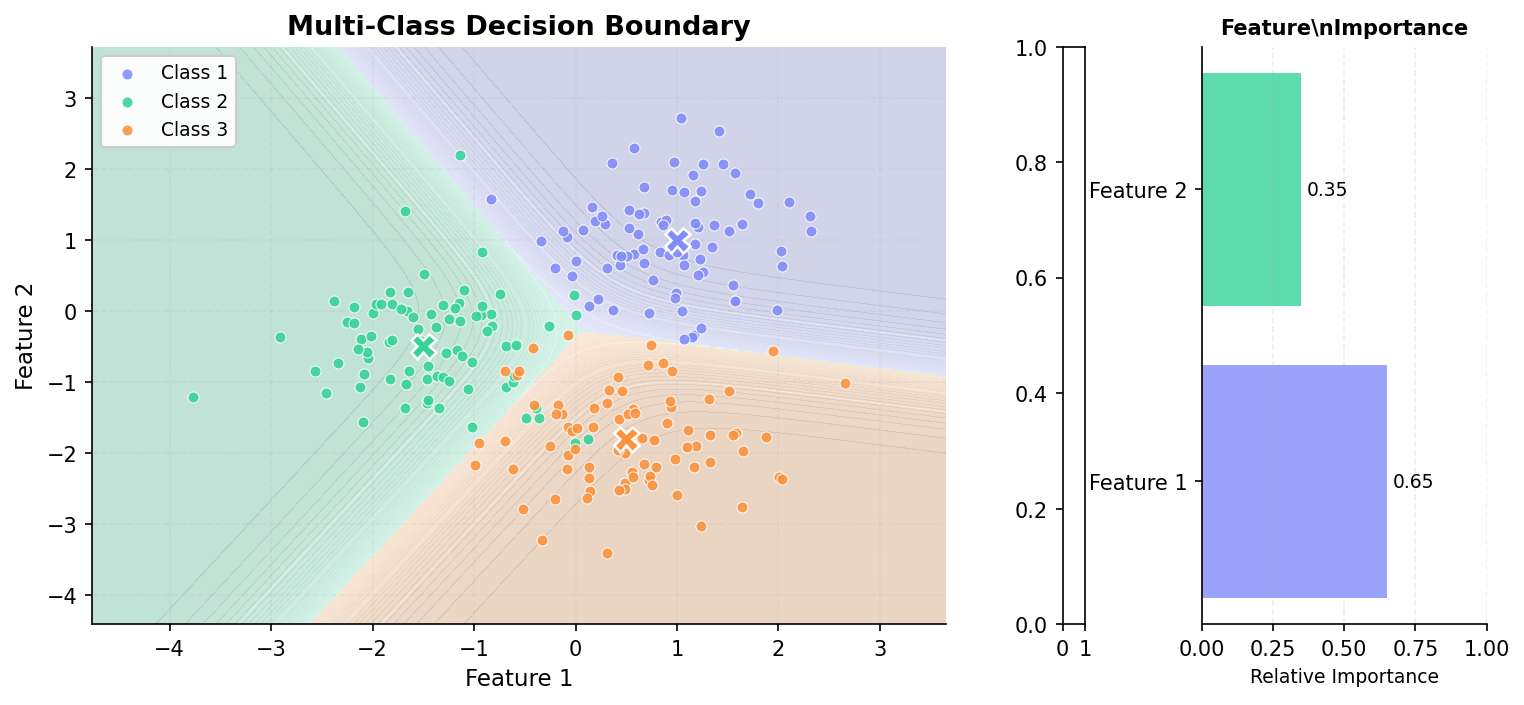
Machine Learning & AI
Model performance metrics, dimensionality reduction, and clustering.
Materials Science
Phase diagrams, crystallography, and material properties.
Neuroscience
Spike rasters, LFPs, and psychometric analysis.
Particle Physics
High energy physics plots, ratio plots, and event displays.
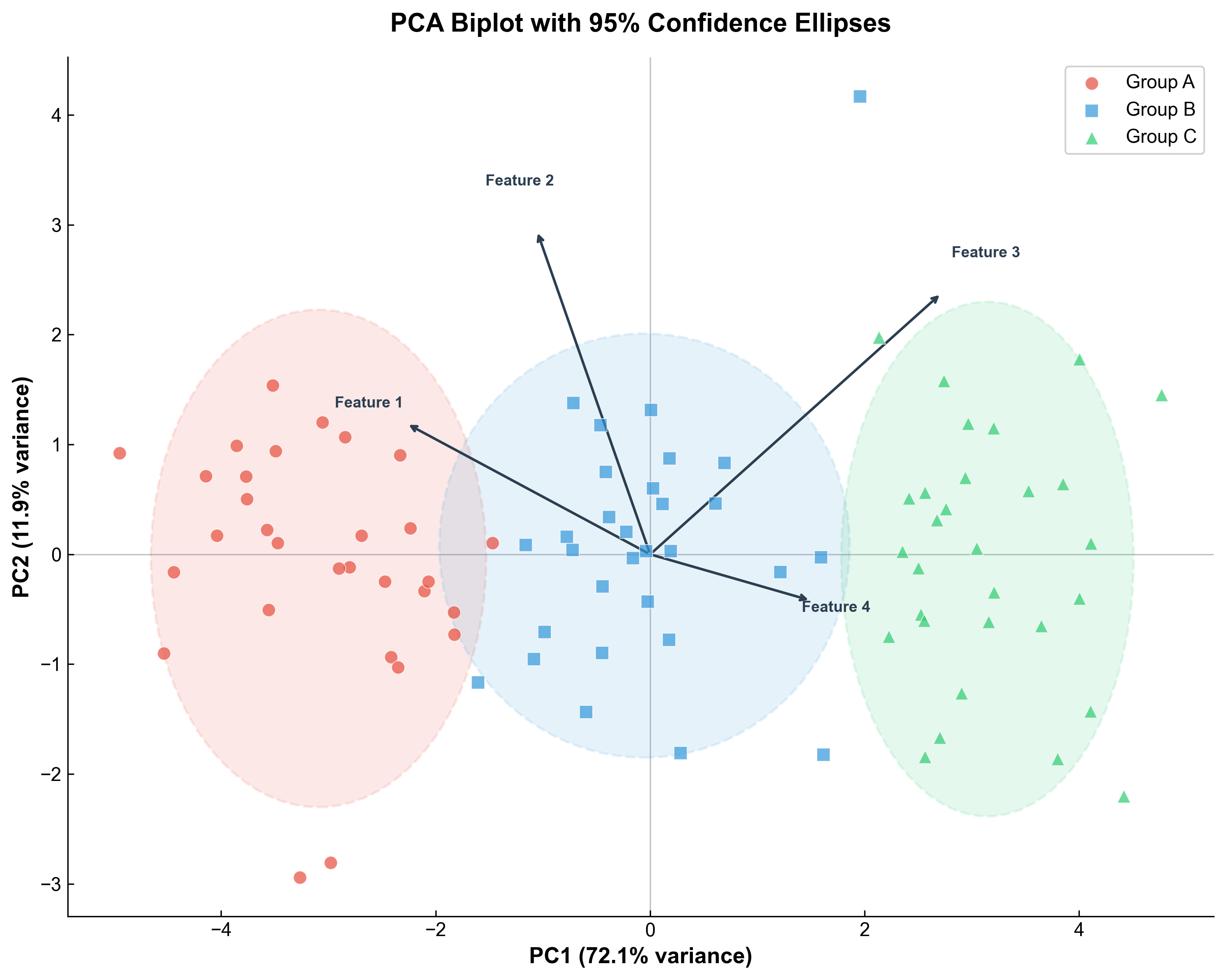
PCA
Principal component analysis for dimensionality reduction and sample structure.
Photonics & Spectroscopy
Optical spectra, bandgap analysis, and signal interpretation workflows.
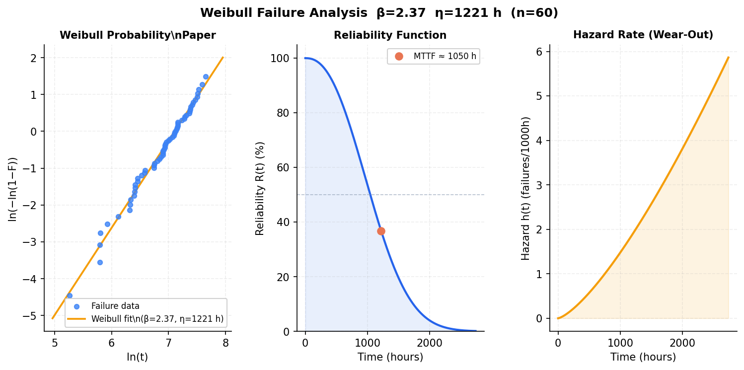
Reliability Engineering
Failure analysis, survival curves, and probability plotting.
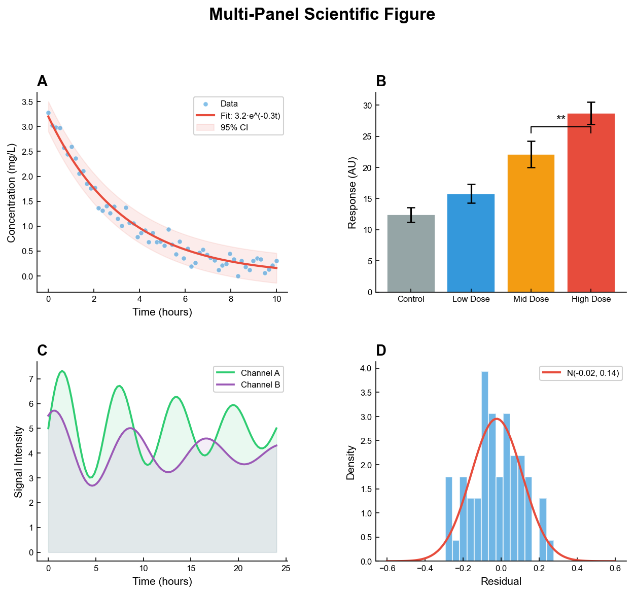
Scientific Data Visualization
Publication-ready figures, statistical analysis, and reproducible workflows for general research.
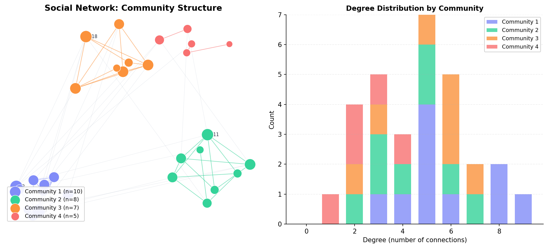
Social Network Analysis
Network graphs, community detection, and relationship mapping.
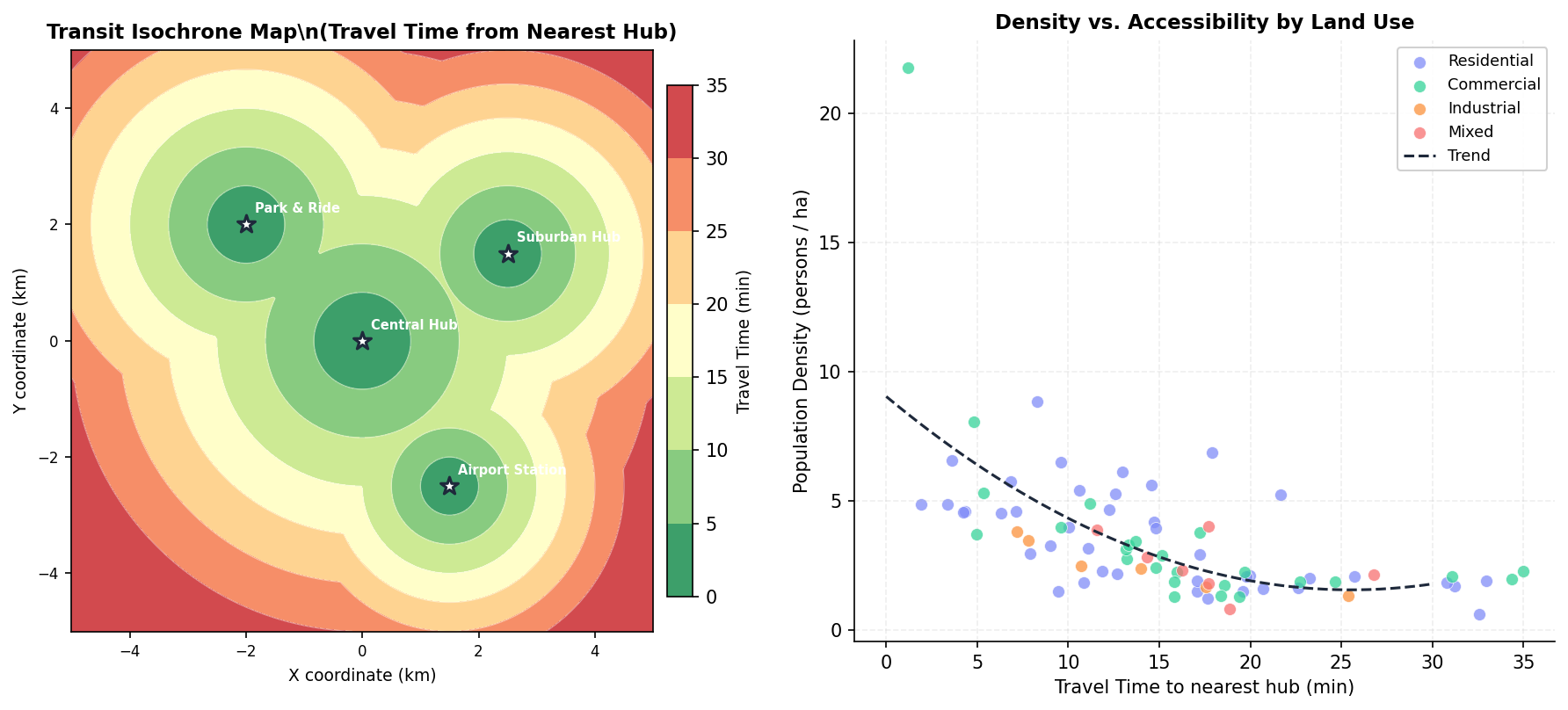
Urban Planning
Geospatial analysis, isochrone maps, and voronoi tessellations.
Specialized Chart Types(46)
Statistical & Distribution(4)
.png&w=1280&q=70)
Box and Whisker Plot
Displays data distribution using quartiles, median, and outliers in a standardized format.

Violin Plot
Combines box plots with kernel density to show distribution shape across groups.

Heatmap
Represents data values as colors in a two-dimensional matrix format.

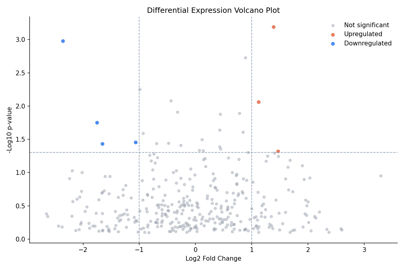
Volcano Plot
Scatter plot combining statistical significance (-log10 p-value) with effect magnitude (log2 fold-change) to identify differentially expressed genes or proteins.
Flow & Hierarchical(2)


Neuroscience(6)

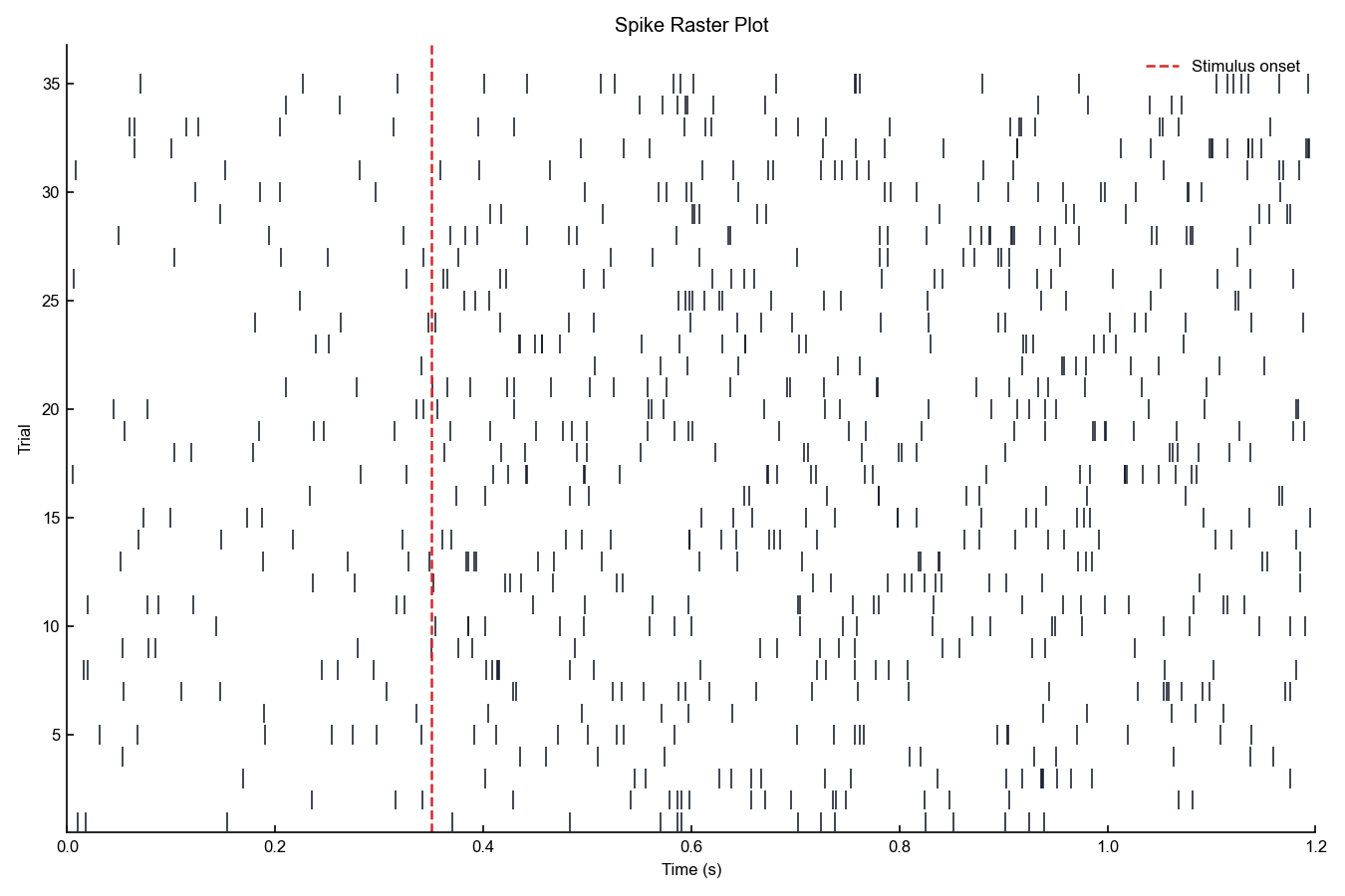
Spike Raster Plot
A dot-per-spike display of neural firing times across trials or neurons.

Peristimulus Time Histogram
A histogram of spike counts aligned to stimulus onset, estimating instantaneous firing rate over time.

Tuning Curve
A plot of mean firing rate as a function of a parametric stimulus dimension such as orientation or direction.

LFP Trace
A time-domain voltage trace showing raw or filtered local field potential signals from neural recordings.

Psychometric Function
A sigmoid function fitted to proportion-correct or hit-rate data across stimulus intensity levels.

Connectivity Matrix
A square heatmap showing pairwise connection strengths between brain regions or network nodes.
Physics(5)

Phase Diagram
Displays thermodynamic stability regions and phase boundaries as a function of temperature, pressure, or composition.

Fermi Surface Plot
Visualizes the constant-energy surface in reciprocal space that separates occupied from unoccupied electronic states at absolute zero.

Dispersion Relation Plot
Plots energy or frequency as a function of wave vector along high-symmetry paths in the Brillouin zone.

Band Structure Plot
Displays the allowed electronic energy levels as a function of crystal momentum, revealing the band gap, effective masses, and band topology.

Hysteresis Loop
Plots magnetization as a function of applied magnetic field, forming the characteristic closed loop that quantifies coercivity, remanence, and saturation.
Materials Science(11)

XRD Pattern
Displays X-ray diffraction intensity versus 2-theta angle with labeled Bragg reflections for crystal phase identification and structural analysis.

Tauc Plot
Plots (alpha*h*nu)^n versus photon energy to extract the optical band gap by linear extrapolation of the absorption edge.

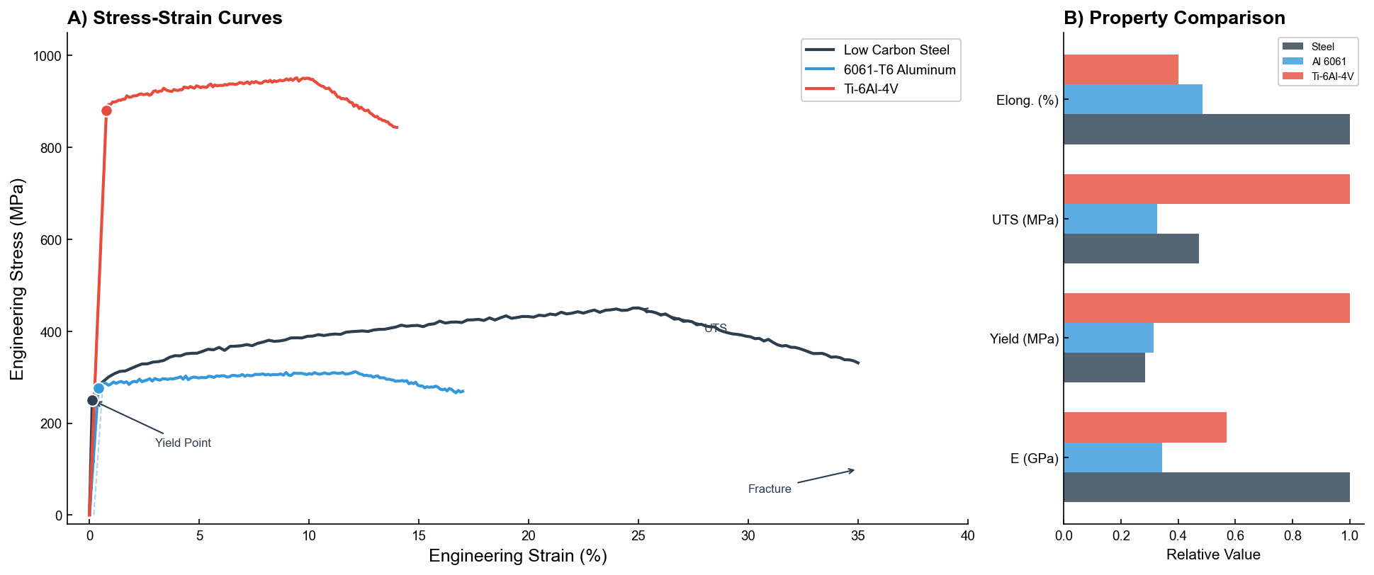
Stress-Strain Curve
Displays mechanical stress versus strain from tensile testing, annotating elastic modulus, yield point, ultimate tensile strength, and fracture.

Arrhenius Plot
Plots the natural logarithm of rate constant versus inverse temperature to extract activation energy from the linear slope.

Particle Size Distribution
Displays the frequency or volume-weighted distribution of particle diameters, typically fitted with log-normal or Gaussian models.

Pore Size Distribution
Displays the differential pore volume versus pore diameter derived from gas adsorption isotherms using BJH or DFT methods.

Impedance Spectrum
Displays electrochemical impedance data as Nyquist (-Z'' vs Z') and Bode (|Z| and phase vs frequency) plots for equivalent circuit analysis.

Cyclic Voltammogram
Displays current versus potential from cyclic voltammetry experiments, revealing redox peaks, electrochemical windows, and electrode kinetics.

Reflectance Spectrum
Plots optical reflectance as a function of wavelength, revealing absorption edges, interference fringes, and plasmonic resonances in optical materials.

Magnetization Curve
Plots magnetization versus temperature (M-T) or field (M-H) to reveal magnetic ordering temperatures, saturation, and phase transitions.

Strain Mapping
Visualizes spatially resolved strain fields as 2D color maps from digital image correlation (DIC), EBSD, or finite element simulations.
Chemistry(9)

NMR Spectrum
Visualize NMR spectroscopy data as intensity versus chemical shift (ppm) with annotated peaks.

Mass Spectrum
Plot m/z ratio against relative intensity as a vertical stick spectrum for mass spectrometry data.

UV-Vis Spectrum
Visualize ultraviolet-visible absorbance or transmittance as a function of wavelength with lambda max annotation.

Raman Spectrum
Plot Raman scattering intensity against Raman shift (cm-1) with baseline correction and annotated characteristic peaks.

FTIR Spectrum
Plot FTIR infrared transmittance or absorbance against wavenumber with annotated functional group regions.

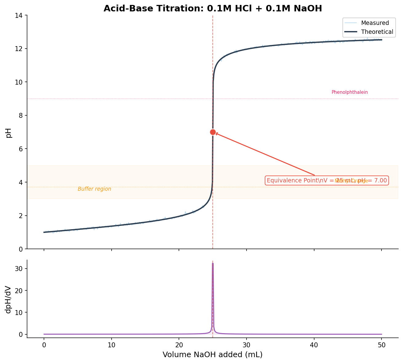
Titration Curve
Plot pH against titrant volume to visualize acid-base titration with equivalence point and buffer region annotations.

Chromatogram
Visualize HPLC or GC chromatography detector response versus retention time with peak identification and area integration.

Reaction Coordinate Diagram
Plot potential energy against reaction coordinate to visualize activation barriers, transition states, and reaction intermediates.

Speciation Diagram
Plot the fractional distribution of chemical species as a function of pH or ligand concentration using equilibrium speciation calculations.
Biology & Bioinformatics(2)

Gene Ontology Plot
Bubble or horizontal bar chart displaying enriched Gene Ontology terms, encoding adjusted p-value by color and gene count by bar length or bubble size.

Circos Plot
Circular layout diagram displaying genomic features, inter-chromosomal links, and data tracks around a circular ideogram of chromosomes.
Clinical & Medical(4)

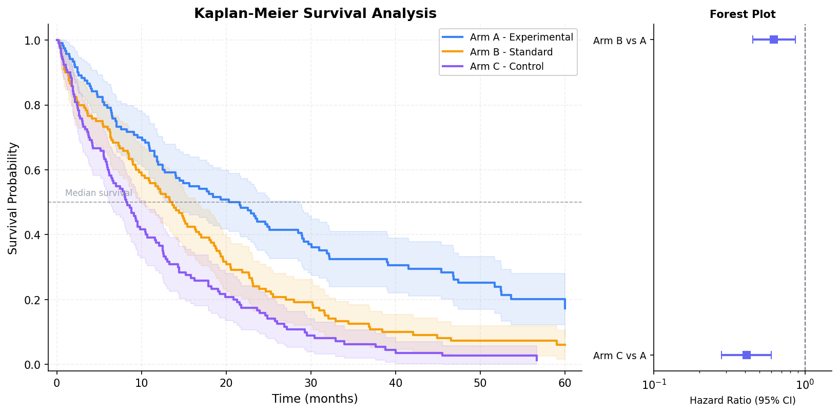
Kaplan-Meier Plot
Step-function survival curves showing the probability of event-free survival over time, with censoring marks and confidence interval bands.

CONSORT Diagram
Generate a CONSORT-compliant flow diagram showing patient enrollment, randomization, follow-up, and analysis for clinical trials.

Swimmer Plot
Visualize individual patient treatment duration, tumor response, and clinical events as horizontal bars sorted by duration.

Number Needed to Treat
Visualize number needed to treat (NNT) and number needed to harm (NNH) with confidence intervals across outcomes or treatment comparisons.
Environmental & Earth Sciences(3)

Climate Stripes
A minimalist visualization of annual temperature anomalies as a sequence of colored vertical stripes from blue to red.

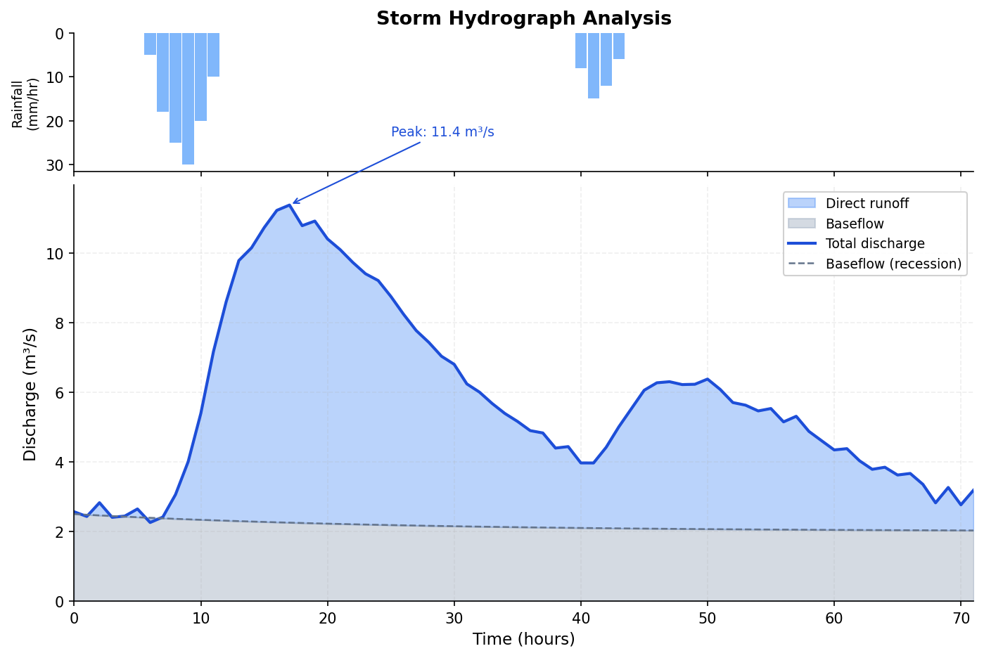
Hydrograph
A dual-axis time series plot combining a streamflow discharge line with an inverted precipitation bar chart.

Exceedance Probability Plot
A log-scale probability plot of ranked extreme values against their empirical exceedance probability or return period.
High-Intent SEO Guides
These pages focus on the searches researchers actually make when they need a specific figure type, validation plot, or diagnostics workflow.
Data Tables
Publication-ready tables in Python & LaTeX booktabs.
Forest Plot
Meta-analysis, hazard ratios, and subgroup evidence.
Bland-Altman Plot
Method comparison and agreement analysis.
QQ Plot
Normality checks and residual diagnostics.
ROC Curve
Model evaluation and diagnostic accuracy with AUC.
Precision-Recall Curve
Classifier evaluation on imbalanced data.
Confusion Matrix
See exactly which classes a model confuses.
Manhattan Plot
GWAS and genome-wide association results.
Waterfall Plot
Tumor response and oncology trial reporting.
Stress-Strain Curve
Tensile testing and materials characterization.
Don't See Your Field?
Plotivy works with any scientific data. If you have a specific use case, we'd love to hear about it and help you get started.