
Static
Code
Diagrams
Alluvial Diagram
Multi-stage flow diagram showing how a population distributes and transitions between category states at two or more timepoints.
matplotlib
pandas
numpy
Refer a Friend
Share your link — earn +15 permanent plots for every friend who joins.
Sign in to get your referral linkExplore 111+ scientific visualization types with Python code examples, chart-selection context, and publication-focused use cases for Matplotlib, Plotly, Seaborn, and more.
Search by chart name, library, or research use case. Each result points to a chart page with Python code, examples, and guidance for turning raw data into a readable scientific figure.
Not sure where to start? Use the chart-selection guide.
111
chart types
7
categories
13
interactive
See any of these charts with example data, or upload your own and let AI create the visualization for you.
Multi-stage flow diagram showing how a population distributes and transitions between category states at two or more timepoints.
.png&w=1280&q=70)
Visualizes connections between nodes placed along a single axis using semicircular arcs.
.png&w=1280&q=70)
Displays quantitative data over time, emphasizing the magnitude of change with filled regions.

A square heatmap displaying attention weight scores between all token or sequence position pairs in a transformer model.

Compares categorical data using rectangular bars with heights proportional to values.

Jittered categorical scatter plot that distributes individual data points horizontally within each group for clarity, ideal for small-n biological experiments.

One-dimensional scatter plot where points are arranged to avoid overlap, showing all individual observations while conveying distribution shape.

Difference vs. mean plot that quantifies the agreement between two measurement methods, showing systematic bias and limits of agreement.
.png&w=1280&q=70)
Displays data distribution using quartiles, median, and outliers in a standardized format.
.png&w=1280&q=70)
A diagram used to visually organize information showing relationships among concepts.
.png&w=1280&q=70)
A scatter plot where bubble size represents a third dimension of data.
.png&w=1280&q=70)
A map displaying circles sized proportionally to values over geographic regions.
.png&w=1280&q=70)
Compares a primary measure against targets with qualitative performance ranges.

A line chart with an inverted y-axis showing how the rankings of multiple entities change across discrete time points.
.png&w=1280&q=70)
Visualizes daily data organized by calendar format with color-coded intensity.

A reliability diagram comparing a classifier's predicted probabilities against observed positive frequencies across probability bins.

Plot predicted probabilities against observed event frequencies to assess calibration of diagnostic or prognostic models.
.png&w=1280&q=70)
Displays OHLC (Open, High, Low, Close) price movements for financial analysis.

Displays inter-relationships between data in a matrix using ribbons connecting arcs.

A thematic map where regions are shaded in proportion to statistical values.
.png&w=1280&q=70)
Displays hierarchical data as nested circles with size proportional to values.

A horizontal dot chart ranking categories by a quantitative value, offering a cleaner alternative to bar charts.

A horizontal dot-and-whisker plot showing regression coefficient estimates with confidence intervals for each predictor.

A heatmap showing true vs. predicted class labels to evaluate classification model accuracy.

Shows connections and routes between geographic points on a map.

Displays three-dimensional data in two dimensions using contour lines connecting points of equal value.

A colour-coded correlation matrix with significance annotations, combining statistical and visual information in a single panel.

A 2D scatter plot overlaid with filled contour regions showing where a classifier assigns each class label.
.png&w=1280&q=70)
Visualizes the distribution of data over a continuous interval using kernel density estimation.

A horizontal bar chart radiating left and right from a central baseline to show positive and negative deviations.

A pie chart variant with a blank center for additional information.
.png&w=1280&q=70)
Uses dots to show the presence or density of features at geographic locations.

Shows data as a grid of dots where each dot represents a unit of data.

Connected dot plot linking two data points per subject or group across time or conditions, emphasizing the direction and magnitude of change.

A step-function plot of the empirical cumulative distribution function of one or more datasets.

Graphical representations of the variability of data indicating error or uncertainty in measurements.

A time-series plot with nested shaded prediction intervals that fan outward from a central forecast line.

A ranked horizontal bar chart displaying the relative importance of input features from a trained tree-based model.

A diagram representing the sequence of steps in a process or workflow.

Shows movement of objects, people, or information between geographic areas.

Horizontal confidence interval plot displaying effect sizes from multiple studies alongside a pooled estimate diamond, the hallmark visualization of systematic reviews.

Plot effect size against study precision or standard error to assess publication bias in meta-analyses.

Illustrates a project schedule with tasks shown as horizontal bars over time.

Time-series plot of cell density or biomass with fitted logistic or exponential growth models, showing lag, exponential, and stationary phases.

Represents data values as colors in a two-dimensional matrix format.

A 2D density plot using hexagonal bins to reveal data concentration when millions of points would create an overplotted scatter.

2D binned density plot using hexagonal tiles to reveal the joint distribution of two continuous variables in large datasets where scatter overlap is intractable.
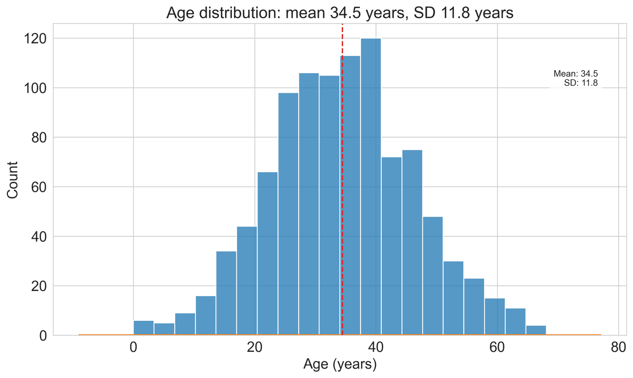
Displays the distribution of numerical data by grouping values into bins.

Custom diagrams using drawing primitives to illustrate specific concepts.

A plot of group means with confidence intervals, emphasising statistical estimation rather than individual observations.

A financial chart for tracking price movements that filters out noise and highlights trend reversals.

Step-function survival curves showing the probability of event-free survival over time, with censoring marks and confidence interval bands.

A dual-line plot of training and validation loss or accuracy tracked across epochs or training set size.

Displays data points connected by straight line segments to show trends over time.

A cleaner alternative to bar charts that uses a thin stem and dot to display a single value per category, reducing visual clutter for ranked comparisons.

A 3D surface or 2D contour plot of a neural network's loss function projected onto two random or principal parameter directions.

Genome-wide scatter plot displaying -log10 p-values of SNP associations across chromosomes, with horizontal significance threshold lines.

Scatter plot augmented with marginal distribution panels (histograms or KDE) along each axis to simultaneously display joint and marginal distributions.

A variable-width bar chart where both width and height of segments are proportional to values.

A bar chart where multiple datasets are displayed side-by-side for direct comparison.

A graph showing how different entities are connected through relationships.

A polar area diagram combining properties of radar charts and bar charts.

A chord diagram where connections are shown as lines rather than ribbons.

Illustrates movements in the price of a financial instrument showing open, high, low, and close values.

Visualizes relationships between all pairs of variables in a dataset, with distributions on the diagonal.

Visualizes high-dimensional data by plotting each variable on a separate vertical axis.

A charting technique focusing on price movements without regard to time.

Displays data as a function of angle in polar coordinates, ideal for radiation patterns, angular distributions, and directional measurements.
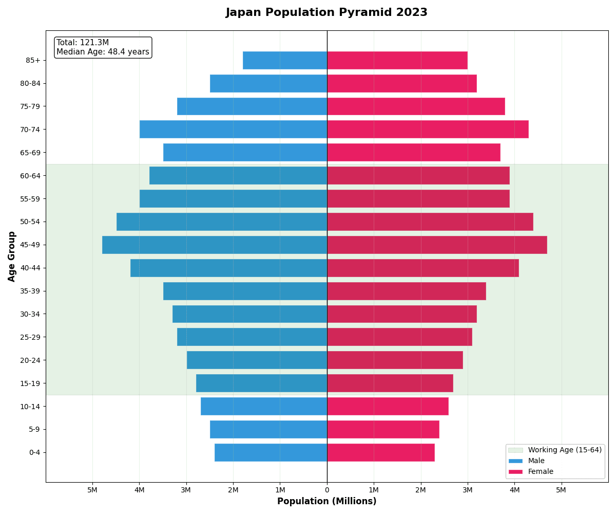
Shows the distribution of various age groups in a population, split by gender.

Plot precision against recall across thresholds to evaluate classifier performance on imbalanced datasets with average precision annotation.

A 100% stacked bar chart showing the relative composition of categories within each group.

Uses shapes with areas proportional to values for visual comparison.

Compares two probability distributions by plotting their quantiles against each other.

A scatter plot of sample quantiles against theoretical or reference distribution quantiles to assess distributional fit.

Displays a 2D vector field as an array of arrows whose direction and length represent the local vector at each grid point.

Displays multivariate data on axes starting from a central point.

A bar chart plotted on a polar coordinate system with bars radiating from the center.

Similar to a radial bar chart but with columns extending from the center outward.

A scatter plot of model residuals against fitted (predicted) values used to diagnose violations of regression assumptions.

Stacked, partially overlapping kernel density curves for multiple groups, revealing distributional shifts and shape differences across many categories at once.

Plot true positive rate against false positive rate across all decision thresholds with AUC annotation for model and diagnostic test evaluation.

Flow diagram where arrow widths are proportional to flow quantities.

A grid of scatter plots showing all pairwise relationships between variables, with univariate distributions on the diagonal.

Displays values for two variables as points on a Cartesian coordinate system.

A two-point parallel coordinate chart that emphasises the direction and magnitude of change between two conditions.

Multi-line plot where each line represents one individual's trajectory over time, displaying heterogeneity and overall trend in longitudinal data simultaneously.

Displays the range between minimum and maximum values as floating bars.

A word-sized miniature line chart designed to be embedded directly in tables or text for dense data communication.

A log-scale plot of power spectral density versus frequency computed via FFT or Welch's method from a time series.

Plots time-series data along a spiral to highlight periodic patterns.

An area chart where multiple series are stacked on top of one another.

A bar chart where parts of the total are stacked on top of each other.
.png&w=1280&q=70)
A text-based display showing data distribution while preserving individual values.

A stacked area graph displaced around a central axis for an organic, flowing shape.

A scatter plot where one variable is categorical, showing individual data points.

Displays hierarchical data in concentric rings radiating from a center.

A 2D scatter plot of high-dimensional data projected via t-SNE, colored by class or cluster label.

A simple table used to count and display the frequency of occurrences.

A formatted table showing a schedule of events with times and details.

A display of events in chronological order along a time axis.

Rank input parameters by their one-way impact on a model output as horizontal diverging bars sorted by magnitude.

Represents hierarchical structures in a branching tree format.

Displays hierarchical data as nested rectangles sized by value.

A 2D scatter plot of UMAP-reduced embeddings that preserves both local and global data structure.

Visualize intersections among multiple sets using a matrix of dots and bar charts, replacing Venn diagrams for four or more sets.

Uses circles to show relationships and overlaps between sets of data.

Combines box plots with kernel density to show distribution shape across groups.

Scatter plot combining statistical significance (-log10 p-value) with effect magnitude (log2 fold-change) to identify differentially expressed genes or proteins.

Waterfall bar chart displaying the best percentage change in tumor size from baseline for each patient, a standard oncology clinical trial visualization.

A polar bar chart showing the frequency and speed distribution of wind across compass directions.

Visualizes text data with word size proportional to frequency or importance.
This scientific chart gallery showcases over 151 visualization types commonly used in data science, scientific research, and business intelligence. Each chart type includes descriptions, Python code examples, library tags, and practical use cases so you can compare the options before creating a figure.
Use this page for high-intent searches such as "Python chart examples", "scientific visualization types", "matplotlib examples", "Plotly charts", and "publication-ready scientific figures". Those keywords match the gallery intent because visitors are comparing chart types and looking for reproducible code examples.
Whether you need bar charts, scatter plots, heatmaps, geographic maps, or advanced visualizations like Sankey diagrams and treemaps, Plotivy supports chart creation with AI-powered code generation.
23 charts
27 charts
16 charts
5 charts
4 charts
12 charts
64 charts