Histogram
Chart overview
Histograms visualize the distribution of continuous numerical data by dividing values into bins and displaying the frequency of observations in each bin.
Key points
- They reveal the shape of your data distribution - whether it's normal, skewed, bimodal, or uniform.
- Histograms are essential for exploratory data analysis and help identify outliers, central tendency, and spread.
- The single most consequential choice is bin width, and it is not cosmetic: too few bins hide bimodality and skew, too many turn real structure into sampling noise, and the same data can look normal or bimodal depending only on the bins - so always try several widths (or a principled rule like Freedman-Diaconis, which adapts to spread and sample size) rather than trusting the default.
Practical guidance
In matplotlib, plt. hist(x, bins=... ) takes an integer, an explicit edge array, or a rule name like 'fd'; seaborn's histplot adds an overlaid KDE and easy per-group coloring. For comparing groups, a filled histogram per group overplots badly - use transparency plus a common bin edge array so bars are comparable, or switch to a KDE / step histogram, or small multiples. Decide between count, density, and probability on the y-axis deliberately: use density (normalize) when comparing samples of different sizes, since raw counts make the larger sample look taller regardless of shape. Watch two traps: default bin edges can straddle a natural boundary (e. g. integers) and create a fake comb pattern, and a histogram of very few points is mostly noise - for small n an ECDF or a dot/strip plot shows the actual values without the binning artifact.
Create a Histogram with your data using AI — no coding required.
Python Tutorial
How to create a histogram in Python
Use the full tutorial for implementation details, troubleshooting, and chart variations in matplotlib, seaborn, and plotly.
How to Plot a Histogram in PythonExample Visualization
Create This Chart Now
Generate publication-ready histograms with AI in seconds. No coding required – just describe your data and let AI do the work.
View example prompt
"Create a histogram showing the 'Age Distribution' of 500 survey respondents. Generate realistic demographic data with a mean age of 42 years and standard deviation of 15 years, slightly right-skewed (more young adults). Use 20 bins ranging from 18 to 80. Overlay a kernel density estimate (KDE) curve in red. Add vertical dashed lines for mean (blue), median (green), and mode (orange) with annotations. Fill histogram bars with a semi-transparent blue. Include X-axis label 'Age (years)', Y-axis as 'Frequency'. Add a text box showing summary statistics: mean, median, std dev, min, max. Title: 'Age Distribution of Survey Respondents (n=500)'."
How to create this chart in 30 seconds
Upload Data
Drag & drop your Excel or CSV file. Plotivy securely processes it in your browser.
AI Generation
Our AI analyzes your data and generates the Histogram code automatically.
Customize & Export
Tweak the design with natural language, then export as high-res PNG, SVG or PDF.
Newsletter
Get one weekly tip for better histograms
Join researchers receiving concise Python plotting techniques to improve chart clarity and reduce revision cycles.
Python Code Example
# === IMPORTS ===
import pandas as pd
import numpy as np
import matplotlib.pyplot as plt
import seaborn as sns

# === USER-EDITABLE PARAMETERS ===
x_col = 'Age'  # Change: Column name for x-axis
bins = 20  # Change: Number of histogram bins
figsize = (10, 6)  # Change: Figure size (width, height) in inches
title_fontsize = 18  # Change: Font size for the plot title
label_fontsize = 16  # Change: Font size for axis labels and ticks
bar_color = '#1f77b4'  # Change: Hex color for histogram bars
kde_color = '#ff7f0e'  # Change: Hex color for KDE line
kde_linewidth = 2  # Change: Line width for KDE
mean_line_color = '#d62728'  # Change: Hex color for mean vertical line
mean_line_style = '--'  # Change: Line style for mean line
mean_line_width = 1.5  # Change: Line width for mean line

# === DATA PREPARATION ===
# Generate example dataset
np.random.seed(0)
ages = np.random.normal(loc=35, scale=12, size=1000)
ages = np.clip(ages, a_min=0, a_max=None)  # Ensure ages are non-negative
df = pd.DataFrame({x_col: ages})

# Compute statistics
mean_age = df[x_col].mean()
std_age = df[x_col].std()
n_points = len(df)

# Print relevant data values
print(f"Number of data points: {n_points}")
print(f"Mean {x_col}: {mean_age:.1f}")
print(f"Standard deviation of {x_col}: {std_age:.1f}")

# === CREATE PLOT ===
sns.set_style('whitegrid')
fig, ax = plt.subplots(figsize=figsize)

# Histogram without KDE
sns.histplot(
    data=df,
    x=x_col,
    bins=bins,
    kde=False,
    color=bar_color,
    ax=ax
)

# KDE overlay
sns.kdeplot(
    data=df,
    x=x_col,
    color=kde_color,
    linewidth=kde_linewidth,
    ax=ax
)

# Add vertical line at mean
ax.axvline(mean_age, color=mean_line_color, linestyle=mean_line_style, linewidth=mean_line_width)

# Title with insight
ax.set_title(
    f"Age distribution: mean {mean_age:.1f} years, SD {std_age:.1f} years",
    fontsize=title_fontsize
)

# Axis labels
ax.set_xlabel(f"{x_col} (years)", fontsize=label_fontsize)
ax.set_ylabel("Count", fontsize=label_fontsize)

# Tick label sizes
ax.tick_params(labelsize=label_fontsize)

# Annotation box with statistics
ax.text(
    0.95,
    0.85,
    f"Mean: {mean_age:.1f}\nSD: {std_age:.1f}",
    transform=ax.transAxes,
    ha='right',
    va='top',
    bbox=dict(facecolor='white', alpha=0.8)
)

# Final layout adjustments
plt.tight_layout()
plt.show()
# END-OF-CODEOpens the Analyze page with this code pre-loaded and ready to execute
Console Output
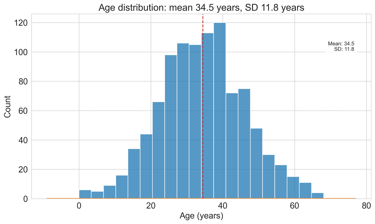
Statistics:
Mean: 41.8 years
Median: 41.2 years
Std Dev: 14.9 years
Min: 18.1 years
Max: 79.8 years
Skewness: 0.23 (slight right skew)
Common Use Cases
- 1Analyzing age demographics
- 2Examining test score distributions
- 3Quality control measurements
- 4Financial return distributions
Pro Tips
Experiment with different bin sizes
Add KDE overlay for smooth distribution curve
Use logarithmic scales for highly skewed data
Frequently asked questions
When should you use a histogram?
Histograms visualize the distribution of continuous numerical data by dividing values into bins and displaying the frequency of observations in each bin. They reveal the shape of your data distribution - whether it's normal, skewed, bimodal, or uniform. Common applications include analyzing age demographics, examining test score distributions, and quality control measurements.
Which Python libraries can create a histogram?
A histogram can be built in Python with matplotlib and seaborn — matplotlib for precise control over axes, annotations, and journal styling and seaborn for statistically-aware defaults on tidy data. In Plotivy you describe the figure and it writes the matplotlib code for you.
Can I make a histogram without writing Python code?
Yes. Describe the histogram you need in plain language and upload your dataset — Plotivy's AI writes the Python code and renders a publication-ready figure. You still get the full, editable matplotlib source, so nothing is locked in a black box.
What are best practices for a clear histogram?
Experiment with different bin sizes. Add KDE overlay for smooth distribution curve.
Long-tail keyword opportunities
High-intent chart variations
Library comparison for this chart
matplotlib
Best when you need full control over axis formatting, annotation placement, and journal-specific styling for histogram.
seaborn
Fastest path to statistically-aware defaults and tidy-data workflows, especially for grouped and distribution-focused histogram views.
Scientific Chart Selection Cheat Sheet
Not sure whether to use a Violin Plot, Box Plot, or Ridge Plot? Download our single-page reference mapping the most-used scientific chart types, exactly when to use them, and the core Matplotlib/Seaborn functions.