Menu
Refer a Friend
Share your link — earn +15 permanent plots for every friend who joins.
Sign in to get your referral linkmatplotlibhistogram
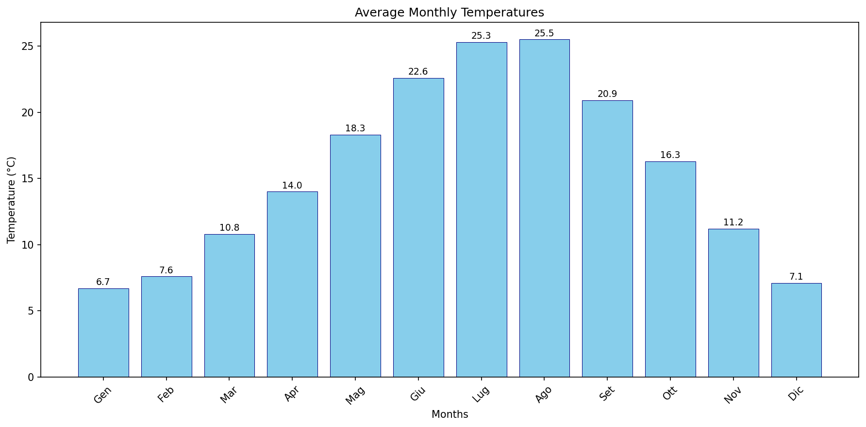
3. Create a bar plot of months (x-axis) vs Tmed MEDIA values (y-axis) to compare average monthly tem
Description
Figure metadata: Title: Average Monthly Temperatures | X axis: Months | Y axis: Temperature (°C) Original request: Create a bar plot of months (x-axis) vs Tmed MEDIA values (y-axis) to compare average monthly temperatures and assess the warmest/coolest seasons for planning activities. Dataset info available.
0
Creator
anonymous
Published
October 22, 2025
More sharing options
More like this
Similar plots from the gallery.
matplotlibhistogram
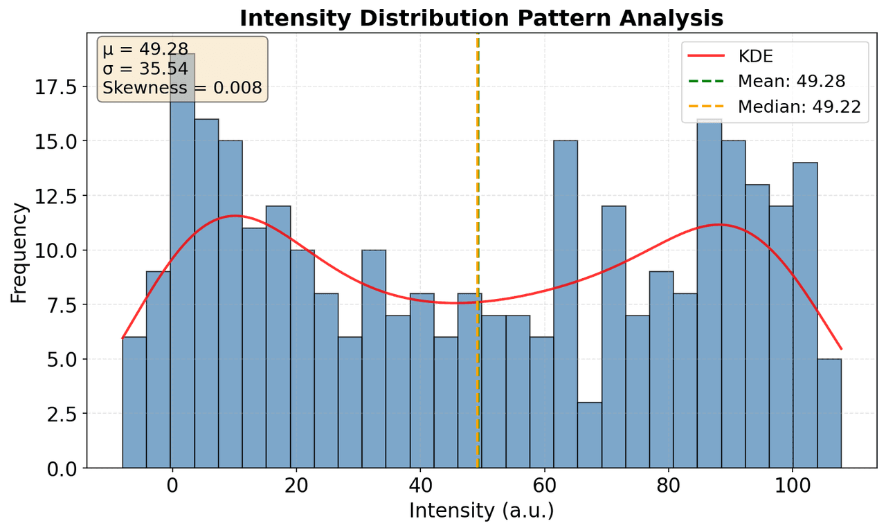
Plot histogram of Intensity distribution to understand pattern characteristics
10
matplotlibhistogram
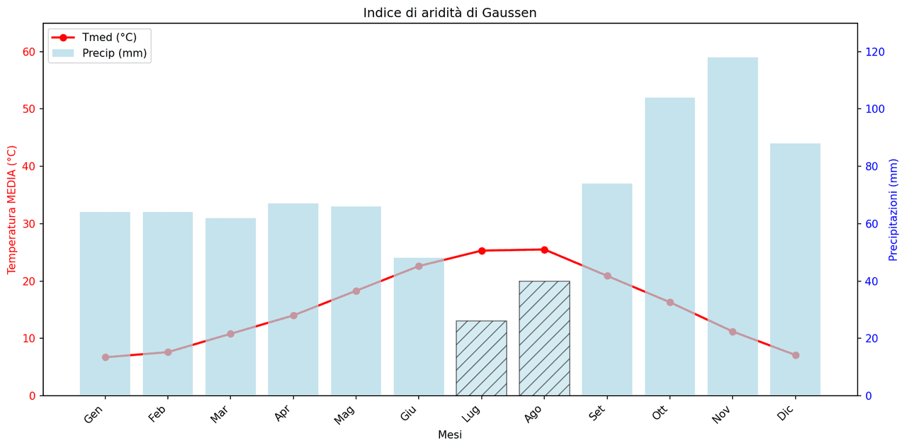
Gaussen Aridity Index.
00
matplotlibhistogram
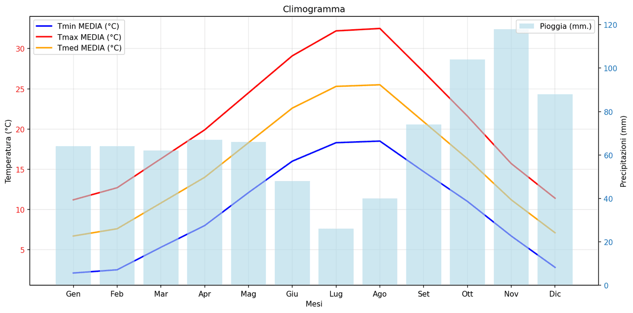
Climogramma di Firenze (Italia)
10
matplotlibhistogram
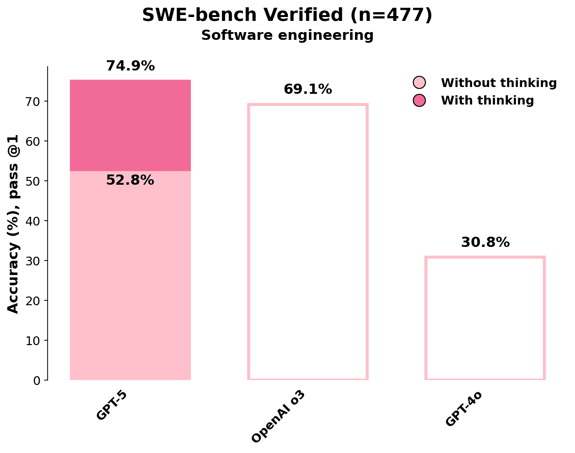
Accuracy (%) at pass @1 across different ChatGPT models.
10
matplotlibhistogram
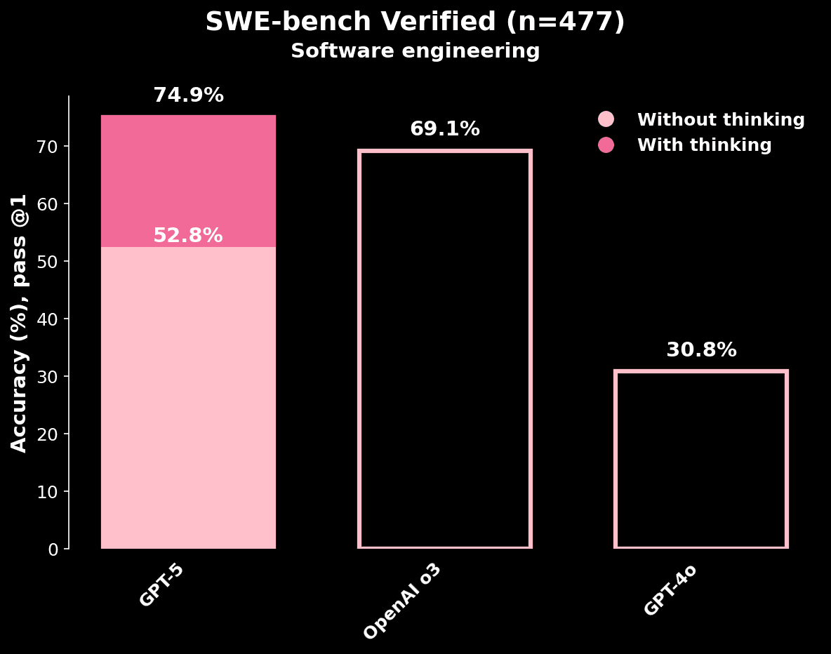
Pass@1 accuracy (%) for GPT-5, OpenAI o3, and GPT-4o models
00