Menu
Refer a Friend
Share your link — earn +15 permanent plots for every friend who joins.
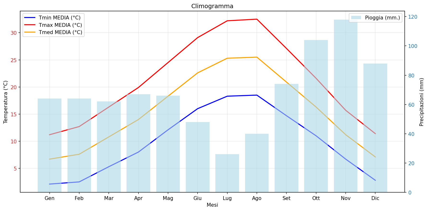
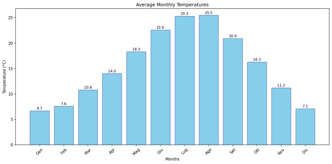
Sign in to get your referral linkClimogramma di Firenze (Italia)
Description
This image shows a climograph that plots the average monthly temperature and precipitation for a specific location. The x-axis represents the months of the year, abbreviated in Italian (Gen for January, Feb for February, etc.). The left y-axis shows temperature in degrees Celsius (°C), and the right y-axis shows precipitation in millimeters (mm). Light blue bars indicate average monthly precipitation (“Pioggia (mm)”), while the red, orange, and blue lines represent average maximum (“Tmax MEDIA (°C)”), mean (“Tmed MEDIA (°C)”), and minimum (“Tmin MEDIA (°C)”) temperatures, respectively. The temperature curves show a clear seasonal pattern typical of the northern hemisphere, with hot summers and mild winters. In summer, average maximum temperatures peak around 32.5°C in July and August, and minimums around 18.5°C. In winter, the coldest months are January and February, with minimum temperatures near 2°C and maximums around 11–12°C. Precipitation shows an opposite trend, with a pronounced dry season in summer and a wet season in autumn and early winter. July is the driest month with about 25 mm of rain, while November is the wettest with around 118 mm, followed by October and December. Overall, the graph represents a typical Mediterranean climate (Csa), characterized by hot, dry summers and mild, wet winters.
Creator
anonymous
Published
October 22, 2025
More sharing options
More like this
Similar plots from the gallery.
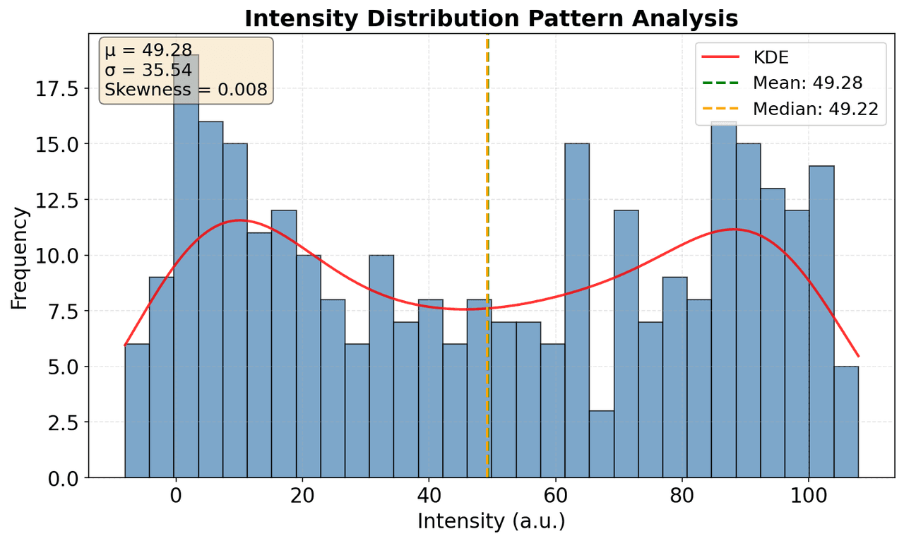
Plot histogram of Intensity distribution to understand pattern characteristics
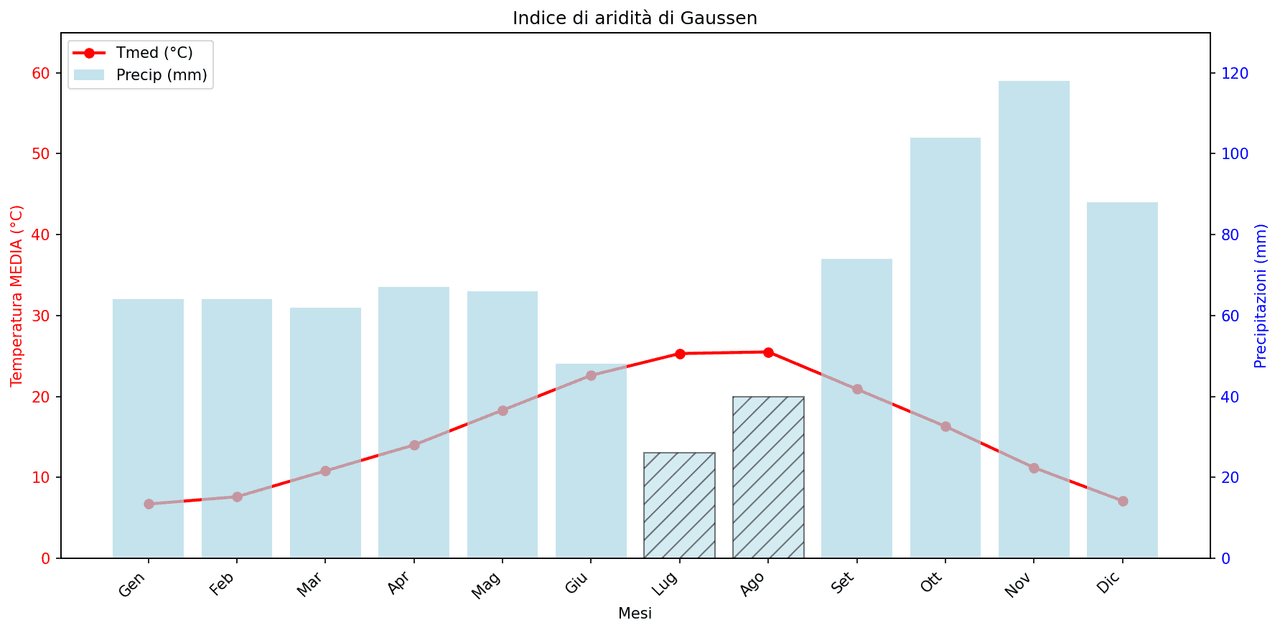
Gaussen Aridity Index.
3. Create a bar plot of months (x-axis) vs Tmed MEDIA values (y-axis) to compare average monthly tem
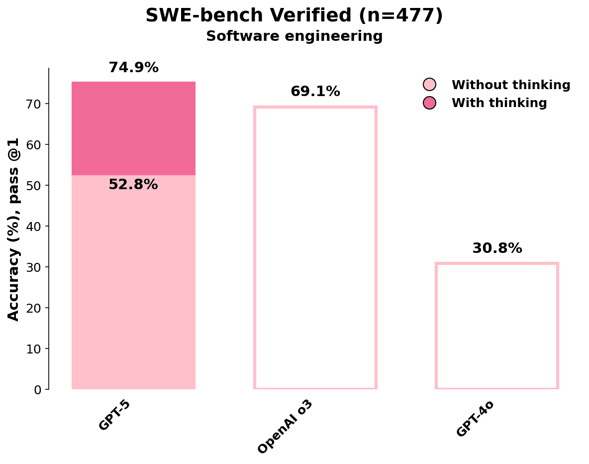
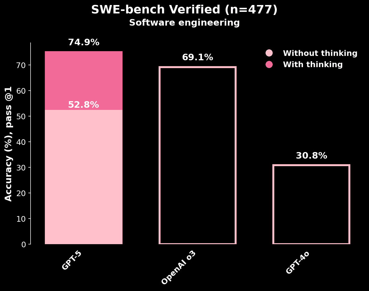
Accuracy (%) at pass @1 across different ChatGPT models.