Menu
Refer a Friend
Share your link — earn +15 permanent plots for every friend who joins.
Sign in to get your referral linkmatplotlibscatter
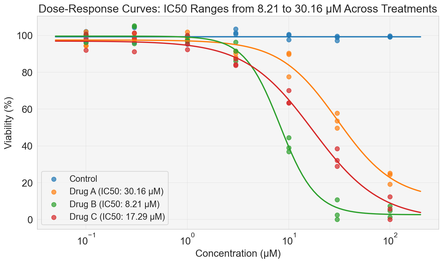
Dose-response curves
Description
Dose-response curves illustrate cell viability as a function of treatment concentration across multiple groups, including a control. Logistic regression fits (solid lines) overlay the experimental data points (symbols) to model sigmoidal inhibition trends, enabling estimation of IC50 values for each non-control treatment. The curves reveal varying potencies among treatments, with IC50s ranging from the lowest to highest observed values, highlighting differential sensitivities to increasing doses.
Tags
#code#data available#scatter#line
1
Creator
85575894-8803-4260-9370-289a4b586346
Published
November 13, 2025
More sharing options
More like this
Similar plots from the gallery.
matplotlibscatter
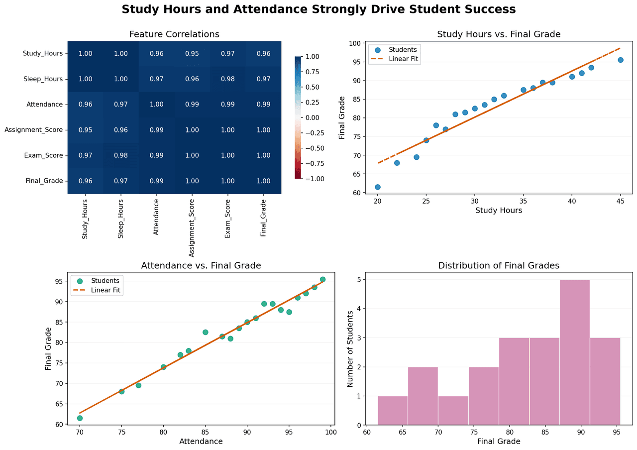
Correlation analysis and performance distribution of student success metrics.
00
matplotlibscatter
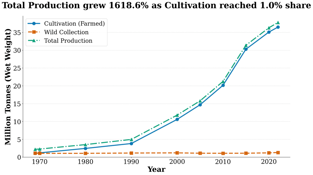
Production Trend
00
matplotlibscatter
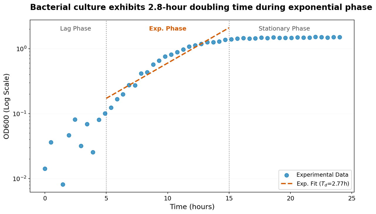
Semi-logarithmic plot of bacterial growth showing optical density (OD600) as a function of time.
00
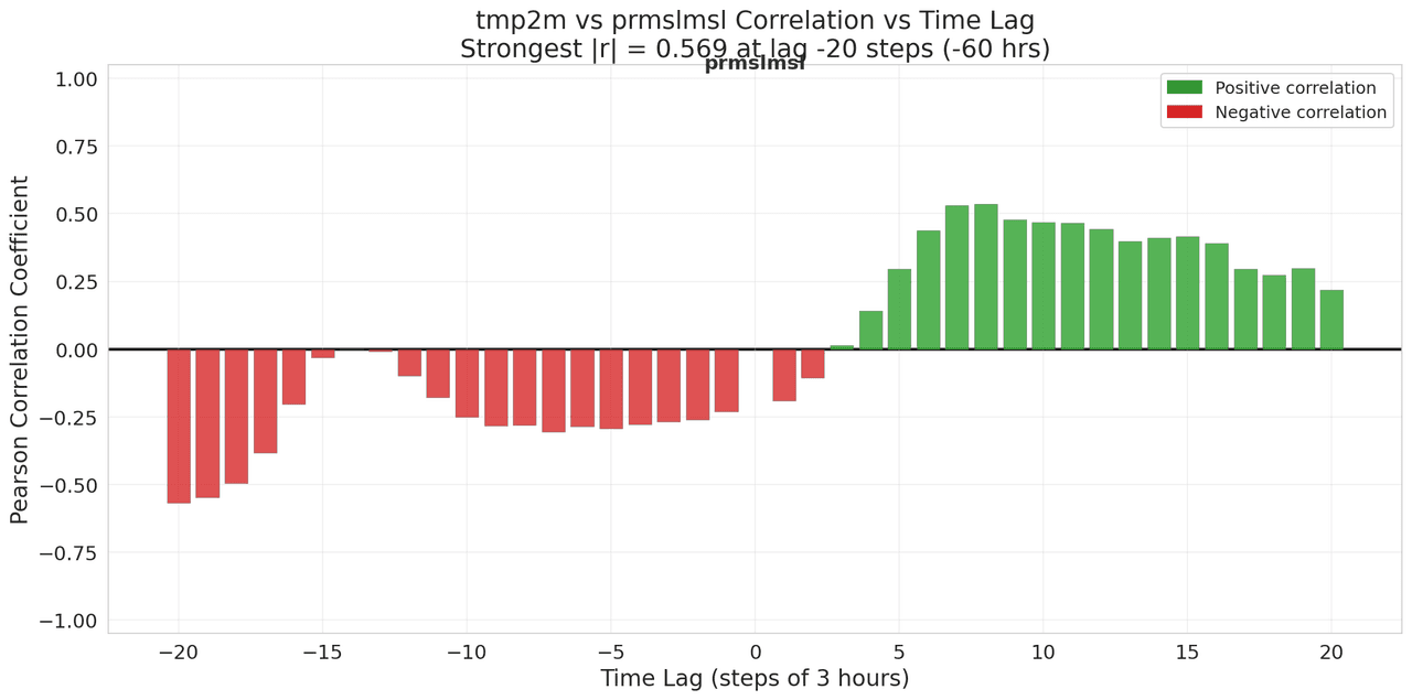
matplotlibscatter
Lagged Correlation Analysis
01
![PWAT (pwatclm) and Td (dpt2m) time series data (10 three-hourly observations) normalized via min-max scaling to [0,1] independently.](/_next/image?url=https%3A%2F%2Fmznathvfriiouibqrfyh.supabase.co%2Fstorage%2Fv1%2Fobject%2Fpublic%2Fgallery-images%2Fvik.ariel-bc5231dabc%2F20251208182006-3b8626a3dd88.png&w=1280&q=70)
matplotlibscatter
PWAT (pwatclm) and Td (dpt2m) time series data (10 three-hourly observations) normalized via min-max scaling to [0,1] independently.
00
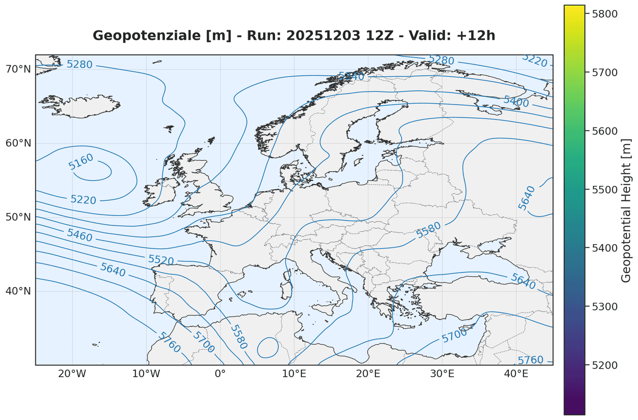
matplotlibscatter
Geopotential height at the 500 hPa pressure level
00