Menu
Refer a Friend
Share your link — earn +15 permanent plots for every friend who joins.
Sign in to get your referral linkmatplotlibscatter
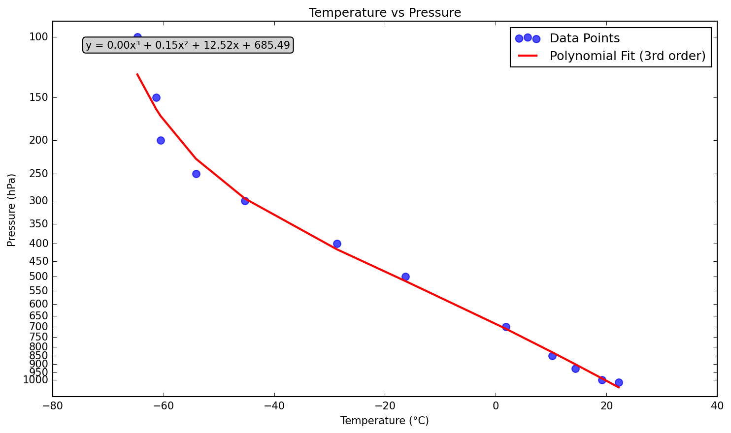
Scatter plot of temperature (TMPC) vs pressure (PRES)
Description
https://weather.uwyo.edu/cgi-bin/sounding?region=europe&TYPE=TEXT%3AUNMERGED&YEAR=2025&MONTH=10&FROM=1312&TO=1312&STNM=16245
0
Creator
anonymous
Published
October 13, 2025
More sharing options
More like this
Similar plots from the gallery.
matplotlibscatter
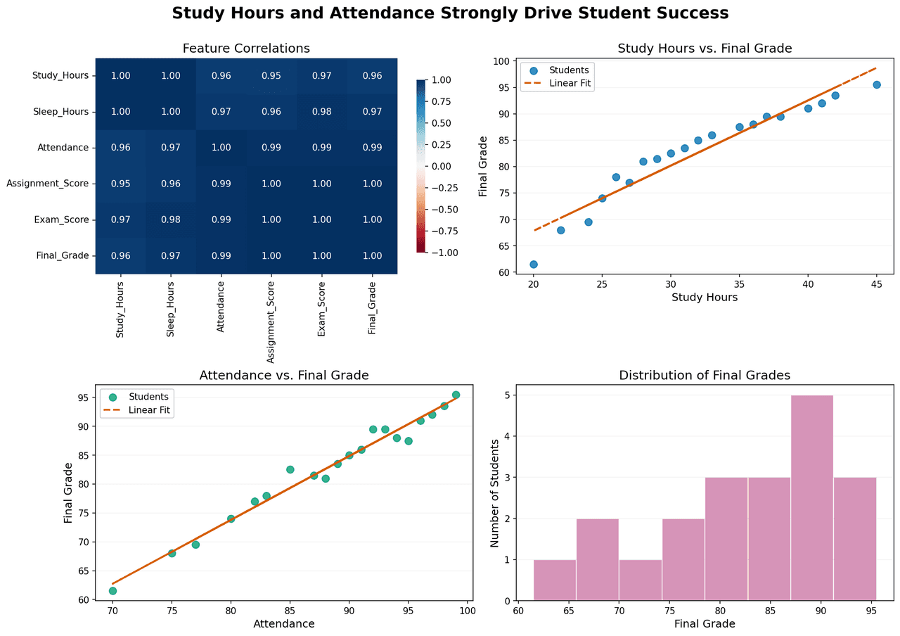
Correlation analysis and performance distribution of student success metrics.
00
matplotlibscatter
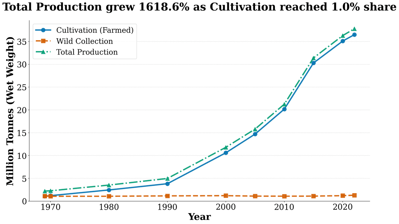
Production Trend
00
matplotlibscatter
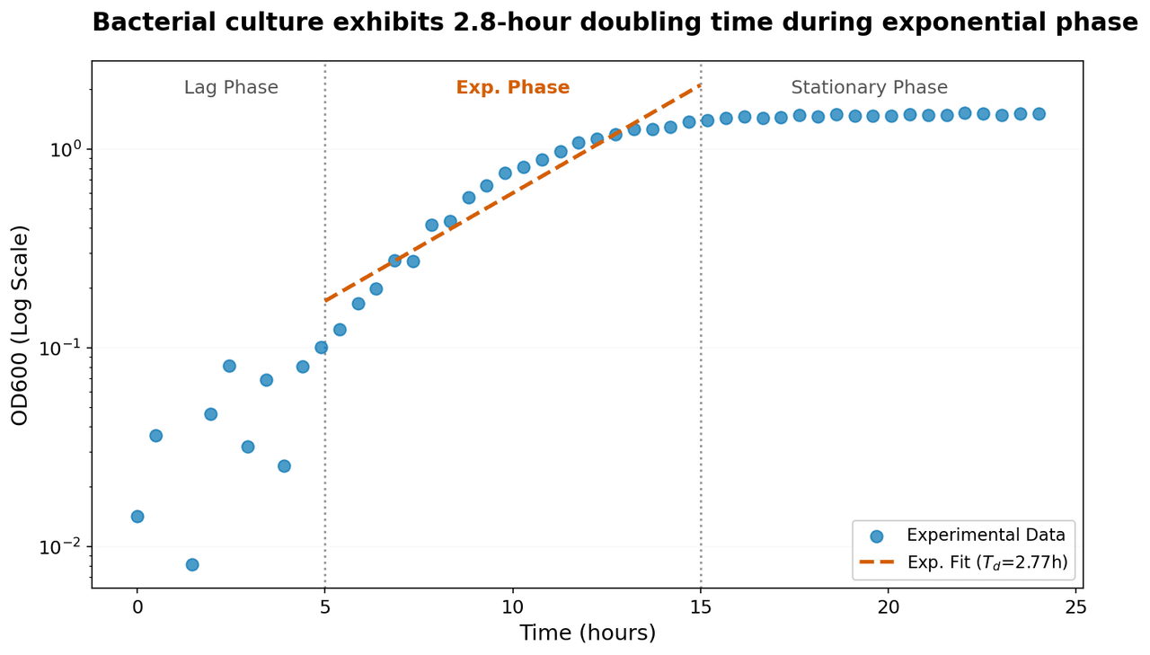
Semi-logarithmic plot of bacterial growth showing optical density (OD600) as a function of time.
00
matplotlibscatter
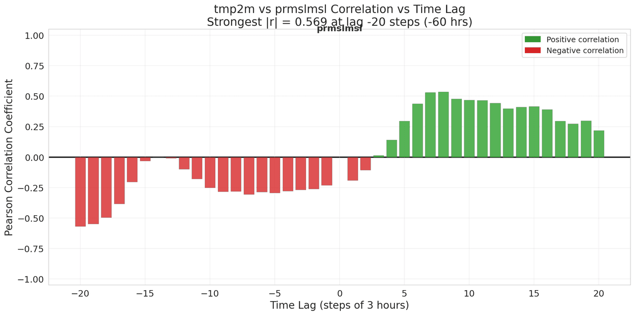
Lagged Correlation Analysis
01
![PWAT (pwatclm) and Td (dpt2m) time series data (10 three-hourly observations) normalized via min-max scaling to [0,1] independently.](/_next/image?url=https%3A%2F%2Fmznathvfriiouibqrfyh.supabase.co%2Fstorage%2Fv1%2Fobject%2Fpublic%2Fgallery-images%2Fvik.ariel-bc5231dabc%2F20251208182006-3b8626a3dd88.png&w=1280&q=70)
matplotlibscatter
PWAT (pwatclm) and Td (dpt2m) time series data (10 three-hourly observations) normalized via min-max scaling to [0,1] independently.
00
matplotlibscatter
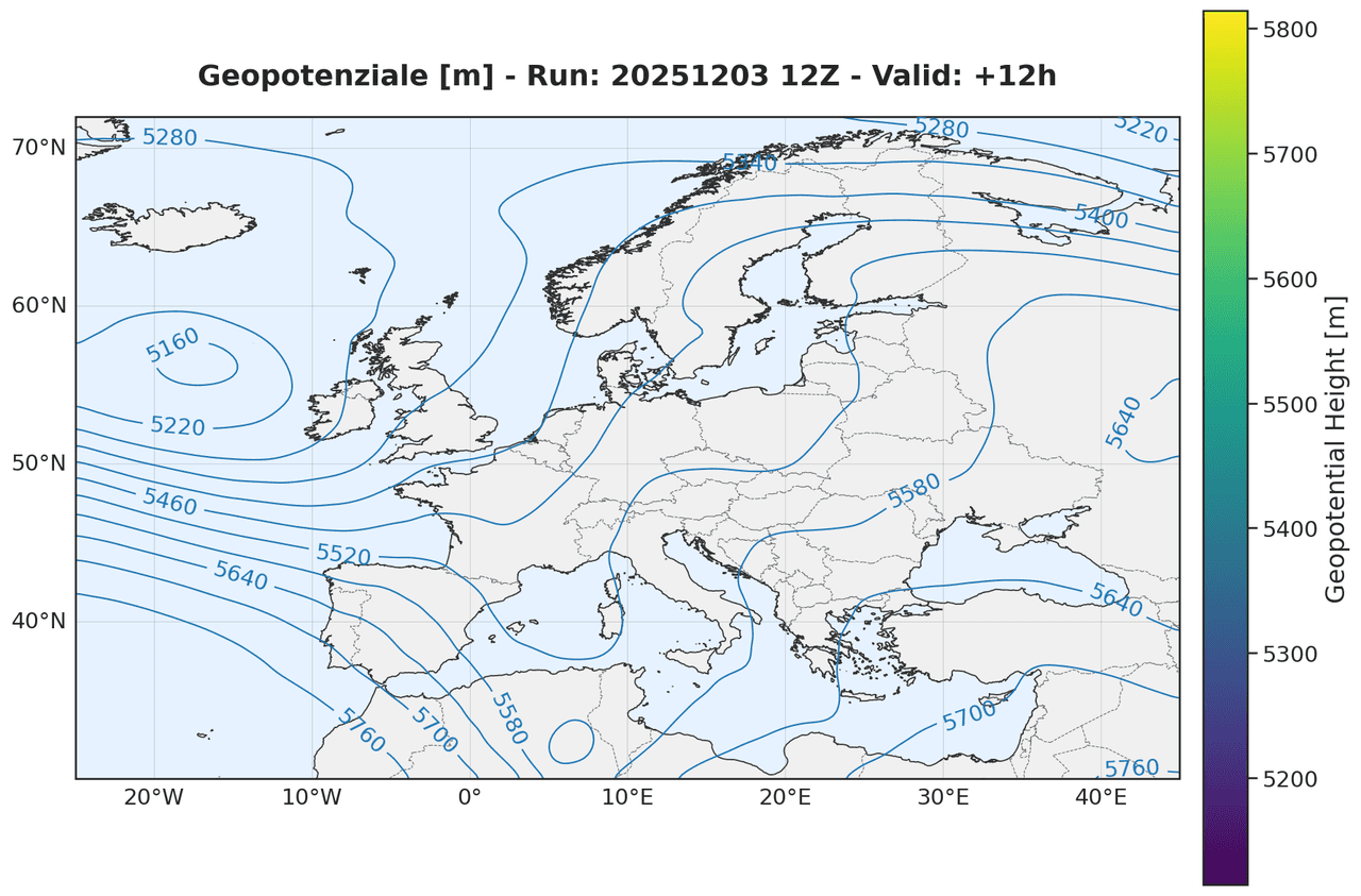
Geopotential height at the 500 hPa pressure level
00