Menu
Refer a Friend
Share your link — earn +15 permanent plots for every friend who joins.
Sign in to get your referral linkmatplotlibscatter
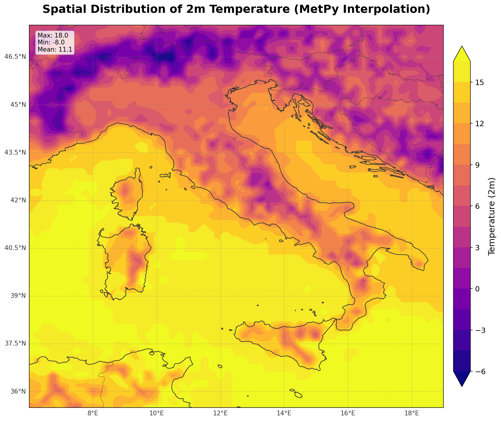
Spatial Distribution of 2m Temperature
Description
The visualization depicts the spatial distribution of 2-meter air temperature across a specific geographic region, utilizing a filled contour plot to represent thermal gradients. By interpolating discrete latitude-longitude measurements onto a regular grid using MetPy, the plot transforms point data into a continuous field. This allows researchers to identify regional thermal patterns, isotherms, and the magnitude of temperature variation (represented by the 'plasma' colormap) that would be difficult to discern from tabular data alone.
Tags
#code#data available#scatter
0
Creator
57343531-6c88-468e-a41a-a14a875e3f74
Published
December 1, 2025
More sharing options
More like this
Similar plots from the gallery.
matplotlibscatter
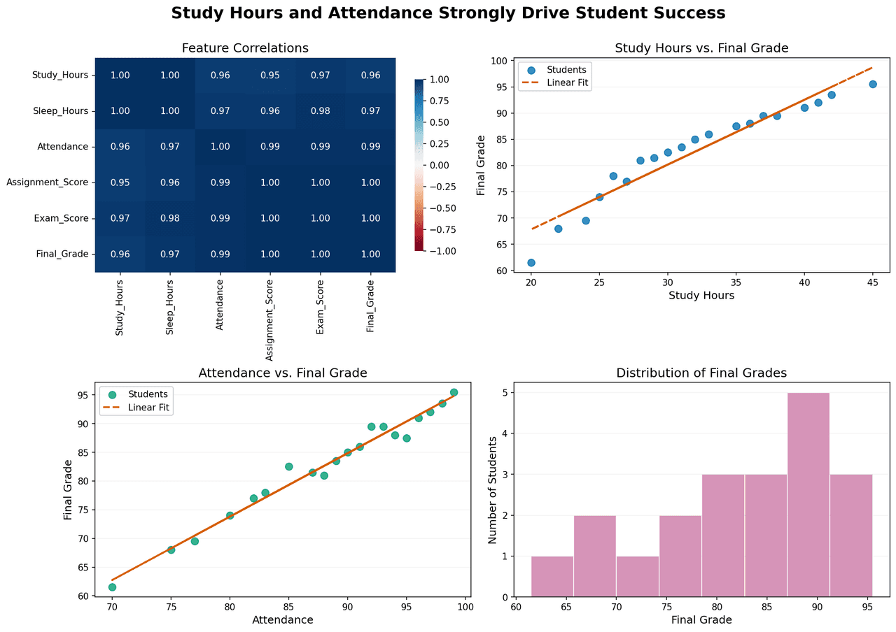
Correlation analysis and performance distribution of student success metrics.
00
matplotlibscatter
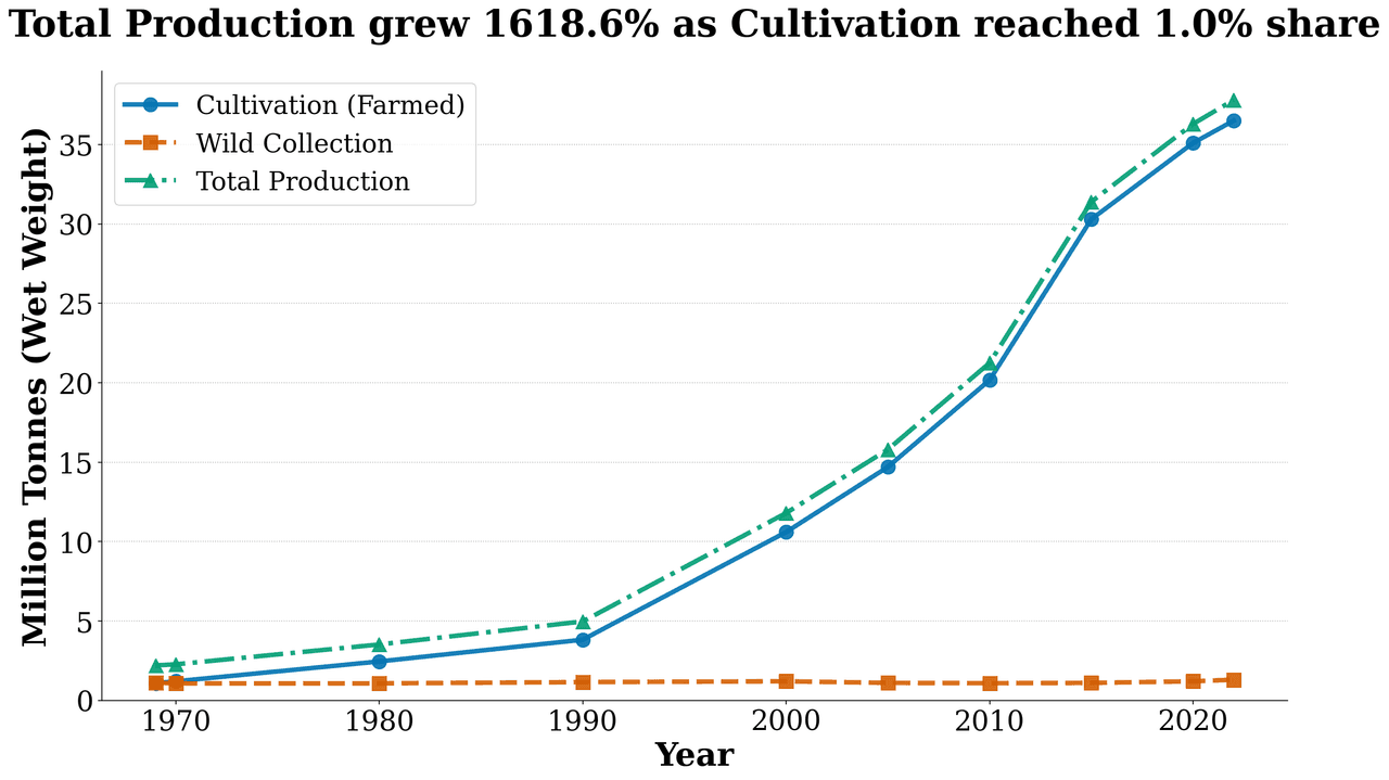
Production Trend
00
matplotlibscatter
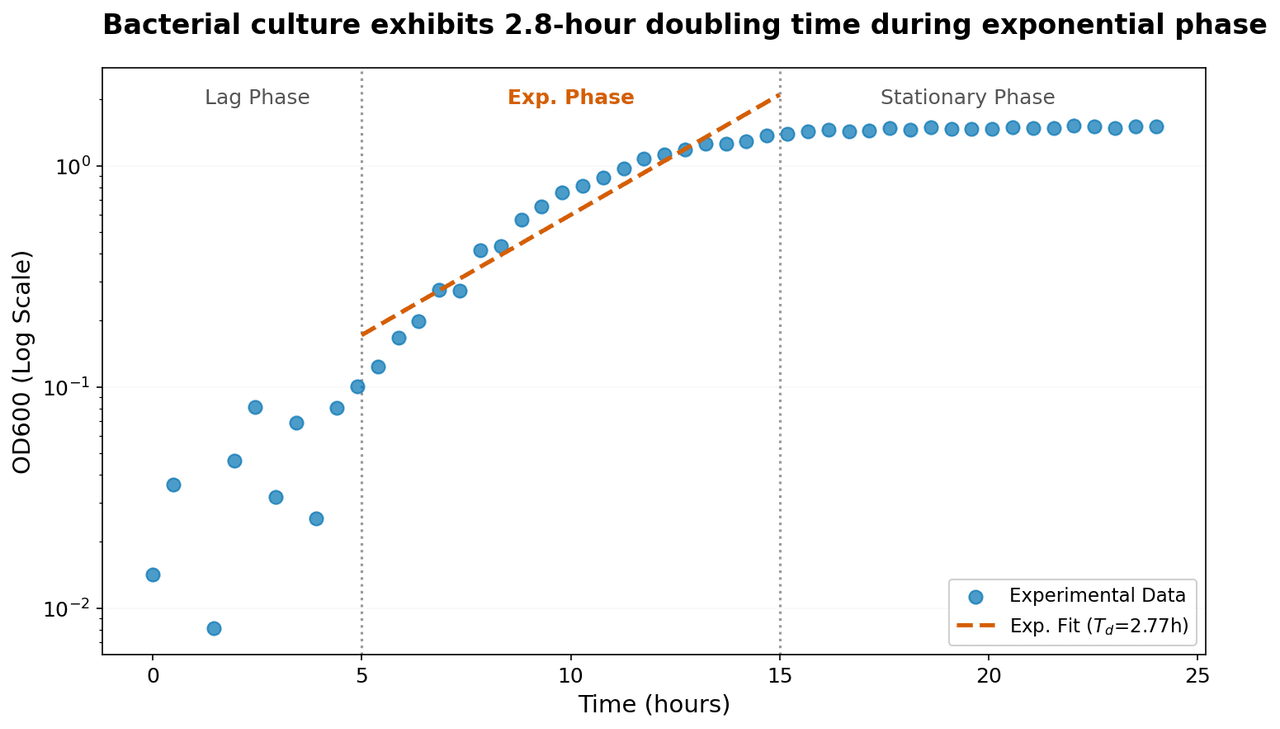
Semi-logarithmic plot of bacterial growth showing optical density (OD600) as a function of time.
00
matplotlibscatter
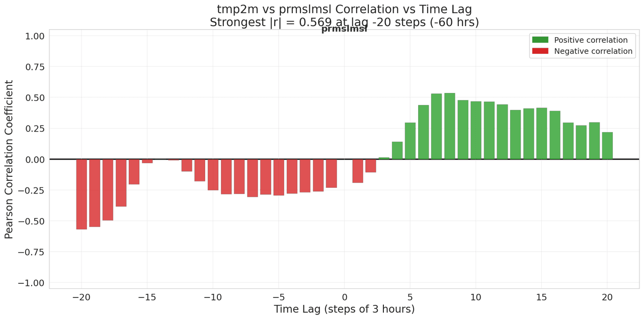
Lagged Correlation Analysis
01
![PWAT (pwatclm) and Td (dpt2m) time series data (10 three-hourly observations) normalized via min-max scaling to [0,1] independently.](/_next/image?url=https%3A%2F%2Fmznathvfriiouibqrfyh.supabase.co%2Fstorage%2Fv1%2Fobject%2Fpublic%2Fgallery-images%2Fvik.ariel-bc5231dabc%2F20251208182006-3b8626a3dd88.png&w=1280&q=70)
matplotlibscatter
PWAT (pwatclm) and Td (dpt2m) time series data (10 three-hourly observations) normalized via min-max scaling to [0,1] independently.
00
matplotlibscatter
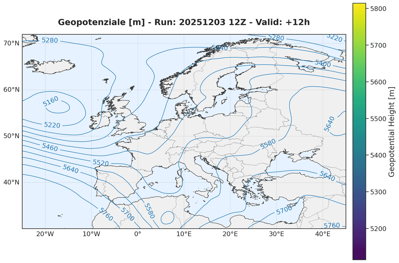
Geopotential height at the 500 hPa pressure level
00