Menu

PARTICLE PHYSICS

Particle Physics Visualizations

From invariant mass spectra and Brazil band plots to Dalitz plots, angular distributions, and detector event displays - create publication-ready HEP figures with AI-generated Python code.

or browse all example datasets

Essential Particle Physics Visualizations

High-energy physics data demands specialized visualization techniques - from mass spectra with signal extraction to exclusion limits, angular correlations, and multi-body decay kinematics. Each requires careful statistical treatment and discipline-specific formatting conventions.

Invariant Mass Spectra

Di-lepton and di-jet mass distributions with Breit-Wigner signal over exponential background

Brazil Band Plots

95% CL upper limits with expected and observed exclusion bands in standard HEP format

Ratio Plots

Data-to-MC comparison panels with pull distributions and systematic uncertainty bands

Dalitz Plots

Two-dimensional phase-space distributions for three-body decay kinematics

Angular Distributions

Polar and azimuthal decay angle spectra with Legendre polynomial fits

Event Displays

Detector-level visualizations of tracks, calorimeter hits, and reconstructed vertices

Why Particle Physicists Use Plotivy

HEP Analysis

Signal extraction, background fitting, mass peak identification, and significance estimation for collider data.

Statistical Methods

CLs exclusion limits, profile likelihood scans, p-value computations, and asymptotic approximations.

Publication Formats

Export to PRL, JHEP, and ATLAS/CMS style with correct fonts, axis labels, and luminosity annotations.

Data-MC Comparison

Ratio panels, pull distributions, systematic uncertainty bands, and stacked background composition.

Invariant Mass Histogram with Signal+Background Fit

Di-muon invariant mass spectrum showing the Z boson resonance at ~91.2 GeV over an exponential background. Includes a ratio panel for data-to-fit comparison - standard format for LHC analyses.

Live Code Editor
Code EditorPython
Loading editor...
Live Preview

Preparing preview

Running once automatically on first load

Learn by Experimenting

This is a safe playground for learning! Try changing:

  • • Colors: Modify color values to see different palettes
  • • Numbers: Adjust sizes, positions, or data ranges
  • • Labels: Update titles, axis names, or legends

Edit the code, run it, then open the full data visualization tool to continue with your own dataset.

Cross-Section Upper Limits (Brazil Band Plot)

Standard HEP exclusion plot showing expected and observed 95% CL upper limits on signal cross-section as a function of resonance mass. Green and yellow bands represent 1-sigma and 2-sigma expected fluctuations.

Live Code Editor
Code EditorPython
Loading editor...
Live Preview

Preparing preview

Running once automatically on first load

Learn by Experimenting

This is a safe playground for learning! Try changing:

  • • Colors: Modify color values to see different palettes
  • • Numbers: Adjust sizes, positions, or data ranges
  • • Labels: Update titles, axis names, or legends

Edit the code, run it, then open the full data visualization tool to continue with your own dataset.

Chart gallery

Explore Particle Physics Chart Types

Interactive examples with ready-to-run code

Browse all chart types →
Histogram showing age distribution with 20 bins and KDE overlay
Distribution•matplotlib, seaborn
From the chart gallery•Analyzing age demographics
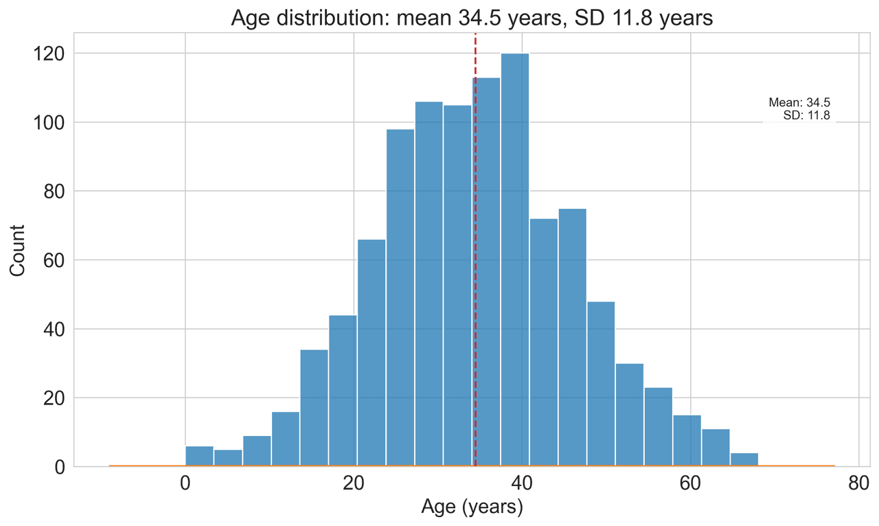
Histogram

Displays the distribution of numerical data by grouping values into bins.

Sample code / prompt

import matplotlib.pyplot as plt
import numpy as np
from scipy.stats import gaussian_kde, skewnorm

# Generate age data with slight right skew
np.random.seed(42)
ages = skewnorm.rvs(a=2, loc=42, scale=15, size=500)
ages = np.clip(ages, 18, 80)  # Clip to realistic range

fig, ax = plt.subplots(figsize=(12, 7))
Correlation heatmap with diverging color scale and coefficient annotations
Statistical•seaborn, matplotlib
From the chart gallery•Correlation analysis between variables

Heatmap

Represents data values as colors in a two-dimensional matrix format.

Sample code / prompt

import matplotlib.pyplot as plt
import seaborn as sns
import pandas as pd
import numpy as np

# Create correlation matrix for financial metrics
metrics = ['Revenue', 'Profit', 'Expenses', 'ROI', 'Customers', 'AOV', 'Marketing', 'Employees']
correlation_data = np.array([
    [1.00, 0.85, -0.45, 0.72, 0.88, 0.65, 0.72, 0.55],
    [0.85, 1.00, -0.78, 0.92, 0.75, 0.58, 0.63, 0.48],

Ready to Visualize Your Particle Physics Data?

Upload your CSV, describe the plot you need, and get publication-ready figures with full Python code in seconds.

Start Free - No Sign-Up