T-Test Visualization in Python with Significance Brackets
Technique overview
Add significance brackets and p-value stars to bar charts. Covers independent, paired, and Welch t-tests with complete matplotlib annotation code.
If you have ever submitted a manuscript only to receive a reviewer comment asking you to add significance brackets and p-value stars to your bar chart, you know how unexpectedly difficult the annotation step can be. The statistics are straightforward - scipy provides independent, paired, and Welch t-tests in a single function call - but drawing the brackets with correct vertical positioning, avoiding overlap, and automatically assigning star notation requires surprisingly fiddly matplotlib code. This page gives you a complete, copy-paste-ready solution that handles the bracket geometry for you, along with the statistical logic to choose the right test variant for your experimental design.
Key points
- Add significance brackets and p-value stars to bar charts. Covers independent, paired, and Welch t-tests with complete matplotlib annotation code.
- If you have ever submitted a manuscript only to receive a reviewer comment asking you to add significance brackets and p-value stars to your bar chart, you know how unexpectedly difficult the annotation step can be.
- The statistics are straightforward - scipy provides independent, paired, and Welch t-tests in a single function call - but drawing the brackets with correct vertical positioning, avoiding overlap, and automatically assigning star notation requires surprisingly fiddly matplotlib code.
- This page gives you a complete, copy-paste-ready solution that handles the bracket geometry for you, along with the statistical logic to choose the right test variant for your experimental design.
Example Visualization
Review the example first, then use the live editor below to run and customize the full workflow.
Mathematical Foundation
If you have ever submitted a manuscript only to receive a reviewer comment asking you to add significance brackets and p-value stars to your bar chart, you know how unexpectedly difficult the annotation step can be.
Equation
t = (x_bar_1 - x_bar_2) / sqrt(s_1^2/n_1 + s_2^2/n_2) (Welch)Parameter breakdown
When to use this technique
Use an independent t-test when comparing two unrelated groups (e.g., treatment vs. control). Use a paired t-test when observations are naturally paired (e.g., before/after in the same subject). Use Welch t-test (default in most modern software) when group variances may differ.
Apply This Technique Now
Run this analysis workflow with AI in seconds. Use the prepared technique prompt or bring your own dataset.
View example prompt
"Compare my two treatment groups with a t-test and create a bar chart with significance brackets, p-value stars, and individual data points overlay"
How to apply this technique in 30 seconds
Generate
Run the example prompt and let AI generate this technique automatically.
Refine and Export
Adjust code or prompt, then export publication-ready figures.
Implementation Code
The core data processing logic. Copy this block and replace the sample data with your measurements.
import numpy as np
from scipy import stats

# --- Example data: two treatment groups ---
np.random.seed(42)
control   = np.random.normal(loc=5.2, scale=0.8, size=15)
treatment = np.random.normal(loc=6.1, scale=1.0, size=15)

# --- Independent t-test (equal variance assumed) ---
t_stat, p_val = stats.ttest_ind(control, treatment, equal_var=True)
print(f"Independent t-test:  t={t_stat:.3f}, p={p_val:.4f}")

# --- Welch t-test (unequal variance) ---
t_w, p_w = stats.ttest_ind(control, treatment, equal_var=False)
print(f"Welch t-test:        t={t_w:.3f}, p={p_w:.4f}")

# --- Paired t-test (same subjects, two conditions) ---
before = np.random.normal(loc=5.0, scale=0.6, size=12)
after  = before + np.random.normal(loc=0.9, scale=0.4, size=12)
t_p, p_p = stats.ttest_rel(before, after)
print(f"Paired t-test:       t={t_p:.3f}, p={p_p:.4f}")

# --- Effect size (Cohen's d) ---
pooled_std = np.sqrt(((len(control)-1)*control.std(ddof=1)**2
                     + (len(treatment)-1)*treatment.std(ddof=1)**2)
                     / (len(control) + len(treatment) - 2))
cohens_d = (treatment.mean() - control.mean()) / pooled_std
print(f"Cohen's d: {cohens_d:.3f}")Visualization Code
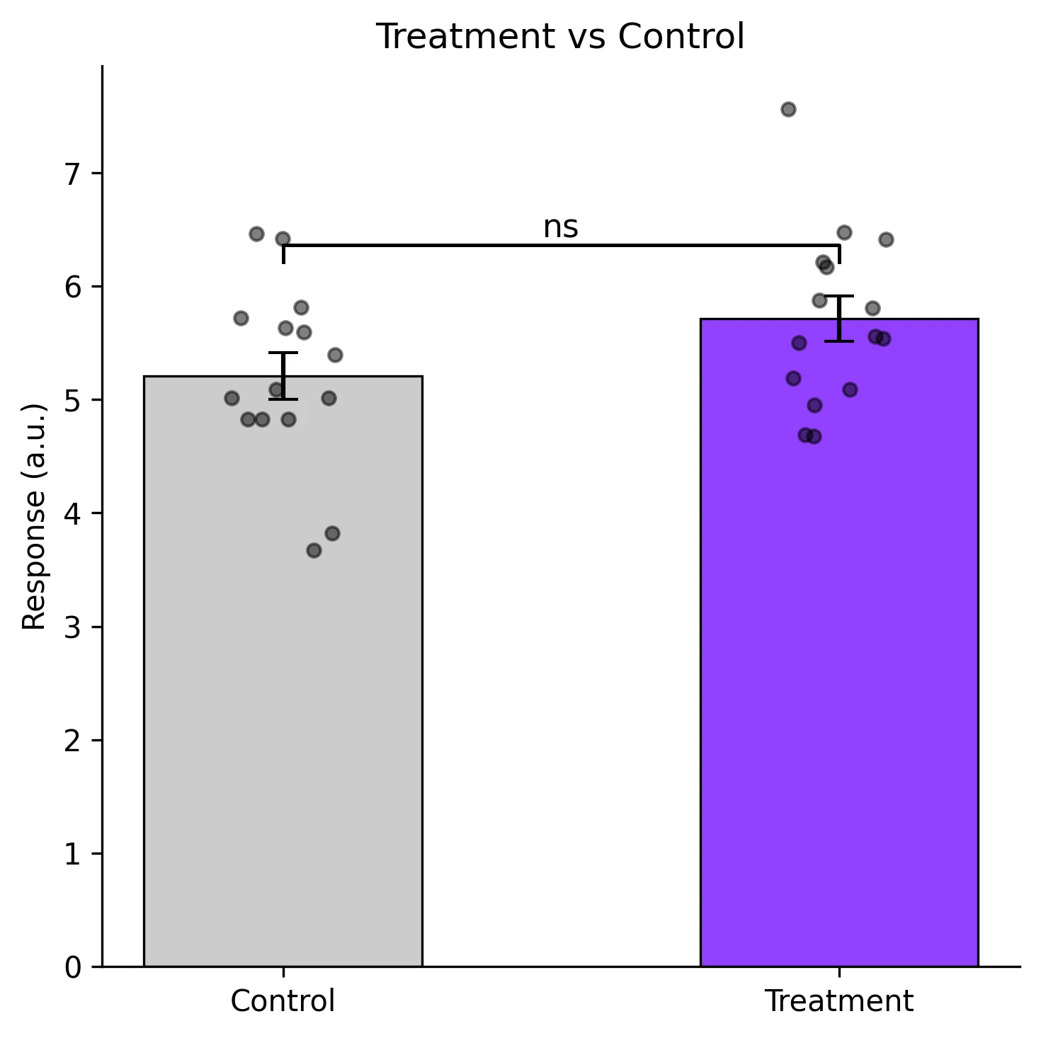
Complete matplotlib code for a publication-ready figure. Copy, paste into your notebook, and adjust labels to match your data.
import numpy as np
import matplotlib.pyplot as plt
from scipy import stats

def p_to_stars(p):
    if p < 0.001:  return '***'
    if p < 0.01:   return '**'
    if p < 0.05:   return '*'
    return 'ns'

def add_bracket(ax, x1, x2, y, h, text):
    """Draw a significance bracket between bar positions x1 and x2."""
    ax.plot([x1, x1, x2, x2], [y, y + h, y + h, y], lw=1.2, color='black')
    ax.text((x1 + x2) / 2, y + h, text, ha='center', va='bottom', fontsize=11)

# --- Data ---
np.random.seed(42)
control   = np.random.normal(5.2, 0.8, 15)
treatment = np.random.normal(6.1, 1.0, 15)
means = [control.mean(), treatment.mean()]
sems  = [stats.sem(control), stats.sem(treatment)]
_, p_val = stats.ttest_ind(control, treatment, equal_var=False)

# --- Figure ---
fig, ax = plt.subplots(figsize=(5, 5))
bars = ax.bar([0, 1], means, yerr=sems, width=0.5, capsize=5,
              color=['#cccccc', '#9240ff'], edgecolor='black', linewidth=0.8)

# Overlay individual data points with jitter
for i, data in enumerate([control, treatment]):
    jitter = np.random.uniform(-0.1, 0.1, size=len(data))
    ax.scatter(np.full_like(data, i) + jitter, data, s=20, color='black',
               alpha=0.5, zorder=5)

# Significance bracket
y_max = max(means[0] + sems[0], means[1] + sems[1]) + 0.3
add_bracket(ax, 0, 1, y_max, 0.15, p_to_stars(p_val))

ax.set_xticks([0, 1])
ax.set_xticklabels(['Control', 'Treatment'])
ax.set_ylabel('Response (a.u.)')
ax.set_title('Treatment vs Control', fontsize=12)
ax.spines[['top', 'right']].set_visible(False)
plt.tight_layout()
plt.savefig('ttest_bars.png', dpi=300, bbox_inches='tight')
plt.show()Effect Size Visualization (Cohen's d)
P-values tell you whether a difference is statistically significant, but not how large it is. Cohen's d quantifies the magnitude of the difference in units of pooled standard deviations (small ~ 0.2, medium ~ 0.5, large ~ 0.8). Plotting Cohen's d with a confidence interval provides a more complete picture for your readers.
import numpy as np
import matplotlib.pyplot as plt
from scipy import stats

def cohens_d_ci(g1, g2, alpha=0.05):
    n1, n2 = len(g1), len(g2)
    pooled = np.sqrt(((n1-1)*g1.std(ddof=1)**2 + (n2-1)*g2.std(ddof=1)**2) / (n1+n2-2))
    d = (g2.mean() - g1.mean()) / pooled
    se_d = np.sqrt((n1+n2)/(n1*n2) + d**2 / (2*(n1+n2-2)))
    t_crit = stats.t.ppf(1 - alpha/2, n1+n2-2)
    return d, d - t_crit*se_d, d + t_crit*se_d

np.random.seed(42)
ctrl = np.random.normal(5.2, 0.8, 15)
trt  = np.random.normal(6.1, 1.0, 15)
d, ci_lo, ci_hi = cohens_d_ci(ctrl, trt)

fig, axes = plt.subplots(1, 2, figsize=(9, 4))

# Left: bar chart with significance
means = [ctrl.mean(), trt.mean()]
sems = [stats.sem(ctrl), stats.sem(trt)]
_, p = stats.ttest_ind(ctrl, trt, equal_var=False)
axes[0].bar([0, 1], means, yerr=sems, width=0.5, capsize=5,
            color=['#ccc', '#9240ff'], edgecolor='black', lw=0.8)
axes[0].set_xticks([0, 1])
axes[0].set_xticklabels(['Control', 'Treatment'])
axes[0].set_ylabel('Response')
axes[0].set_title(f'p = {p:.4f}', fontsize=11)

# Right: Cohen's d forest plot
axes[1].errorbar(d, 0, xerr=[[d - ci_lo], [ci_hi - d]], fmt='o', color='#9240ff',
                 markersize=8, capsize=6, lw=2)
axes[1].axvline(0, color='gray', ls='--', lw=0.8)
axes[1].set_xlabel("Cohen's d")
axes[1].set_yticks([])
axes[1].set_title(f"d = {d:.2f} [{ci_lo:.2f}, {ci_hi:.2f}]", fontsize=11)
axes[1].spines[['top', 'right', 'left']].set_visible(False)

plt.tight_layout()
plt.savefig('effect_size.png', dpi=300, bbox_inches='tight')
plt.show()Common Errors and How to Fix Them
Using an equal-variance t-test when variances differ
Why: The classical Student t-test assumes equal population variances. When this is violated, the p-value can be either too liberal or too conservative.
Fix: Use Welch t-test (equal_var=False) as the default. It is robust when variances are equal and correct when they are not.
Data are not normally distributed
Why: The t-test assumes normality of the sampling distribution. With small samples (n < 15), departures from normality reduce the test's reliability.
Fix: Check normality with a Shapiro-Wilk test. For non-normal data, use the Mann-Whitney U test (independent) or Wilcoxon signed-rank test (paired).
Multiple comparisons without correction
Why: Running several t-tests (e.g., 3 pairwise comparisons from 3 groups) inflates the family-wise error rate.
Fix: Use ANOVA with post-hoc tests for 3+ groups. If you must do pairwise t-tests, apply Bonferroni correction (alpha / number of comparisons).
Identical values in both groups produce NaN t-statistic
Why: When all values within a group are tied (zero variance), the denominator of the t-statistic is zero.
Fix: This usually indicates a measurement or data-entry problem. Verify the data. If ties are genuine (e.g., floor/ceiling effect), use a permutation test.
Using independent t-test on paired data
Why: Paired data have correlated errors (same subject measured twice). Ignoring the pairing throws away information and typically inflates the standard error.
Fix: Always use ttest_rel for paired designs. A good check: if each row of your spreadsheet links two measurements from the same unit, the data are paired.
Frequently Asked Questions
Learn More Before You Run It
Apply T-Test Visualization in Python with Significance Brackets to Your Data
Upload your dataset and Plotivy generates the Python code, runs the analysis, and produces a publication-ready figure.
Generate Code for This TechniquePython Libraries
Quick Info
- Domain
- Statistics
- Typical Audience
- Biology PhD students and postdocs who need to add statistical significance annotations to their manuscript figures