ROC Curve and AUC Analysis in Python
Technique overview
Generate ROC curves with AUC, bootstrap confidence intervals, optimal threshold identification, and multi-class or multi-classifier comparison plots.
Receiver Operating Characteristic analysis is the standard framework for evaluating the diagnostic accuracy of a binary classifier, whether that classifier is a clinical biomarker threshold, a logistic regression model, or a deep-learning algorithm. The ROC curve plots sensitivity (true positive rate) against 1 - specificity (false positive rate) across all possible thresholds, and the Area Under the Curve (AUC) summarises discriminative ability in a single number. Beyond the basic ROC plot, reviewers increasingly expect bootstrap confidence intervals for the AUC and identification of the optimal operating point (maximising Youden index). This page provides all three elements with production-ready matplotlib code.
Key points
- Generate ROC curves with AUC, bootstrap confidence intervals, optimal threshold identification, and multi-class or multi-classifier comparison plots.
- Receiver Operating Characteristic analysis is the standard framework for evaluating the diagnostic accuracy of a binary classifier, whether that classifier is a clinical biomarker threshold, a logistic regression model, or a deep-learning algorithm.
- The ROC curve plots sensitivity (true positive rate) against 1 - specificity (false positive rate) across all possible thresholds, and the Area Under the Curve (AUC) summarises discriminative ability in a single number.
- Beyond the basic ROC plot, reviewers increasingly expect bootstrap confidence intervals for the AUC and identification of the optimal operating point (maximising Youden index).
Example Visualization
Review the example first, then use the live editor below to run and customize the full workflow.
Mathematical Foundation
Receiver Operating Characteristic analysis is the standard framework for evaluating the diagnostic accuracy of a binary classifier, whether that classifier is a clinical biomarker threshold, a logistic regression model, or a deep-learning algorithm.
Equation
TPR = TP / (TP + FN), FPR = FP / (FP + TN), AUC = integral of TPR d(FPR)Parameter breakdown
When to use this technique
Use ROC analysis when evaluating a binary classifier or diagnostic test. It is threshold-independent, making it ideal for comparing classifiers without committing to a specific operating point. For highly imbalanced datasets, consider Precision-Recall curves as a complement.
Apply This Technique Now
Run this analysis workflow with AI in seconds. Use the prepared technique prompt or bring your own dataset.
View example prompt
"Plot ROC curves for my classifier results, calculate AUC with 95% bootstrap confidence intervals, mark the optimal threshold point, and annotate sensitivity/specificity values"
How to apply this technique in 30 seconds
Generate
Run the example prompt and let AI generate this technique automatically.
Refine and Export
Adjust code or prompt, then export publication-ready figures.
Implementation Code
The core data processing logic. Copy this block and replace the sample data with your measurements.
import numpy as np
from sklearn.metrics import roc_curve, auc

# --- Simulated clinical diagnostic data ---
np.random.seed(42)
n = 200
y_true = np.concatenate([np.ones(100), np.zeros(100)])
y_scores = np.concatenate([
    np.random.normal(0.65, 0.2, 100),  # Positive class
    np.random.normal(0.35, 0.2, 100),  # Negative class
])
y_scores = np.clip(y_scores, 0, 1)

# --- ROC curve ---
fpr, tpr, thresholds = roc_curve(y_true, y_scores)
roc_auc = auc(fpr, tpr)

# --- Optimal threshold (Youden index) ---
youden = tpr - fpr
optimal_idx = np.argmax(youden)
optimal_threshold = thresholds[optimal_idx]

print(f"AUC: {roc_auc:.4f}")
print(f"Optimal threshold: {optimal_threshold:.3f}")
print(f"  Sensitivity: {tpr[optimal_idx]:.3f}")
print(f"  Specificity: {1 - fpr[optimal_idx]:.3f}")

# --- Bootstrap CI for AUC ---
n_boot = 1000
aucs = []
for _ in range(n_boot):
    idx = np.random.choice(n, size=n, replace=True)
    if len(np.unique(y_true[idx])) < 2:
        continue
    fpr_b, tpr_b, _ = roc_curve(y_true[idx], y_scores[idx])
    aucs.append(auc(fpr_b, tpr_b))
ci_low, ci_high = np.percentile(aucs, [2.5, 97.5])
print(f"AUC 95% CI: [{ci_low:.4f}, {ci_high:.4f}]")Visualization Code
Complete matplotlib code for a publication-ready figure. Copy, paste into your notebook, and adjust labels to match your data.
import numpy as np
import matplotlib.pyplot as plt
from sklearn.metrics import roc_curve, auc
np.random.seed(42)
y_true = np.concatenate([np.ones(100), np.zeros(100)])
y_scores = np.concatenate([
np.random.normal(0.65, 0.2, 100),
np.random.normal(0.35, 0.2, 100),
])
y_scores = np.clip(y_scores, 0, 1)
fpr, tpr, thresholds = roc_curve(y_true, y_scores)
roc_auc = auc(fpr, tpr)
youden = tpr - fpr
opt_idx = np.argmax(youden)
# Bootstrap CI
n_boot = 1000
aucs = []
for _ in range(n_boot):
idx = np.random.choice(200, 200, replace=True)
if len(np.unique(y_true[idx])) < 2:
continue
f, t, _ = roc_curve(y_true[idx], y_scores[idx])
aucs.append(auc(f, t))
ci_lo, ci_hi = np.percentile(aucs, [2.5, 97.5])
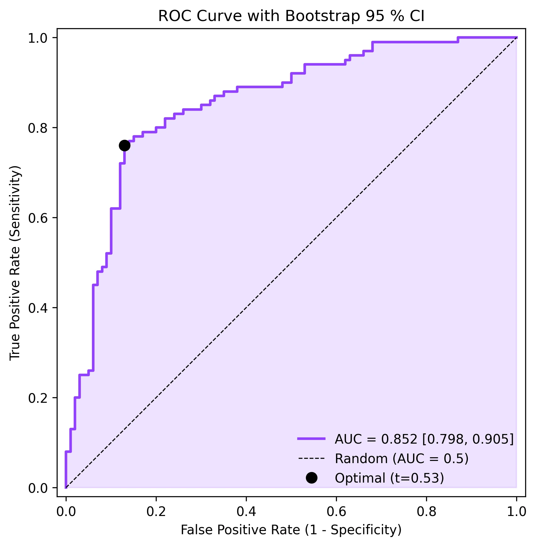
fig, ax = plt.subplots(figsize=(6, 6))
ax.fill_between(fpr, tpr, alpha=0.15, color='#9240ff')
ax.plot(fpr, tpr, color='#9240ff', lw=2,
label=f'AUC = {roc_auc:.3f} [{ci_lo:.3f}, {ci_hi:.3f}]')
ax.plot([0, 1], [0, 1], 'k--', lw=0.8, label='Random (AUC = 0.5)')
ax.plot(fpr[opt_idx], tpr[opt_idx], 'o', color='black', markersize=8,
label=f'Optimal (t={thresholds[opt_idx]:.2f})')
ax.set_xlabel('False Positive Rate (1 - Specificity)')
ax.set_ylabel('True Positive Rate (Sensitivity)')
ax.set_title('ROC Curve with Bootstrap 95 % CI', fontsize=12)
ax.legend(loc='lower right', frameon=False)
ax.set_xlim([-0.02, 1.02])
ax.set_ylim([-0.02, 1.02])
ax.set_aspect('equal')
plt.tight_layout()
plt.savefig('roc_curve.png', dpi=300, bbox_inches='tight')
plt.show()Multi-Classifier ROC Comparison
When you have multiple classifiers (or the same classifier with different feature sets), plotting their ROC curves on the same axes provides a direct visual and numerical comparison. This code trains three simple classifiers, computes their ROC curves, and overlays them with AUC annotations.
import numpy as np
import matplotlib.pyplot as plt
from sklearn.metrics import roc_curve, auc
from sklearn.linear_model import LogisticRegression
from sklearn.ensemble import RandomForestClassifier, GradientBoostingClassifier
from sklearn.model_selection import train_test_split
from sklearn.datasets import make_classification

X, y = make_classification(n_samples=500, n_features=20, n_informative=10,
                           random_state=42)
X_train, X_test, y_train, y_test = train_test_split(X, y, test_size=0.3,
                                                      random_state=42)

classifiers = {
    'Logistic Regression': LogisticRegression(max_iter=1000),
    'Random Forest': RandomForestClassifier(n_estimators=100, random_state=42),
    'Gradient Boosting': GradientBoostingClassifier(n_estimators=100,
                                                     random_state=42),
}
colors = ['#9240ff', '#e67e22', '#27ae60']

fig, ax = plt.subplots(figsize=(7, 7))

for (name, clf), color in zip(classifiers.items(), colors):
    clf.fit(X_train, y_train)
    y_prob = clf.predict_proba(X_test)[:, 1]
    fpr, tpr, _ = roc_curve(y_test, y_prob)
    roc_auc = auc(fpr, tpr)
    ax.plot(fpr, tpr, color=color, lw=2, label=f'{name} (AUC={roc_auc:.3f})')

ax.plot([0, 1], [0, 1], 'k--', lw=0.8, label='Random')
ax.set_xlabel('False Positive Rate')
ax.set_ylabel('True Positive Rate')
ax.set_title('Multi-Classifier ROC Comparison', fontsize=12)
ax.legend(loc='lower right', frameon=False, fontsize=9)
ax.set_xlim([-0.02, 1.02])
ax.set_ylim([-0.02, 1.02])
ax.set_aspect('equal')
plt.tight_layout()
plt.savefig('multi_roc.png', dpi=300, bbox_inches='tight')
plt.show()Common Errors and How to Fix Them
AUC is artificially inflated due to class imbalance
Why: With severe imbalance (e.g., 95 % negatives), even a mediocre classifier achieves high AUC because most negative samples are easy to classify correctly.
Fix: Complement ROC analysis with Precision-Recall curves. Report both AUC-ROC and AUC-PR. Consider stratified bootstrapping for confidence intervals.
Cross-validation leakage inflates AUC estimates
Why: If feature selection, scaling, or oversampling is done before the train/test split, test-set performance is overestimated.
Fix: Put all preprocessing inside a Pipeline and use cross_val_predict with proper CV folds. Never touch test data until final evaluation.
Incorrect pos_label argument with reversed class coding
Why: sklearn.metrics.roc_curve assumes the higher label value is positive by default. If your coding is reversed (0 = disease, 1 = healthy), the ROC will be inverted.
Fix: Explicitly set pos_label=1 (or whichever label represents the positive class) in the roc_curve call.
Only a few unique threshold values in the ROC curve
Why: If the classifier outputs discrete probabilities (e.g., a simple rule-based system with few bins), the ROC curve will have very few points and look jagged.
Fix: Use a classifier that outputs continuous probabilities. For rule-based systems, consider using more bins or a smoothed score.
Oversmoothed ROC from averaging across folds incorrectly
Why: Naively averaging TPR across folds at fixed FPR values requires interpolation, which can smooth out important features.
Fix: Use sklearn.metrics.auc with interpolated mean TPR at a common set of FPR points (np.linspace(0, 1, 100)). The {mean +/- SD} band is the standard approach.
Frequently Asked Questions
Apply ROC Curve and AUC Analysis in Python to Your Data
Upload your dataset and Plotivy generates the Python code, runs the analysis, and produces a publication-ready figure.
Generate Code for This TechniquePython Libraries
Quick Info
- Domain
- Clinical
- Typical Audience
- Clinical researchers evaluating diagnostic tests and ML practitioners comparing binary classifiers who need publication-quality ROC analysis