What is Data Analysis and Visualization? The Complete Guide (2026)

Data analysis is the process of inspecting, cleaning, and modeling data to discover useful information. Data visualization is how you communicate those discoveries visually. Together, they form the backbone of modern research and decision-making.
What You'll Learn
0.Live Code: Exploratory vs Explanatory
1.What Is Data Analysis?
2.What Is Data Visualization?
3.Types of Data Visualization
4.The Analysis-Visualization Pipeline
5.Tools & Getting Started
0. Live Code: Exploratory vs Explanatory
The most important distinction in visualization: exploratory charts are for you (quick, messy, many). Explanatory charts are for others (polished, focused, few). Edit the code below to see both.
1. What Is Data Analysis?
Data analysis transforms raw numbers into actionable insights. It involves four stages:
1. Collection
Gather data from experiments, surveys, sensors, or databases.
2. Cleaning
Handle missing values, remove duplicates, fix formatting errors.
3. Analysis
Apply statistical methods: means, correlations, regressions, hypothesis tests.
4. Interpretation
Draw conclusions, identify patterns, and communicate findings.
2. What Is Data Visualization?
Try it
Try it now: turn this method into your next figure
Apply the same approach to your own dataset and generate clean, publication-ready code and plots in minutes.
Open in Plotivy Analyze →Newsletter
Get a weekly Python plotting tip
One concise tip each week for cleaner, faster scientific figures. Built for researchers who publish.
Data visualization maps data values to visual properties - position, length, color, size - so humans can perceive patterns that raw numbers hide. Good visualization is not decoration. It is a cognitive tool.
Why visualization works
- Pre-attentive processing: The brain detects color, position, and size changes in under 250 ms - before conscious thought.
- Pattern recognition: Humans spot trends, clusters, and outliers in scatter plots that are invisible in spreadsheets.
- Memory: Visual information is retained 6x longer than text-only information.
- Communication: A single well-designed figure replaces paragraphs of description.
3. Types of Data Visualization
| Purpose | Chart Types | Best For |
|---|---|---|
| Comparison | Bar, grouped bar, dot plot | Comparing categories or groups |
| Distribution | Histogram, box plot, violin plot | Understanding data spread |
| Relationship | Scatter plot, bubble chart, heatmap | Correlations between variables |
| Composition | Stacked bar, pie, treemap | Parts of a whole |
| Trend | Line chart, area chart | Change over time |
| Spatial | Map, contour plot, ternary | Geographic or phase data |
4. The Analysis-Visualization Pipeline
Raw Data
CSV, Excel, database export, sensor logs
Data Cleaning
pandas: dropna(), fillna(), astype(), merge()
Exploratory Analysis
Quick histograms, scatter matrices, summary statistics
Statistical Modeling
Regression, ANOVA, clustering, hypothesis testing
Explanatory Visualization
Publication-ready figures with proper labels, legends, and DPI
Communication
Paper, poster, presentation, or interactive dashboard
5. Tools & Getting Started
Python + Matplotlib
Most flexibleFull control over every pixel. Steep learning curve but unlimited customization.
R + ggplot2
Academic standardGrammar of Graphics approach. Excellent for statistical plots.
Excel / Google Sheets
Quickest startGood for simple charts. Limited for publication quality.
Plotivy
AI-assistedDescribe your figure in natural language, edit the generated Python code, export at 600 DPI.
Chart gallery
Explore Every Chart Type
Interactive examples of the most common scientific chart types.

Scatterplot
Displays values for two variables as points on a Cartesian coordinate system.
Sample code / prompt
import matplotlib.pyplot as plt
import numpy as np
from scipy import stats
import pandas as pd

# Generate sample data
np.random.seed(42)
n_samples = 200
height = np.random.normal(170, 8, n_samples)
weight = height * 0.6 + np.random.normal(0, 8, n_samples) - 50
Bar Chart
Compares categorical data using rectangular bars with heights proportional to values.
Sample code / prompt
import numpy as np
import pandas as pd
import matplotlib.pyplot as plt
import seaborn as sns
from scipy import stats

# Generate performance scores for 5 treatment groups
np.random.seed(42)
groups = ['Control', 'Treatment A', 'Treatment B', 'Treatment C', 'Treatment D']
n_samples = 30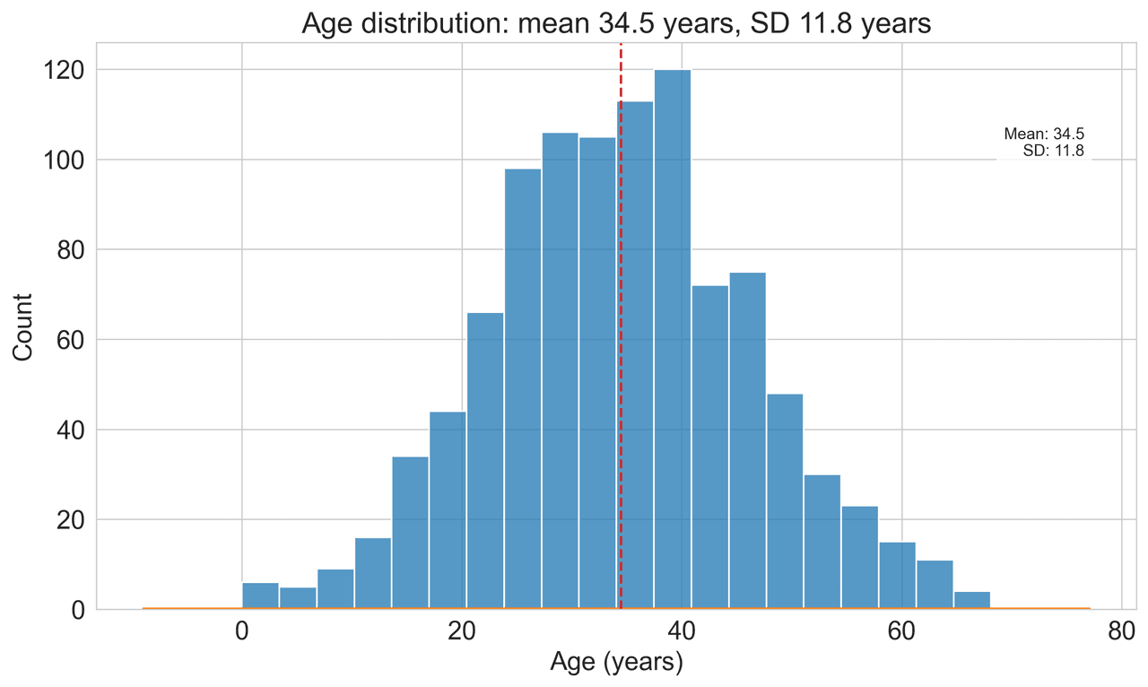
Histogram
Displays the distribution of numerical data by grouping values into bins.
Sample code / prompt
import matplotlib.pyplot as plt
import numpy as np
from scipy.stats import gaussian_kde, skewnorm

# Generate age data with slight right skew
np.random.seed(42)
ages = skewnorm.rvs(a=2, loc=42, scale=15, size=500)
ages = np.clip(ages, 18, 80)  # Clip to realistic range

fig, ax = plt.subplots(figsize=(12, 7)).png&w=1280&q=70)
Box and Whisker Plot
Displays data distribution using quartiles, median, and outliers in a standardized format.
Sample code / prompt
import numpy as np
import pandas as pd
import matplotlib.pyplot as plt
import seaborn as sns
from scipy import stats

# Generate gene expression data for 4 genotypes
np.random.seed(42)
genotypes = ['WT', 'KO1', 'KO2', 'Mutant']
n_per_group = 20
Heatmap
Represents data values as colors in a two-dimensional matrix format.
Sample code / prompt
import matplotlib.pyplot as plt
import seaborn as sns
import pandas as pd
import numpy as np

# Create correlation matrix for financial metrics
metrics = ['Revenue', 'Profit', 'Expenses', 'ROI', 'Customers', 'AOV', 'Marketing', 'Employees']
correlation_data = np.array([
    [1.00, 0.85, -0.45, 0.72, 0.88, 0.65, 0.72, 0.55],
    [0.85, 1.00, -0.78, 0.92, 0.75, 0.58, 0.63, 0.48],
Line Graph
Displays data points connected by straight line segments to show trends over time.
Sample code / prompt
import matplotlib.pyplot as plt
import numpy as np

# Generate temperature data for 3 major US cities over 12 months
months = ['Jan', 'Feb', 'Mar', 'Apr', 'May', 'Jun', 'Jul', 'Aug', 'Sep', 'Oct', 'Nov', 'Dec']
nyc = [30, 32, 40, 52, 65, 75, 82, 81, 74, 63, 50, 38]
miami = [65, 66, 70, 76, 82, 87, 90, 90, 87, 80, 72, 66]
chicago = [25, 27, 35, 48, 62, 72, 80, 79, 71, 60, 45, 32]

# Create figure with enhanced stylingStart Visualizing Your Data
Upload a CSV, describe what you want to see, and get publication-ready Python code instantly.
Technique guides scientists read next
scipy.signal.find_peaks guide
Tune prominence and width parameters for robust peak extraction.
Savitzky-Golay smoothing
Reduce noise while preserving peak shape and position.
PCA visualization workflow
Move from high-dimensional measurements to interpretable components.
ANOVA with post-hoc brackets
Add statistically correct pairwise significance annotations.
Found this helpful? Share it with your network.
Experimental Physicist & Photonics Researcher
Hands-on experience in silicon photonics, semiconductor fabrication (DRIE/ICP-RIE), optical simulation, and data-driven analysis. Built Plotivy to help researchers focus on discoveries instead of data struggles.
More about the authorVisualize your own data
Apply the techniques from this article to your own datasets. Upload CSV, Excel, or paste data directly.