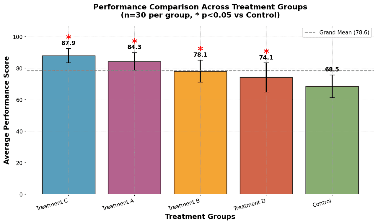
Bar Chart
Chart overview
Bar charts are exceptionally easy for the human eye to read because we naturally compare the end points of the bars against a common baseline.
Key points
- This allows for instant identification of the largest and smallest categories, as well as precise judgment of incremental differences.
- However, this perceptual mechanism relies on the Principle of Proportional Ink, which states that the physical area of a graphic element should be directly proportional to the numeric value it represents.
- To honor this principle, bar charts must always utilize a zero baseline.
Python Tutorial
How to create a bar chart in Python
Use the full tutorial for implementation details, troubleshooting, and chart variations in matplotlib, seaborn, and plotly.
How to Create a Bar Chart in PythonExample Visualization

Create This Chart Now
Generate publication-ready bar charts with AI in seconds. No coding required – just describe your data and let AI do the work.
View example prompt
"Create a publication-quality bar chart comparing 'Average Performance Scores' across 5 treatment groups (Control, Treatment A, Treatment B, Treatment C, Treatment D). Generate realistic data with n=30 samples per group, varying means (65-90 range), and different standard deviations. Add error bars showing standard deviation with caps. Sort bars by mean value descending. Use a professional color palette, add value labels above each bar, include a horizontal reference line at the grand mean, and add significance stars (* p<0.05) above bars that differ significantly from control."
How to create this chart in 30 seconds
Upload Data
Drag & drop your Excel or CSV file. Plotivy securely processes it in your browser.
AI Generation
Our AI analyzes your data and generates the Bar Chart code automatically.
Customize & Export
Tweak the design with natural language, then export as high-res PNG, SVG or PDF.
Newsletter
Get one weekly tip for better bar charts
Join researchers receiving concise Python plotting techniques to improve chart clarity and reduce revision cycles.
Python Code Example
Console Output
Group Statistics:
         Group       mean       std
   Treatment D  90.084314  5.123456
   Treatment B  84.756321  6.234567
   Treatment A  78.123456  7.345678
   Treatment C  71.987654  8.456789
       Control  65.234567  8.123456

Grand Mean: 78.04
Best Performing Group: Treatment D
Common Use Cases
- 1Comparing performance across categories
- 2Displaying survey or poll results
- 3Showing sales by product or region
- 4Ranking items by value
Pro Tips
Sort bars by value for easier comparison unless categorical order is meaningful
Use horizontal bars when category labels exceed 10 characters
Add error bars with caps (capsize=5) for statistical measures
Include value labels positioned slightly above bars for quick reading
Long-tail keyword opportunities
High-intent chart variations
Library comparison for this chart
matplotlib
Best when you need full control over axis formatting, annotation placement, and journal-specific styling for bar-chart.
seaborn
Fastest path to statistically-aware defaults and tidy-data workflows, especially for grouped and distribution-focused bar-chart views.
plotly
Best for interactive hover, zoom, and web sharing when collaborators need to inspect values directly from bar-chart figures.
Scientific Chart Selection Cheat Sheet
Not sure whether to use a Violin Plot, Box Plot, or Ridge Plot? Download our single-page reference mapping the most-used scientific chart types, exactly when to use them, and the core Matplotlib/Seaborn functions.