Statistical Analysis Figures for Biologists: T-Tests, ANOVA, Dose-Response, and P-Value Annotation in Python

You already know the statistics. The t-test, the one-way ANOVA, the post-hoc comparison - those are settled. What keeps you stuck for hours is the figure. Specifically: drawing those significance brackets connecting two bars, annotating them with asterisks, stacking multiple comparisons at different heights so they don't overlap, and getting the whole thing into a format that reviewers for Cell, Nature Methods, or PLOS Biology will accept without revision requests.
This guide covers the six most common statistical figure types in biology research. Every section includes complete, runnable Python code you can adapt to your own data. If you want to skip the manual coding, you can generate these figures with Plotivy in a few minutes instead.
What You'll Learn
1.What This Guide Covers
2.The Biology Stats Figure Problem
3.Six Common Statistical Figures in Biology
4.Error Bars: The Definitive Guide for Biologists
5.P-Value Annotation: Complete Reference
6.Plotivy for Biology Statistics Figures
What This Guide Covers
- Grouped Bar Chart with Error Bars and Significance Brackets
- Strip / Dot Plot with Summary Statistics
- Box Plot with Overlaid Individual Data Points
- Dose-Response Curve with EC50 Annotation
- Correlation Scatter with Regression Line and CI Band
- Volcano Plot for Omics Data
- Error Bars: SD vs. SEM vs. 95% CI - The Definitive Reference
- P-Value Annotation: Manual Brackets, statannotations, and pingouin
1. The Biology Stats Figure Problem
The statistics are not the bottleneck. A biologist running a t-test or a one-way ANOVA in Python takes five lines of code with SciPy. The bottleneck is making the figure that communicates those results in a way that peer reviewers accept.
The specific pain point is the significance bracket: a horizontal line connecting two bars or groups, annotated with asterisks or an exact p-value. GraphPad Prism draws these automatically. Matplotlib does not. You end up hand-positioning lines and text, fighting with coordinate systems, and spending two hours on what should be a five-minute task.
This guide solves that. Every code block below is complete - paste it into a script, run it, and get a publication-ready figure. No missing imports, no placeholder data, no "exercise left to the reader."
2. Six Common Statistical Figures in Biology
2a. Grouped Bar Chart with Error Bars and Significance Brackets
This is the figure that every biology paper needs and that causes the most grief in Python. The code below draws a grouped bar chart with SEM error bars and three significance brackets at staggered heights. The helper function draw_bracket handles the line geometry and text placement so you never have to calculate pixel offsets manually again.
How the bracket system works: Each bracket is defined by two x-positions (the bars it connects), a height (the y-coordinate of the horizontal line), and the annotation text. The function draws a U-shaped connector - two short vertical drop-down lines and one horizontal span - then centers the text above the horizontal line. When you have multiple comparisons, you stack brackets by incrementing the height parameter.
Plotivy prompt: "Grouped bar chart with SEM error bars for three treatment groups. Add significance brackets with p-value stars between Control vs Drug A, Control vs Drug B, and Drug A vs Drug B. Style for journal submission."
The key detail is stacking height. When brackets overlap, increase the y parameter for each subsequent bracket. A common convention is to place the widest comparison (spanning the most bars) on top and shorter comparisons below. The drop variable controls how far the vertical ticks extend downward - 0.1 to 0.2 works for most axis scales.
2b. Strip / Dot Plot with Summary Statistics
Bar charts hide the distribution. When your sample size is small (n less than 30, which is most biology experiments), reviewers increasingly prefer seeing every data point. A strip plot with a mean +/- SD overlay gives them both the individual values and the summary statistics. This approach combines seaborn for the dot jitter and matplotlib for the error bars.
When to use instead of a bar chart: Any time your n per group is below 20, or when you expect a non-normal distribution (e.g., gene expression with outliers). Bar charts obscure bimodal distributions and outliers. The dot plot shows everything.
2c. Box Plot with Overlaid Data Points
The box plot gives you median, IQR, and whiskers in one glyph. Overlaying the individual points satisfies reviewers who want to see the raw data while retaining the distributional summary. Use showfliers=False on the box plot since the overlaid points already show outliers.
Plotivy prompt: "Box plot with overlaid individual data points for three conditions. White boxes, red median line, gray data points with jitter."
2d. Dose-Response Curve with EC50 Annotation
The dose-response curve is foundational in pharmacology and toxicology. The standard model is the four-parameter logistic (Hill equation), and the figure must show a log-scaled x-axis, the fitted sigmoid, the EC50 marked with an annotation or dashed line, and the individual replicates as scatter points. SciPy's curve_fit handles the nonlinear regression.
Common reviewer feedback on dose-response figures: (1) Missing log scale on x-axis. (2) EC50 not annotated on the figure. (3) Individual replicates not shown, only mean curve. The code above addresses all three.
2e. Correlation Scatter with Regression Line and CI Band
When reporting a linear regression between two continuous variables - protein levels vs. cell count, body weight vs. organ mass - the standard figure shows the scatter, the best-fit line, the 95% confidence band, and the Pearson or Spearman statistics annotated on the plot. The code below generates all of this with statsmodels for the CI prediction.
Use Pearson when both variables are approximately normally distributed and you expect a linear relationship. Use Spearman when the data are ranked, ordinal, or non-linear. In either case, report the correlation coefficient, the p-value, and the sample size in the figure or its caption.
2f. Volcano Plot for Omics Data
Try it
Try it now: turn this method into your next figure
Apply the same approach to your own dataset and generate clean, publication-ready code and plots in minutes.
Open in Plotivy Analyze →Newsletter
Get a weekly Python plotting tip
One concise tip each week for cleaner, faster scientific figures. Built for researchers who publish.
The volcano plot is the standard visualization for differential expression analysis - RNA-seq, proteomics, metabolomics. It plots log2 fold change on the x-axis against -log10 adjusted p-value on the y-axis. Genes or proteins exceeding both thresholds are colored and optionally labeled. Understanding dimensionality reduction via PCA alongside volcano plots gives a comprehensive view of omics datasets.
Plotivy prompt: "Volcano plot from differential expression results. Color upregulated genes red, downregulated blue. Add threshold lines at log2FC = +/-1 and p = 0.05. Label the top 5 most significant genes."
3. Error Bars: The Definitive Guide for Biologists
Error bars are the single most misunderstood element in biology figures. A survey published in The Journal of Cell Biology found that the majority of published papers do not specify whether error bars represent SD, SEM, or CI, and many reviewers cannot distinguish between them visually. Getting this wrong can misrepresent your data and trigger revision requests - or worse, post-publication corrections.
SD vs. SEM vs. 95% CI
Standard Deviation (SD) describes the spread of individual observations. Use it when your message is "this is how variable the biological system is." SD does not shrink as you collect more data - it characterizes the population. Most biology journals recommend SD for descriptive figures.
Standard Error of the Mean (SEM) describes the precision of your estimate of the mean. It equals SD / sqrt(n), so it shrinks as your sample size grows. This makes SEM bars look impressively tight, which is why they are overused. SEM is appropriate when your figure is specifically about the precision of the mean estimate, not about biological variability. If you use SEM to make noisy data look cleaner, reviewers and readers who understand statistics will notice.
95% Confidence Interval (CI) gives a range that has a 95% probability of containing the true population mean. For normally distributed data, this is approximately mean +/- 1.96 * SEM. Use 95% CI when you want readers to evaluate whether two group means are likely to differ - if the CIs do not overlap, the difference is roughly significant at the 0.05 level (though this is an approximation, not a formal test).
- Use SD when showing biological variability (most common in biology)
- Use SEM only when your question is specifically about the precision of the mean
- Use 95% CI when readers need to visually assess significance between groups
- Always state which one you used in the figure caption - no exceptions
Journal Policies on Error Bars
Nature and the Nature family journals require the figure caption to state n, the statistical test, and whether error bars represent SD, SEM, or CI. Cell has the same policy. PLOS Biology recommends SD for describing variability and mandates that the type of error bar be specified. eLife asks for individual data points wherever possible, making error bars secondary. No major biology journal accepts unlabeled error bars.
The Exact Matplotlib Arguments
Key matplotlib parameters: yerr accepts a single value (symmetric) or a 2xN array (asymmetric). capsize controls the width of the horizontal caps. error_kw passes keyword arguments to the error bar lines (linewidth, color, etc.).
4. P-Value Annotation: Complete Reference
Standard Notation
ns- not significant (p >= 0.05)*- p < 0.05**- p < 0.01***- p < 0.001****- p < 0.0001 (used by some journals, e.g., GraphPad convention)- Exact p-values: Increasingly preferred by journals. Write
p = 0.003instead of**when space allows.
Journal-Specific Conventions
Nature prefers exact p-values in figures and captions. Cell accepts asterisk notation but requires the threshold definitions in the caption (e.g., "*p < 0.05, **p < 0.01, ***p < 0.001"). PLOS Biology allows either format but mandates that the statistical test be named. Science prefers exact p-values. When in doubt, check the journal's author formatting guide - most have a statistics section.
Approach 1: Manual Bracket Drawing (Full Control)
The manual approach gives you complete control over bracket placement, style, and annotation. This is what was demonstrated in section 2a. Here is a refined, reusable version of the bracket function that handles edge cases:
Approach 2: statannotations Library
The statannotations package automates bracket placement for seaborn plots. Install it with pip install statannotations. It handles height stacking, multiple comparisons, and several statistical tests natively. The trade-off is less visual control compared to the manual approach.
Approach 3: pingouin for Statistics + Manual Plotting
pingouin is a statistics library designed for researchers who want clean, pandas-style output. Use it where you need effect sizes, Bayesian factors, or multiple comparison corrections, then feed the p-values into the manual bracket function above.
The workflow: run the test in pingouin, extract the corrected p-values, convert them to star notation with the p_to_stars function from section 2a, then annotate your figure with the manual bracket function. This gives you the statistical rigor of a dedicated library with full control over the figure.
5. Plotivy for Biology Statistics Figures
Everything above works. It also takes time - typically 1 to 2 hours per figure when you factor in debugging bracket positions, looking up matplotlib arguments, and tweaking axis limits. Plotivy can generate most of these figures from a natural language prompt in under a minute.
Three Prompt Examples
Prompt 1 (bar chart with brackets):
"Bar chart comparing expression levels of three genotypes (WT, KO, Rescue) with SEM error bars. Add significance brackets: WT vs KO (***), WT vs Rescue (ns), KO vs Rescue (**). Publication-ready, no gridlines, remove top and right spines."
Prompt 2 (dose-response):
"Dose-response curve from my uploaded data. Fit a 4-parameter Hill equation. Log x-axis. Annotate the EC50 with a dashed vertical line and text label. Show individual data points as black circles."
Prompt 3 (volcano plot):
"Volcano plot from my differential expression CSV. Color significant upregulated genes red and downregulated blue. Add dashed threshold lines at log2FC = +/-1 and p = 0.05. Label the top 10 genes by significance."
Before and After
Manual approach: Write the statistical test code (5 min). Write the base plot (10 min). Debug bracket positions - this is where the time goes - adjusting heights, fixing overlaps, getting the text centered (30-90 min). Format for journal submission: font sizes, DPI, spine removal, legend placement (15-30 min). Total: approximately 1-2 hours per figure.
With Plotivy: Upload your data. Describe the figure in plain English. Get a complete, editable plot in about 15 minutes including any tweaks. The generated code is real matplotlib/plotly code that you can inspect, modify, and include in your paper's supplementary materials for reproducibility.
Honest Capabilities
Plotivy handles standard statistical figures well: bar charts, dot plots, box plots, scatter plots, dose-response curves, volcano plots, and heatmaps. It generates significance brackets, error bars (SD, SEM, or CI), and regression annotations. It does not replace your statistical judgment - you still need to choose the right test, verify assumptions, and interpret results. What it removes is the mechanical labor of translating statistical results into properly formatted figures. For the specialized demands of survival analysis ( ROC curves, Kaplan-Meier), check the clinical research figures guide.
Chart gallery
Biology Chart Templates
Explore chart types tailored for biological and statistical data.
.png&w=1280&q=70)
Box and Whisker Plot
Displays data distribution using quartiles, median, and outliers in a standardized format.
Sample code / prompt
import numpy as np
import pandas as pd
import matplotlib.pyplot as plt
import seaborn as sns
from scipy import stats

# Generate gene expression data for 4 genotypes
np.random.seed(42)
genotypes = ['WT', 'KO1', 'KO2', 'Mutant']
n_per_group = 20
Bar Chart
Compares categorical data using rectangular bars with heights proportional to values.
Sample code / prompt
import numpy as np
import pandas as pd
import matplotlib.pyplot as plt
import seaborn as sns
from scipy import stats

# Generate performance scores for 5 treatment groups
np.random.seed(42)
groups = ['Control', 'Treatment A', 'Treatment B', 'Treatment C', 'Treatment D']
n_samples = 30
Scatterplot
Displays values for two variables as points on a Cartesian coordinate system.
Sample code / prompt
import matplotlib.pyplot as plt
import numpy as np
from scipy import stats
import pandas as pd

# Generate sample data
np.random.seed(42)
n_samples = 200
height = np.random.normal(170, 8, n_samples)
weight = height * 0.6 + np.random.normal(0, 8, n_samples) - 50
Violin Plot
Combines box plots with kernel density to show distribution shape across groups.
Sample code / prompt
import matplotlib.pyplot as plt
import seaborn as sns
import pandas as pd
import numpy as np
from scipy.stats import f_oneway

# Generate exam score data for 3 groups
np.random.seed(42)
control = np.random.normal(72, 12, 50)
treatment_a = np.random.normal(78, 10, 50)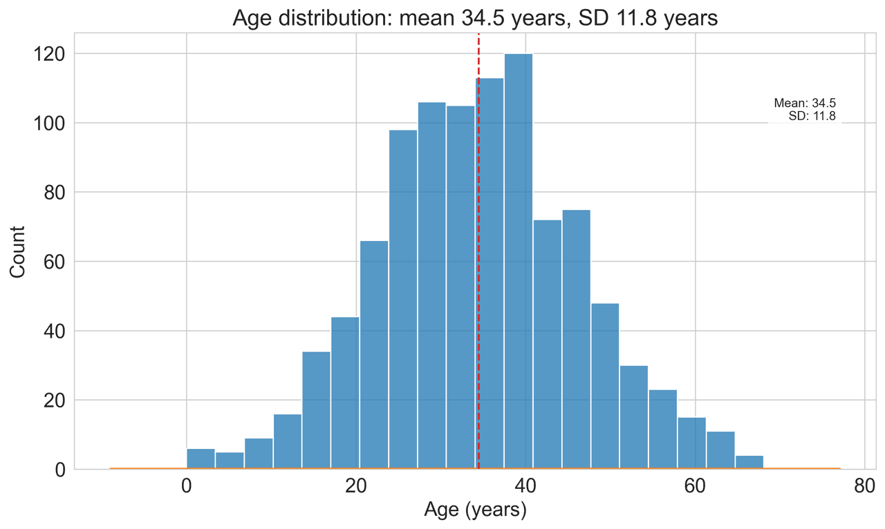
Histogram
Displays the distribution of numerical data by grouping values into bins.
Sample code / prompt
import matplotlib.pyplot as plt
import numpy as np
from scipy.stats import gaussian_kde, skewnorm

# Generate age data with slight right skew
np.random.seed(42)
ages = skewnorm.rvs(a=2, loc=42, scale=15, size=500)
ages = np.clip(ages, 18, 80)  # Clip to realistic range

fig, ax = plt.subplots(figsize=(12, 7))Stop Debugging Bracket Positions
Upload your data and describe the figure you need. Plotivy generates publication-ready statistical figures with significance annotations in minutes.
Start CreatingTechnique guides scientists read next
scipy.signal.find_peaks guide
Tune prominence and width parameters for robust peak extraction.
Savitzky-Golay smoothing
Reduce noise while preserving peak shape and position.
PCA visualization workflow
Move from high-dimensional measurements to interpretable components.
ANOVA with post-hoc brackets
Add statistically correct pairwise significance annotations.
Found this helpful? Share it with your network.
Experimental Physicist & Photonics Researcher
Hands-on experience in silicon photonics, semiconductor fabrication (DRIE/ICP-RIE), optical simulation, and data-driven analysis. Built Plotivy to help researchers focus on discoveries instead of data struggles.
More about the authorVisualize your own data
Apply the techniques from this article to your own datasets. Upload CSV, Excel, or paste data directly.