The Scientific Visualization Landscape: Competitor Analysis & Market Gaps

The scientific visualization market is worth $4.5B and growing 8% annually. But most researchers still use Excel or expensive desktop software from the 2000s. Here is the full competitive landscape and the gaps no one is filling.
In This Analysis
0.Live Code: Market Comparison Figure
1.Market Landscape (2026)
2.Legacy Desktop Tools
3.Code-Based Platforms
4.AI-Powered Entrants
5.Market Gaps & Opportunities
0. Live Code: Market Comparison Figure
Radar chart comparing 5 tools across 6 dimensions. Edit the scores and re-run to build your own competitive analysis.
Preparing preview
Running once automatically on first load
Learn by Experimenting
This is a safe playground for learning! Try changing:
- • Colors: Modify color values to see different palettes
- • Numbers: Adjust sizes, positions, or data ranges
- • Labels: Update titles, axis names, or legends
Edit the code, run it, then open the full data visualization tool to continue with your own dataset.
1. Market Landscape (2026)
| Tool | Category | Price | Est. Users |
|---|---|---|---|
| Excel | Spreadsheet | $150+/yr | 800M+ |
| GraphPad Prism | Desktop | $255-595/yr | 500K+ |
| OriginPro | Desktop | $1,095+ | 200K+ |
| MATLAB | IDE | $800+/yr | 4M+ |
| R + ggplot2 | Code | Free | 2M+ |
| Python + matplotlib | Code | Free | 10M+ |
| Julius AI | AI SaaS | $20-99/mo | 100K+ |
| Plotivy | AI + Code | Free tier | Growing |
2. Legacy Desktop Tools
Try it
Try it now: turn this method into your next figure
Apply the same approach to your own dataset and generate clean, publication-ready code and plots in minutes.
Open in Plotivy Analyze →Newsletter
Get a weekly Python plotting tip
One concise tip each week for cleaner, faster scientific figures. Built for researchers who publish.
OriginPro
Strengths: 100+ chart types, advanced curve fitting, batch processing
Weaknesses: Windows-only, $1,095+, dated UI, click-based workflow
Dominant in physics, materials science, engineering
GraphPad Prism
Strengths: Guided stats wizard, dose-response curves, clean interface
Weaknesses: $255+/yr, limited chart customization, no multi-panel layouts
Dominant in biomedical and pharmaceutical research
3. Code-Based Platforms
The open-source advantage
R and Python are free, infinitely customizable, and fully reproducible. They dominate in academia and data science. But they require programming knowledge that most researchers lack.
70%
of data science jobs require Python
20K+
packages on CRAN (R ecosystem)
13M+
monthly matplotlib downloads
4. AI-Powered Entrants
ChatGPT + Code Interpreter
Approach: General-purpose AI generates plotting code from natural language. User copies code to local environment.
Gap: No iterative editing. Not purpose-built for scientific figures.
Julius AI
Approach: Conversational data analysis SaaS. Upload data, ask questions, get charts. Hides code from user.
Gap: No code editing. Limited export quality. $20-99/mo.
Plotivy
Approach: AI generates publication-ready Python code. User edits in Monaco editor and re-runs. Export at 300-1200 DPI.
Gap: Newer platform. Building feature parity with legacy tools.
5. Market Gaps & Opportunities
Code + GUI hybrid
Researchers want the flexibility of code with the approachability of a GUI. No tool fully delivers this.
Cross-platform reproducibility
OriginPro is Windows-only. Prism has limited Mac support. Browser-based tools have an advantage.
AI + domain knowledge
Generic AI lacks knowledge of journal-specific requirements (DPI, fonts, dimensions).
Affordable multi-panel figures
Creating 4-panel publication layouts costs $1,000+ in desktop tools or hours in matplotlib.
Chart gallery
What Modern Scientific Viz Looks Like
50+ chart types generated with AI, editable with code, exported at publication DPI.

Radar Chart
Displays multivariate data on axes starting from a central point.
Sample code / prompt
import numpy as np
import matplotlib.pyplot as plt
from matplotlib.patches import Circle
import pandas as pd

# EV Model comparison data (0-100 scale)
categories = ['Range', 'Acceleration', 'Charging Speed',
              'Interior Quality', 'Technology', 'Value']
tesla_scores = [85, 90, 88, 70, 95, 80]
bmw_scores = [70, 80, 75, 90, 85, 65]
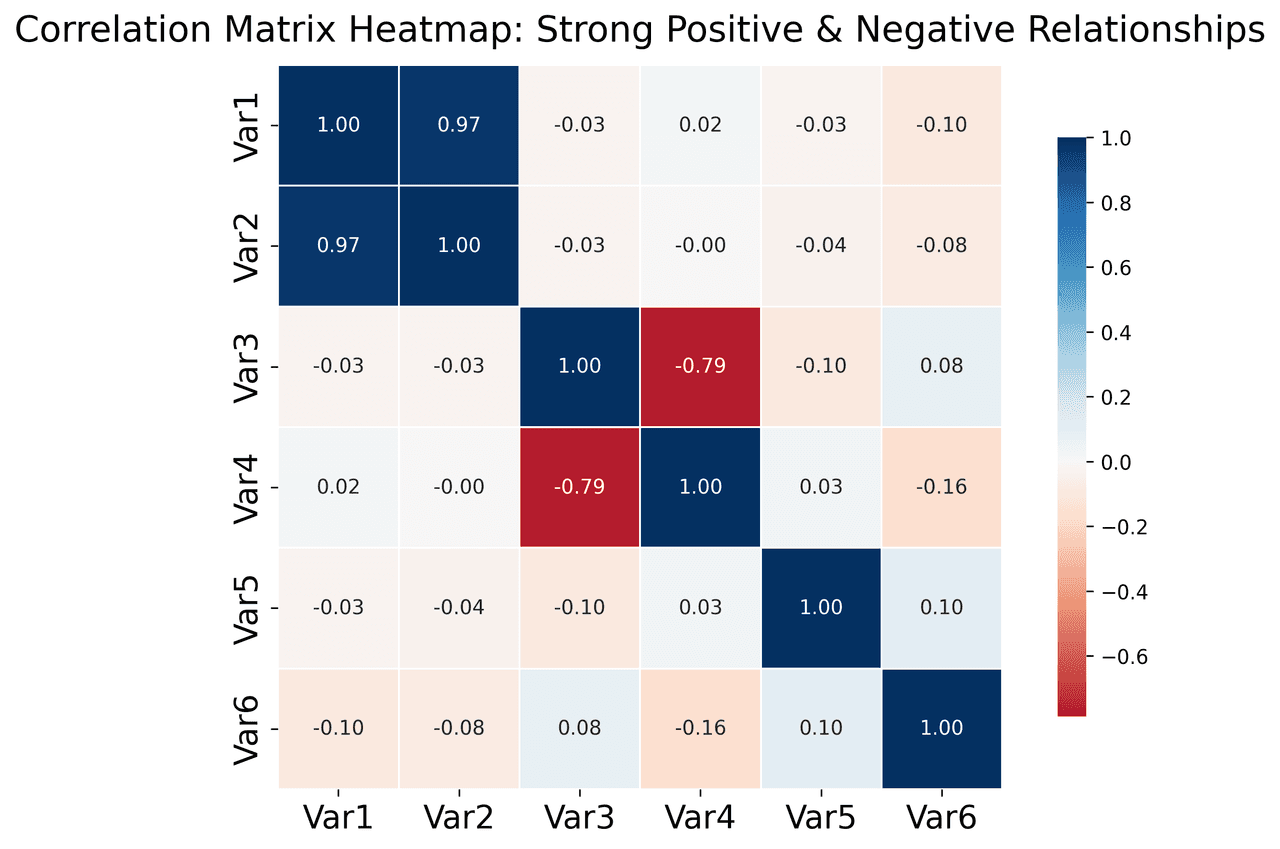
Heatmap
Represents data values as colors in a two-dimensional matrix format.
Sample code / prompt
import matplotlib.pyplot as plt
import seaborn as sns
import pandas as pd
import numpy as np

# Create correlation matrix for financial metrics
metrics = ['Revenue', 'Profit', 'Expenses', 'ROI', 'Customers', 'AOV', 'Marketing', 'Employees']
correlation_data = np.array([
    [1.00, 0.85, -0.45, 0.72, 0.88, 0.65, 0.72, 0.55],
    [0.85, 1.00, -0.78, 0.92, 0.75, 0.58, 0.63, 0.48],
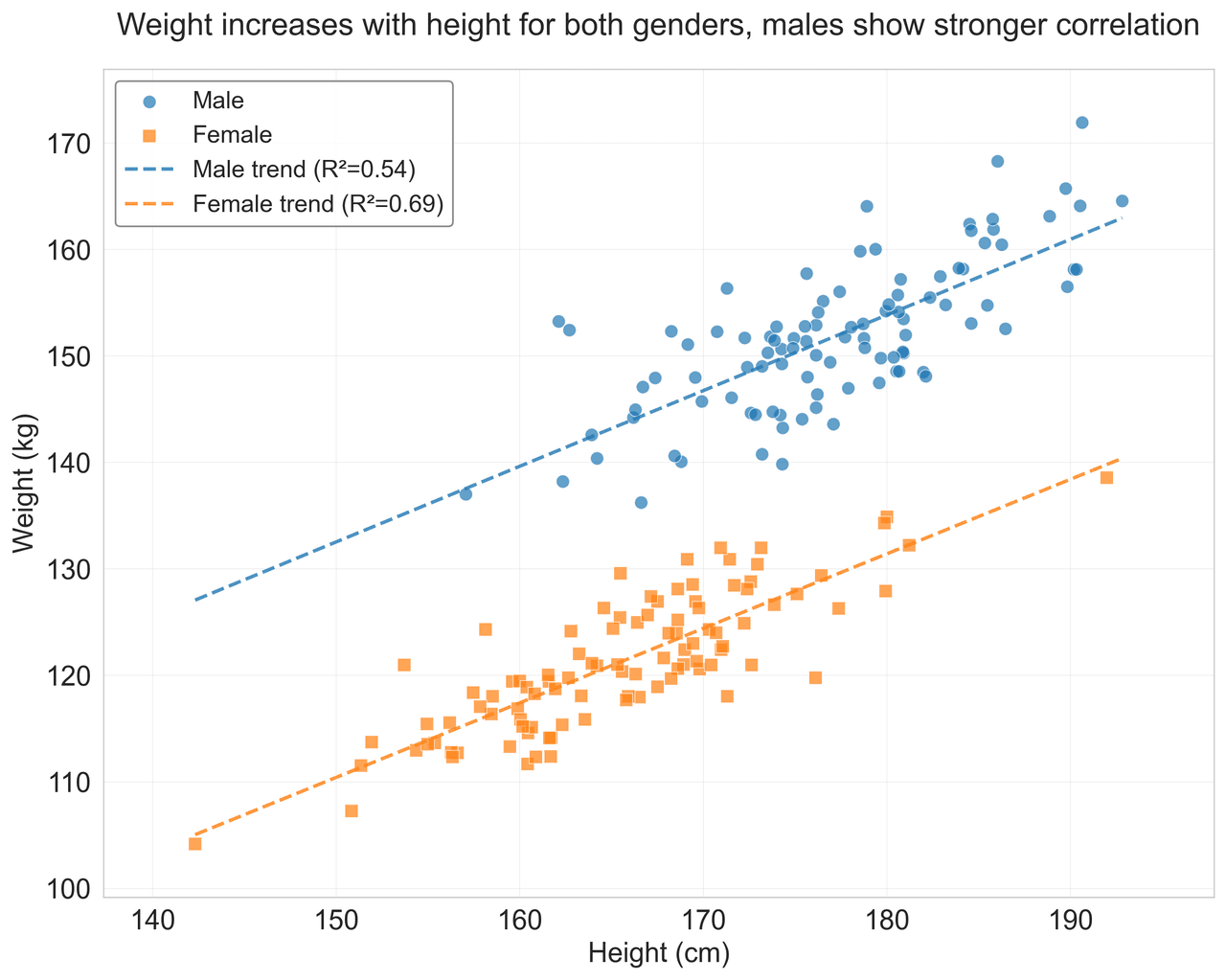
Scatterplot
Displays values for two variables as points on a Cartesian coordinate system.
Sample code / prompt
import matplotlib.pyplot as plt
import numpy as np
from scipy import stats
import pandas as pd

# Generate sample data
np.random.seed(42)
n_samples = 200
height = np.random.normal(170, 8, n_samples)
weight = height * 0.6 + np.random.normal(0, 8, n_samples) - 50
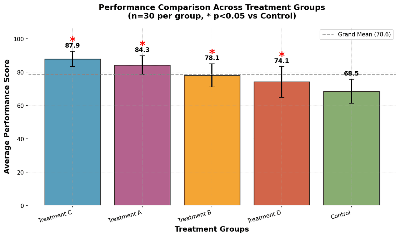
Bar Chart
Compares categorical data using rectangular bars with heights proportional to values.
Sample code / prompt
import numpy as np
import pandas as pd
import matplotlib.pyplot as plt
import seaborn as sns
from scipy import stats

# Generate performance scores for 5 treatment groups
np.random.seed(42)
groups = ['Control', 'Treatment A', 'Treatment B', 'Treatment C', 'Treatment D']
n_samples = 30
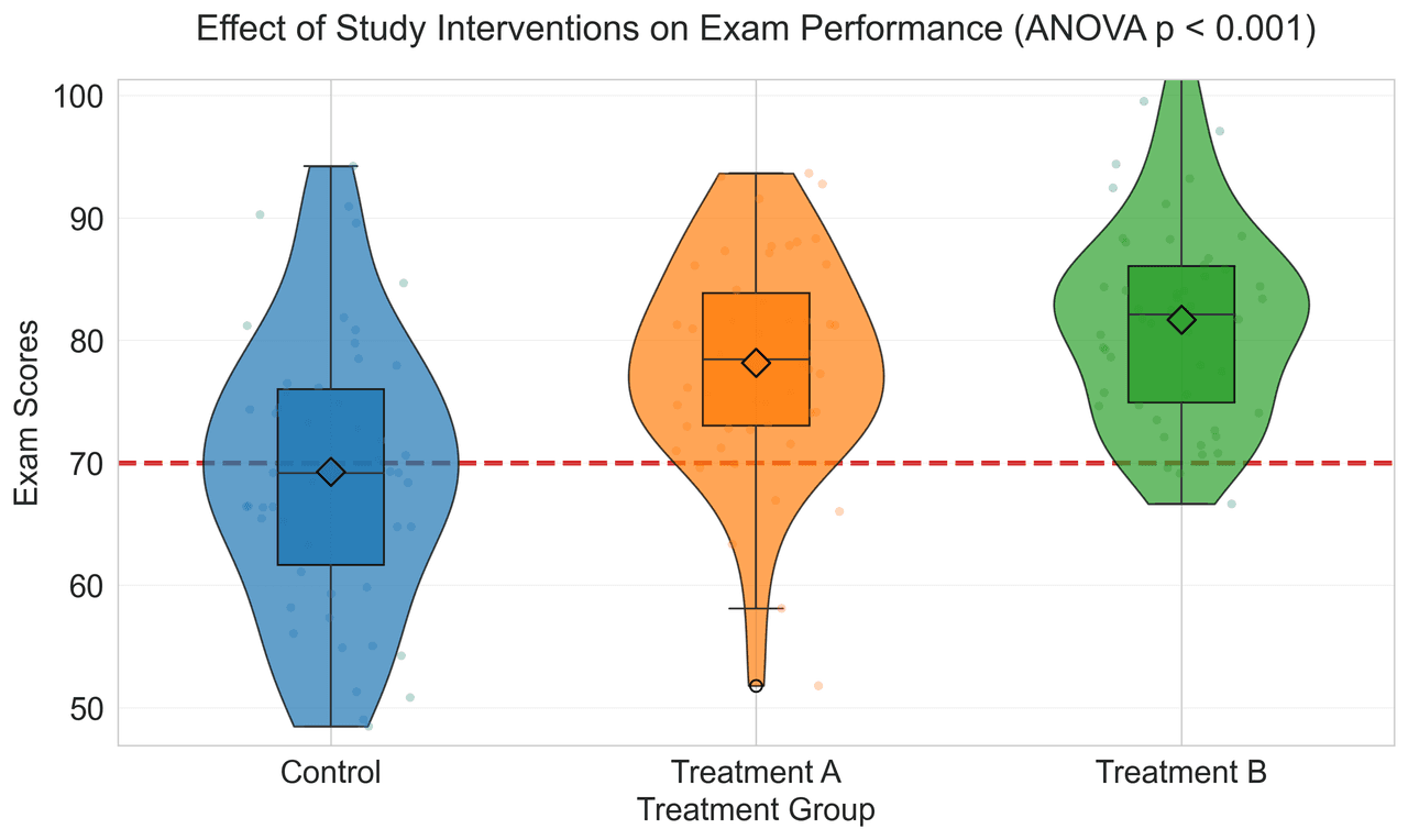
Violin Plot
Combines box plots with kernel density to show distribution shape across groups.
Sample code / prompt
import matplotlib.pyplot as plt
import seaborn as sns
import pandas as pd
import numpy as np
from scipy.stats import f_oneway

# Generate exam score data for 3 groups
np.random.seed(42)
control = np.random.normal(72, 12, 50)
treatment_a = np.random.normal(78, 10, 50)
Sankey Diagram
Flow diagram where arrow widths are proportional to flow quantities.
Sample code / prompt
import plotly.graph_objects as go

# US Energy Flow Data (Quadrillion BTU)
sources = ['Coal', 'Natural Gas', 'Petroleum', 'Nuclear', 'Renewables']
source_values = [11, 32, 35, 8, 12]

transforms = ['Electricity Gen.', 'Direct Use', 'Rejected Energy']
end_uses = ['Residential', 'Commercial', 'Industrial', 'Transportation']

# Define flows: source -> transform/enduseThe Tool That Fills the Gap
AI generation + editable code + publication export. Free to start.
Technique guides scientists read next
scipy.signal.find_peaks guide
Tune prominence and width parameters for robust peak extraction.
Savitzky-Golay smoothing
Reduce noise while preserving peak shape and position.
PCA visualization workflow
Move from high-dimensional measurements to interpretable components.
ANOVA with post-hoc brackets
Add statistically correct pairwise significance annotations.
Found this helpful? Share it with your network.
Experimental Physicist & Photonics Researcher
Hands-on experience in silicon photonics, semiconductor fabrication (DRIE/ICP-RIE), optical simulation, and data-driven analysis. Built Plotivy to help researchers focus on discoveries instead of data struggles.
More about the authorVisualize your own data
Apply the techniques from this article to your own datasets. Upload CSV, Excel, or paste data directly.