Population Pyramid
Chart overview
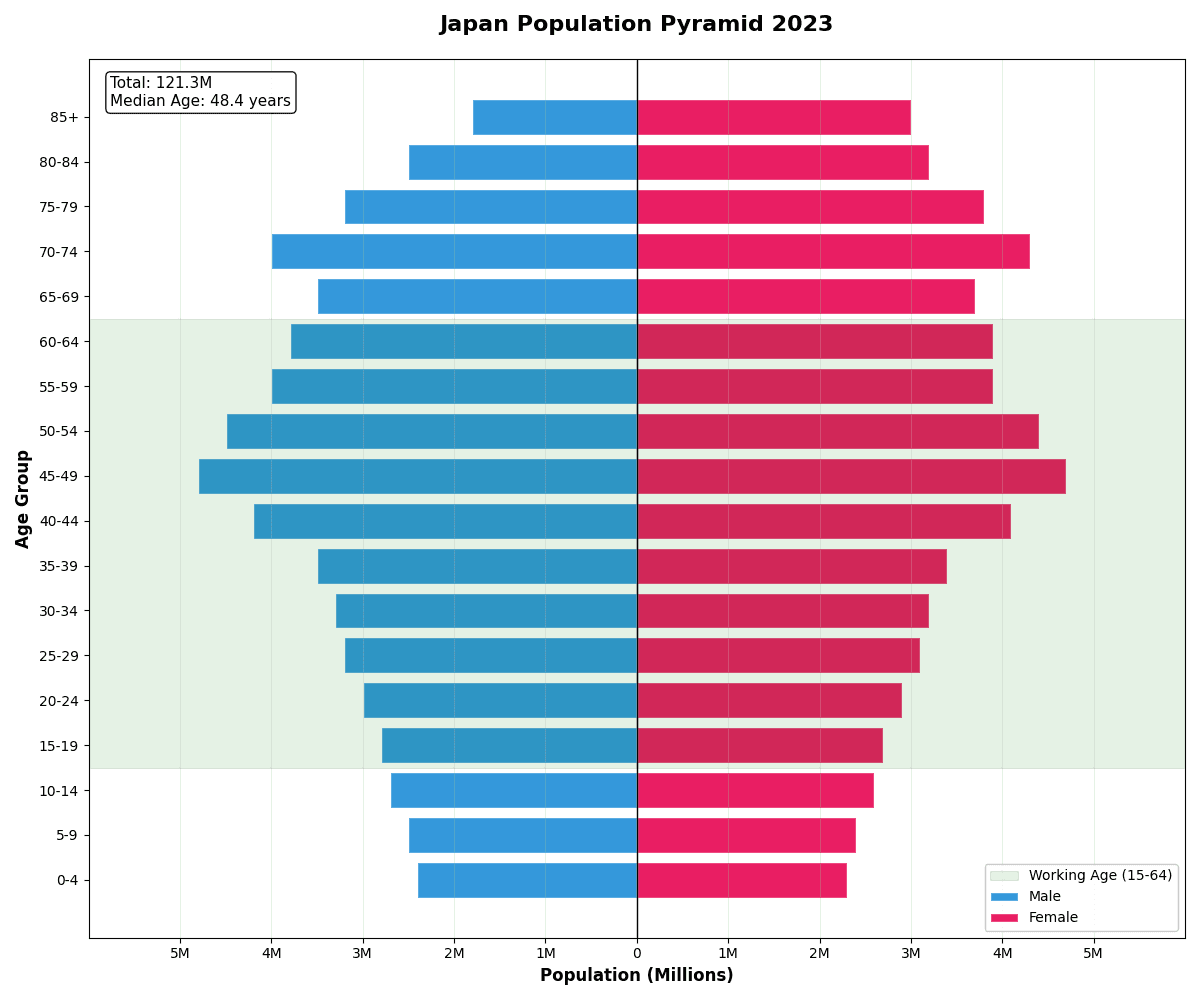
Population pyramids display age-sex distribution with males on one side and females on the other.
Key points
- The shape reveals demographic patterns: expansive (young population), constrictive (aging population), or stationary.
- They are essential for demographic analysis, healthcare planning, and policy development.
- Build one in matplotlib with two horizontal barh series - negate one side's values so it extends left, then relabel the x-axis with absolute numbers (a FuncFormatter that prints abs(value)) so readers never see minus signs.
Practical guidance
Keep age bins identical on both sides and order them youngest-to-oldest from the bottom, since the pyramid reading depends on that convention. Percent-of-total scaling usually beats raw counts when comparing two populations of different sizes - plot two pyramids side by side, or overlay one as a step outline over filled bars for a before/after comparison. Pitfalls: unequal bin widths (a 0-14 bin followed by 5-year bins) silently distort the shape; truncating the open-ended top bin (85+) hides exactly the aging structure most analyses care about; and extra colors add nothing beyond the two sexes - reserve hue for highlighting one cohort of interest, such as working-age population.
Create a Population Pyramid with your data using AI — no coding required.
Python Tutorial
How to create a population pyramid in Python
Use the full tutorial for implementation details, troubleshooting, and chart variations in matplotlib, seaborn, and plotly.
Complete Guide to Scientific Data VisualizationExample Visualization
Create This Chart Now
Generate publication-ready population pyramids with AI in seconds. No coding required – just describe your data and let AI do the work.
View example prompt
"Create a population pyramid showing the 'Age Distribution' of Japan's population by gender. Generate realistic demographic data for 18 age groups (0-4, 5-9, ..., 80-84, 85+) in millions: younger groups smaller (reflecting low birth rate), bulge at 45-54 (baby boomers), and significant 65+ population. Males on left (blue), Females on right (pink). X-axis shows population in millions (symmetric scale). Y-axis shows age groups. Add a vertical center line. Highlight the 'working age' population (15-64) with a subtle background shade. Include annotations for median age (48.4 years), dependency ratio, and total population. Title: 'Japan Population Pyramid 2023'."
How to create this chart in 30 seconds
Upload Data
Drag & drop your Excel or CSV file. Plotivy securely processes it in your browser.
AI Generation
Our AI analyzes your data and generates the Population Pyramid code automatically.
Customize & Export
Tweak the design with natural language, then export as high-res PNG, SVG or PDF.
Newsletter
Get one weekly tip for better population pyramids
Join researchers receiving concise Python plotting techniques to improve chart clarity and reduce revision cycles.
Python Code Example
# === IMPORTS ===
import numpy as np
import matplotlib.pyplot as plt

# === USER-EDITABLE PARAMETERS ===
title = "Japan Population Pyramid 2023"
figsize = (12, 10)

# === EXAMPLE DATASET ===
# Age groups and population data (in millions)
age_groups = ['0-4', '5-9', '10-14', '15-19', '20-24', '25-29', '30-34', '35-39',
              '40-44', '45-49', '50-54', '55-59', '60-64', '65-69', '70-74',
              '75-79', '80-84', '85+']

# Japan-style pyramid: aging population with bulge at 45-54
male_pop = [2.4, 2.5, 2.7, 2.8, 3.0, 3.2, 3.3, 3.5,
            4.2, 4.8, 4.5, 4.0, 3.8, 3.5, 4.0,
            3.2, 2.5, 1.8]
female_pop = [2.3, 2.4, 2.6, 2.7, 2.9, 3.1, 3.2, 3.4,
              4.1, 4.7, 4.4, 3.9, 3.9, 3.7, 4.3,
              3.8, 3.2, 3.0]

# Print summary
total_pop = sum(male_pop) + sum(female_pop)
working_age_male = sum(male_pop[3:13])  # 15-64
working_age_female = sum(female_pop[3:13])
elderly_pop = sum(male_pop[13:]) + sum(female_pop[13:])

print("=== Japan Population Statistics ===")
print(f"\nTotal Population: {total_pop:.1f}M")
print(f"Male: {sum(male_pop):.1f}M | Female: {sum(female_pop):.1f}M")
print(f"Working Age (15-64): {working_age_male + working_age_female:.1f}M")
print(f"Elderly (65+): {elderly_pop:.1f}M ({elderly_pop/total_pop*100:.1f}%)")
print(f"Dependency Ratio: {(total_pop - working_age_male - working_age_female) / (working_age_male + working_age_female) * 100:.1f}%")

# === CREATE POPULATION PYRAMID ===
fig, ax = plt.subplots(figsize=figsize)

y_pos = np.arange(len(age_groups))

# Male bars (left side - negative values)
ax.barh(y_pos, [-m for m in male_pop], color='#3498db', edgecolor='white',
        label='Male', height=0.8)
# Female bars (right side - positive values)
ax.barh(y_pos, female_pop, color='#e91e63', edgecolor='white',
        label='Female', height=0.8)

# Center line
ax.axvline(x=0, color='black', linewidth=1)

# Highlight working age (15-64) with background
ax.axhspan(2.5, 12.5, alpha=0.1, color='green', label='Working Age (15-64)')

# Labels
ax.set_yticks(y_pos)
ax.set_yticklabels(age_groups)
ax.set_xlabel('Population (Millions)', fontsize=12, fontweight='bold')
ax.set_ylabel('Age Group', fontsize=12, fontweight='bold')
ax.set_title(title, fontsize=16, fontweight='bold', pad=20)

# X-axis: show absolute values
ax.set_xlim(-6, 6)
ax.set_xticks([-5, -4, -3, -2, -1, 0, 1, 2, 3, 4, 5])
ax.set_xticklabels(['5M', '4M', '3M', '2M', '1M', '0', '1M', '2M', '3M', '4M', '5M'])

# Legend
ax.legend(loc='lower right', framealpha=0.9)

# Add annotations
ax.annotate(f'Total: {total_pop:.1f}M\nMedian Age: 48.4 years',
            xy=(0.02, 0.98), xycoords='axes fraction',
            fontsize=11, verticalalignment='top',
            bbox=dict(boxstyle='round', facecolor='white', alpha=0.9))

ax.grid(True, alpha=0.3, axis='x')

plt.tight_layout()
plt.show()
# END-OF-CODE
Opens the Analyze page with this code pre-loaded and ready to execute
Console Output
Total Population: 115.0 million
Male Population: 57.0M (49.6%)
Female Population: 58.0M (50.4%)
Median Age: 48.4 years
Dependency Ratio: 73.8%
Common Use Cases
- 1Census data visualization
- 2Healthcare resource planning
- 3Market demographic analysis
- 4Social policy development
Pro Tips
Use consistent age brackets (5 or 10 years)
Mirror the axes for symmetry
Add median age line for context
Frequently asked questions
When should you use a population pyramid?
Population pyramids display age-sex distribution with males on one side and females on the other. The shape reveals demographic patterns: expansive (young population), constrictive (aging population), or stationary. Common applications include census data visualization, healthcare resource planning, and market demographic analysis.
Which Python libraries can create a population pyramid?
A population pyramid can be built in Python with seaborn and matplotlib — seaborn for statistically-aware defaults on tidy data and matplotlib for precise control over axes, annotations, and journal styling. In Plotivy you describe the figure and it writes the seaborn code for you.
Can I make a population pyramid without writing Python code?
Yes. Describe the population pyramid you need in plain language and upload your dataset — Plotivy's AI writes the Python code and renders a publication-ready figure. You still get the full, editable seaborn source, so nothing is locked in a black box.
What are best practices for a clear population pyramid?
Use consistent age brackets (5 or 10 years). Mirror the axes for symmetry.
Long-tail keyword opportunities
High-intent chart variations
Library comparison for this chart
seaborn
Fastest path to statistically-aware defaults and tidy-data workflows, especially for grouped and distribution-focused population-pyramid views.
matplotlib
Best when you need full control over axis formatting, annotation placement, and journal-specific styling for population-pyramid.
Scientific Chart Selection Cheat Sheet
Not sure whether to use a Violin Plot, Box Plot, or Ridge Plot? Download our single-page reference mapping the most-used scientific chart types, exactly when to use them, and the core Matplotlib/Seaborn functions.