FAIR Data Principles Explained: Make Your Research Data Findable & Reusable

FAIR data principles are now required by most funding agencies and journals. Making your data Findable, Accessible, Interoperable, and Reusable is not just good practice - it is becoming mandatory for publication.
This guide covers each principle with actionable steps and a live radar chart you can use to assess your own dataset compliance.
What You Will Learn
0.Live Code: FAIR Compliance Dashboard
1.What Are FAIR Principles?
2.Findable
3.Accessible
4.Interoperable
5.Reusable
0. Live Code: FAIR Compliance Radar Chart
A radar chart comparing FAIR compliance before and after implementing best practices. Modify the scores to evaluate your own dataset.
1. What Are FAIR Principles?
Published in 2016 by Wilkinson et al., FAIR principles provide guidelines for making data more useful to both humans and machines. They apply to data, metadata, and infrastructure.
Findable
Data has persistent identifiers, rich metadata, and is registered in searchable resources
Accessible
Retrievable via standard protocols with clear authentication when needed
Interoperable
Uses formal, shared, broadly applicable vocabularies and references other data
Reusable
Clear usage license, detailed provenance, meets domain-relevant standards
2. Findable
Assign Persistent Identifiers
Use DOIs (via Zenodo, Figshare, or Dryad) for datasets. Every version should get its own DOI.
Create Rich Metadata
Include title, authors, date, methodology, variables, units, and instrument details. More metadata = more discoverable.
Register in Searchable Resources
Deposit in domain repositories (GenBank, PDB, PANGAEA) or general repositories (Zenodo, Figshare).
Try it
Try it now: turn this method into your next figure
Apply the same approach to your own dataset and generate clean, publication-ready code and plots in minutes.
Open in Plotivy Analyze →Newsletter
Get a weekly Python plotting tip
One concise tip each week for cleaner, faster scientific figures. Built for researchers who publish.
3. Accessible
Accessible does not mean "open" - it means retrievable via standard, open protocols (HTTP, FTP) with clear authentication when needed.
Key Distinction
Even if data cannot be shared (e.g., patient data), the metadata should always be accessible. This way, others know the data exists and can request access through proper channels.
4. Interoperable
Use open, machine-readable formats (CSV, JSON, HDF5) instead of proprietary ones. Use standard vocabularies and ontologies for your domain.
Avoid
- - Proprietary formats (.xlsx with macros)
- - Custom abbreviations without definitions
- - Embedded figures without source data
Prefer
- + CSV/TSV with clear headers
- + Standard ontology terms
- + Separate data + code + figures
5. Reusable
Attach a clear license (CC-BY 4.0 is standard for research data) and document provenance: how data was collected, processed, and quality-controlled.
License Your Data
CC-BY 4.0 for open data, CC-BY-NC for non-commercial use. No license = no reuse rights.
Document Provenance
Include instrument settings, software versions, processing steps, and quality checks.
Meet Domain Standards
Follow MIAME for microarray, MINSEQE for sequencing, or domain-specific reporting guidelines.
Chart gallery
Visualize your research data
FAIR data deserves FAIR visualizations. Start from these chart types.

Bar Chart
Compares categorical data using rectangular bars with heights proportional to values.
Sample code / prompt
import numpy as np
import pandas as pd
import matplotlib.pyplot as plt
import seaborn as sns
from scipy import stats

# Generate performance scores for 5 treatment groups
np.random.seed(42)
groups = ['Control', 'Treatment A', 'Treatment B', 'Treatment C', 'Treatment D']
n_samples = 30
Scatterplot
Displays values for two variables as points on a Cartesian coordinate system.
Sample code / prompt
import matplotlib.pyplot as plt
import numpy as np
from scipy import stats
import pandas as pd

# Generate sample data
np.random.seed(42)
n_samples = 200
height = np.random.normal(170, 8, n_samples)
weight = height * 0.6 + np.random.normal(0, 8, n_samples) - 50
Heatmap
Represents data values as colors in a two-dimensional matrix format.
Sample code / prompt
import matplotlib.pyplot as plt
import seaborn as sns
import pandas as pd
import numpy as np

# Create correlation matrix for financial metrics
metrics = ['Revenue', 'Profit', 'Expenses', 'ROI', 'Customers', 'AOV', 'Marketing', 'Employees']
correlation_data = np.array([
    [1.00, 0.85, -0.45, 0.72, 0.88, 0.65, 0.72, 0.55],
    [0.85, 1.00, -0.78, 0.92, 0.75, 0.58, 0.63, 0.48],
Line Graph
Displays data points connected by straight line segments to show trends over time.
Sample code / prompt
import matplotlib.pyplot as plt
import numpy as np

# Generate temperature data for 3 major US cities over 12 months
months = ['Jan', 'Feb', 'Mar', 'Apr', 'May', 'Jun', 'Jul', 'Aug', 'Sep', 'Oct', 'Nov', 'Dec']
nyc = [30, 32, 40, 52, 65, 75, 82, 81, 74, 63, 50, 38]
miami = [65, 66, 70, 76, 82, 87, 90, 90, 87, 80, 72, 66]
chicago = [25, 27, 35, 48, 62, 72, 80, 79, 71, 60, 45, 32]

# Create figure with enhanced styling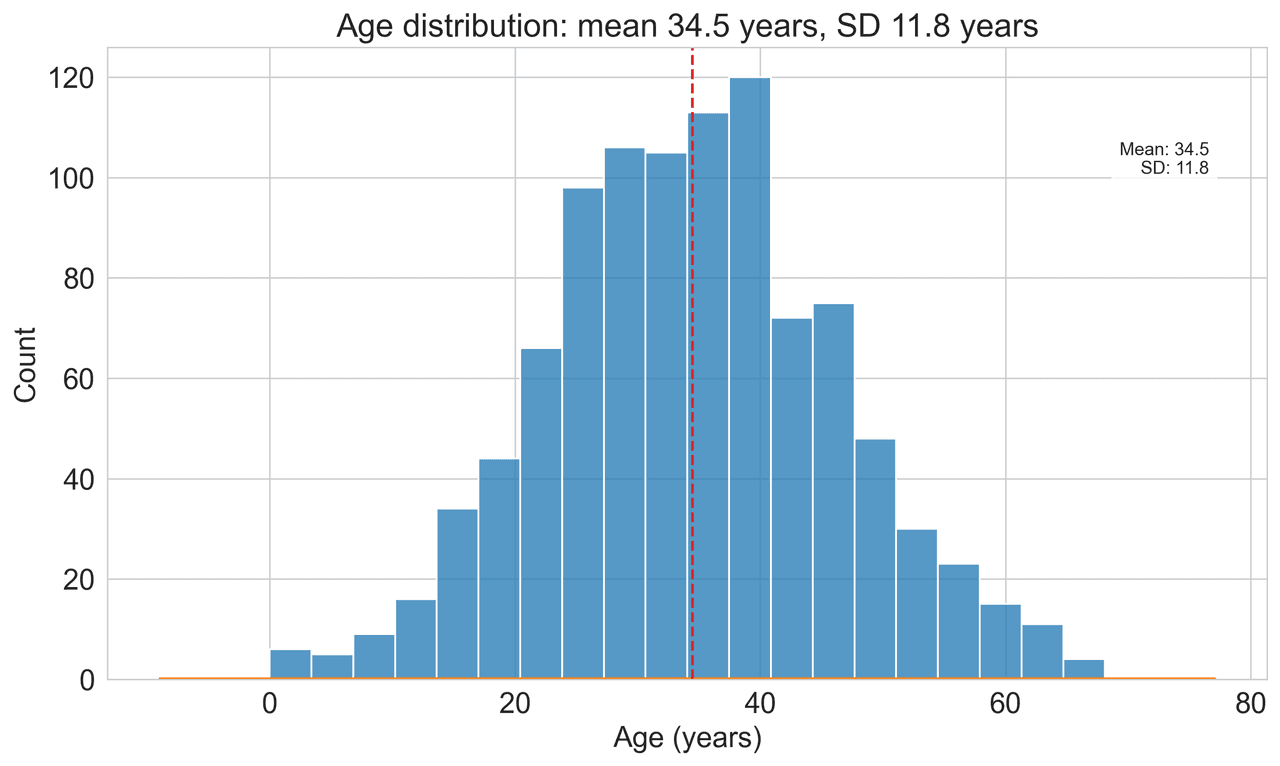
Histogram
Displays the distribution of numerical data by grouping values into bins.
Sample code / prompt
import matplotlib.pyplot as plt
import numpy as np
from scipy.stats import gaussian_kde, skewnorm

# Generate age data with slight right skew
np.random.seed(42)
ages = skewnorm.rvs(a=2, loc=42, scale=15, size=500)
ages = np.clip(ages, 18, 80)  # Clip to realistic range

fig, ax = plt.subplots(figsize=(12, 7))Make Your Figures FAIR Too
Upload your FAIR-compliant dataset and create reproducible, code-backed figures. Every plot comes with the Python code to regenerate it.
Technique guides scientists read next
scipy.signal.find_peaks guide
Tune prominence and width parameters for robust peak extraction.
Savitzky-Golay smoothing
Reduce noise while preserving peak shape and position.
PCA visualization workflow
Move from high-dimensional measurements to interpretable components.
ANOVA with post-hoc brackets
Add statistically correct pairwise significance annotations.
Found this helpful? Share it with your network.
Experimental Physicist & Photonics Researcher
Hands-on experience in silicon photonics, semiconductor fabrication (DRIE/ICP-RIE), optical simulation, and data-driven analysis. Built Plotivy to help researchers focus on discoveries instead of data struggles.
More about the authorVisualize your own data
Apply the techniques from this article to your own datasets. Upload CSV, Excel, or paste data directly.