How to Organize Research Data: Folder Structure & Naming Conventions
Bad data organization is the #1 reason experiments can't be reproduced. This guide gives you a battle-tested system for folder structure, file naming, and metadata that scales from a single experiment to a multi-year PhD project. For hands-on utilities to implement these practices, check out our Research Toolkit.
What You Will Learn
1.The Golden Rules
2.Folder Structure Template
3.File Naming Conventions
4.Version Control for Non-Coders
5.Metadata & Data Dictionaries
6.Backup Strategy
1. The Golden Rules
Never modify raw data
Treat raw data files as read-only. All transformations go to a separate processed/ folder.
Use consistent naming
Pick a naming convention on day one and follow it for every file in the project.
Document everything
Future-you is a stranger. Write README files and data dictionaries.Learn how
Automate what you can
Scripts are better than memory. If you click 20 times, write a script instead.
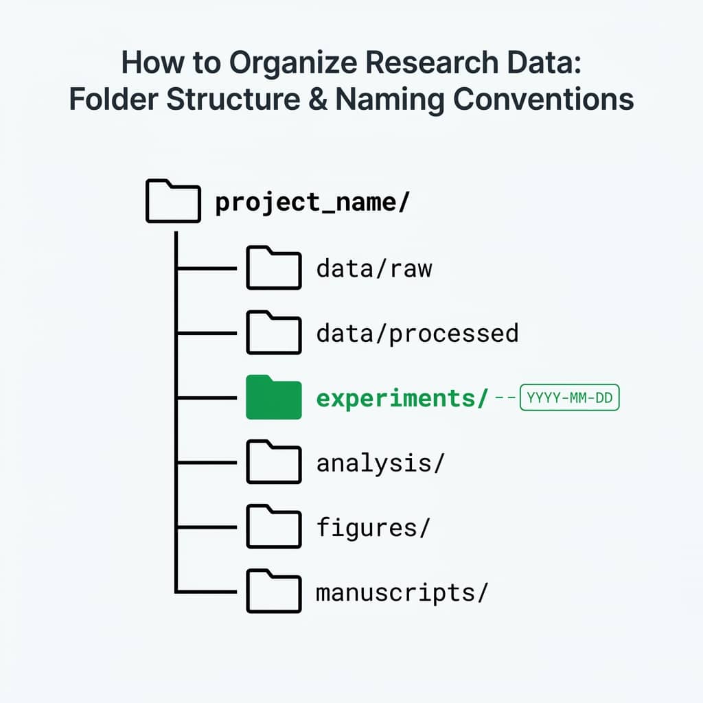
2. Folder Structure Template
shellproject-name/
├── README.md                    # Project overview, how to reproduce
├── data/
│   ├── raw/                     # Original, unmodified data files
│   │   ├── 2025-01-15_xrd-scan.csv
│   │   └── 2025-01-16_sem-images/
│   ├── processed/               # Cleaned, transformed data
│   │   └── xrd-peaks-extracted.csv
│   └── external/                # Data from external sources
│       └── reference-patterns.csv
├── figures/
│   ├── exploratory/             # Quick plots for analysis
│   └── publication/             # Final figures for paper
│       ├── figure-1-xrd.pdf
│       └── figure-1-xrd.png
├── scripts/
│   ├── 01-import-and-clean.py
│   ├── 02-analyze.py
│   └── 03-generate-figures.py
├── notebooks/                   # Jupyter notebooks for exploration
├── docs/
│   ├── data-dictionary.md       # What each column means
│   └── protocol.md              # Experiment protocol
└── results/
    └── statistical-summary.csv
Why numbered scripts?
Prefixing scripts with numbers (01-, 02-, 03-) shows the execution order. Anyone can reproduce your analysis by running them in sequence.
Managing Figures
Your figures/publication folder should contain both vector (PDF/SVG) and raster (PNG/TIFF) formats.
Plotivy lets you easily export your figures in both vector and raster formats directly from the visualization editor - no extra tooling needed.
Check out our guide on Common Visualization Mistakes to ensure your figures are publication-ready, or review our Peer Review Guide. For a comprehensive overview, see our Complete Guide to Scientific Data Visualization.
Folder Structure Generator
Create this entire project structure with one click. Download a shell script that sets up your folder hierarchy automatically.
3. File Naming Conventions
| Rule | Good | Bad |
|---|---|---|
| Date first (ISO 8601) | 2025-01-15_xrd-scan.csv | xrd scan jan.csv |
| No spaces | cell-growth-data.csv | cell growth data.csv |
| Lowercase + hyphens | dose-response-drugA.csv | DoseResponse_DrugA.csv |
| Descriptive names | mouse-weight-cohort-3.csv | data2_final_v3.csv |
| Version numbers | analysis-v02.py | analysis-FINAL-FINAL.py |
The "final" problem
If you have files named thesis-FINAL.docx, thesis-FINAL-v2.docx, thesis-FINAL-REAL.docx - you need version control, not better naming.
Try it
Try it now: turn this method into your next figure
Apply the same approach to your own dataset and generate clean, publication-ready code and plots in minutes.
Open in Plotivy Analyze →Newsletter
Get a weekly Python plotting tip
One concise tip each week for cleaner, faster scientific figures. Built for researchers who publish.
4. Version Control for Non-Coders
Git + GitHub
RecommendedBest for code and scripts. Free private repos. Track every change with full history.
Google Drive versioning
EasiestRight-click any file to see version history. No setup required. Good for documents.
OSF (Open Science Framework)
AcademicPurpose-built for research. DOI minting, preregistration, data archiving. Free. Learn more in our FAIR Principles resources.
5. Metadata & Data Dictionaries
Data dictionary template
markdown# data-dictionary.md

## Dataset: cell-growth-data.csv

| Column        | Type    | Unit    | Description                       |
|---------------|---------|---------|-----------------------------------|
| sample_id     | string  | -       | Unique sample identifier          |
| time_hours    | float   | hours   | Time since treatment              |
| cell_count    | integer | cells   | Viable cell count (trypan blue)   |
| treatment     | string  | -       | Drug name or "control"            |
| concentration | float   | uM      | Drug concentration                |
| replicate     | integer | -       | Biological replicate number (1-3) |

## Collection Notes
- Instrument: Countess II (Thermo Fisher)
- Operator: J. Smith
- Date range: 2025-01-10 to 2025-01-17
Every dataset needs a data dictionary
Columns named "conc", "val", or "x" are meaningless six months later. A data dictionary takes five minutes to write and saves hours of confusion.
Data Dictionary Generator
Create a clear data dictionary for your datasets. Define variables, units, and types in minutes.
Metadata Generator
Generate standardized YAML/JSON metadata files for your research project. Fill in the form, download the file.
Generate MetadataREADME Generator
Create professional README documentation for your research project with structured templates.
Create READMELearn more: Ensure your data follows open science standards with our FAIR Principles Guide, or explore FAIR Principles in the Research Toolkit.
6. Backup Strategy
3 copies
Keep at least 3 copies of critical data.
2 media types
Local drive + cloud storage (or external drive).
1 offsite
At least one backup should be in a different physical location.
Daily: Automatic cloud sync (Google Drive, OneDrive, Dropbox)
Weekly: Verify sync status, check for conflicts
Monthly: Export a snapshot to an external drive or institutional archive
Per-milestone: Tag a Git release when you submit a paper or complete an experiment
Experiment Checklist
Track your daily lab protocols with customizable checklists. Never miss a critical step again.
Open ChecklistData Licensing Guide
Choose the right license for sharing your research data openly. Compare CC, MIT, Apache, and more.
Explore LicensesThe Scientific Visualization
Visualization Guide
We're finalizing a practical PDF guide for researchers who need clearer scientific figures, reusable Python plotting templates, and publication-ready visualization workflows without starting from a blank notebook.
What the guide will help you improve
Figure readability, chart selection, annotation discipline, export quality, and repeatable Python workflows for lab reports, papers, and internal research updates.
Visualization
Chart gallery
Visualize Your Organized Data
Once your data is clean and organized, generate publication figures instantly.

Bar Chart
Compares categorical data using rectangular bars with heights proportional to values.
Sample code / prompt
import numpy as np
import pandas as pd
import matplotlib.pyplot as plt
import seaborn as sns
from scipy import stats

# Generate performance scores for 5 treatment groups
np.random.seed(42)
groups = ['Control', 'Treatment A', 'Treatment B', 'Treatment C', 'Treatment D']
n_samples = 30
Scatterplot
Displays values for two variables as points on a Cartesian coordinate system.
Sample code / prompt
import matplotlib.pyplot as plt
import numpy as np
from scipy import stats
import pandas as pd

# Generate sample data
np.random.seed(42)
n_samples = 200
height = np.random.normal(170, 8, n_samples)
weight = height * 0.6 + np.random.normal(0, 8, n_samples) - 50
Heatmap
Represents data values as colors in a two-dimensional matrix format.
Sample code / prompt
import matplotlib.pyplot as plt
import seaborn as sns
import pandas as pd
import numpy as np

# Create correlation matrix for financial metrics
metrics = ['Revenue', 'Profit', 'Expenses', 'ROI', 'Customers', 'AOV', 'Marketing', 'Employees']
correlation_data = np.array([
    [1.00, 0.85, -0.45, 0.72, 0.88, 0.65, 0.72, 0.55],
    [0.85, 1.00, -0.78, 0.92, 0.75, 0.58, 0.63, 0.48],
Line Graph
Displays data points connected by straight line segments to show trends over time.
Sample code / prompt
import matplotlib.pyplot as plt
import numpy as np

# Generate temperature data for 3 major US cities over 12 months
months = ['Jan', 'Feb', 'Mar', 'Apr', 'May', 'Jun', 'Jul', 'Aug', 'Sep', 'Oct', 'Nov', 'Dec']
nyc = [30, 32, 40, 52, 65, 75, 82, 81, 74, 63, 50, 38]
miami = [65, 66, 70, 76, 82, 87, 90, 90, 87, 80, 72, 66]
chicago = [25, 27, 35, 48, 62, 72, 80, 79, 71, 60, 45, 32]

# Create figure with enhanced styling.png&w=1280&q=70)
Box and Whisker Plot
Displays data distribution using quartiles, median, and outliers in a standardized format.
Sample code / prompt
import numpy as np
import pandas as pd
import matplotlib.pyplot as plt
import seaborn as sns
from scipy import stats

# Generate gene expression data for 4 genotypes
np.random.seed(42)
genotypes = ['WT', 'KO1', 'KO2', 'Mutant']
n_per_group = 20
Violin Plot
Combines box plots with kernel density to show distribution shape across groups.
Sample code / prompt
import matplotlib.pyplot as plt
import seaborn as sns
import pandas as pd
import numpy as np
from scipy.stats import f_oneway

# Generate exam score data for 3 groups
np.random.seed(42)
control = np.random.normal(72, 12, 50)
treatment_a = np.random.normal(78, 10, 50)From Organized Data to Publication Figures
Upload your clean CSV, describe your figure, and get editable Python code with 600 DPI export.
Make sure to check our Journal Figure Cheat Sheet before exporting.
Technique guides scientists read next
scipy.signal.find_peaks guide
Tune prominence and width parameters for robust peak extraction.
Savitzky-Golay smoothing
Reduce noise while preserving peak shape and position.
PCA visualization workflow
Move from high-dimensional measurements to interpretable components.
ANOVA with post-hoc brackets
Add statistically correct pairwise significance annotations.
Found this helpful? Share it with your network.
Experimental Physicist & Photonics Researcher
Hands-on experience in silicon photonics, semiconductor fabrication (DRIE/ICP-RIE), optical simulation, and data-driven analysis. Built Plotivy to help researchers focus on discoveries instead of data struggles.
More about the authorVisualize your own data
Apply the techniques from this article to your own datasets. Upload CSV, Excel, or paste data directly.