Plotivy vs Julius AI: Choosing the Right AI Analyst

Julius AI and Plotivy both promise AI-powered data analysis, but they target different use cases. Julius focuses on conversational analytics; Plotivy focuses on publication-quality figure generation with editable code.
In This Article
0.Live Code: What Plotivy Produces
1.Quick Comparison Table
2.Data Privacy & Security
3.Code Output & Editability
4.Pricing Breakdown
5.Which Should You Choose?
0. Live Code: What Plotivy Produces
Dose-response comparison - a pharmacology figure with EC50 annotations and Hill equation fits. Edit the code below and re-run instantly.
1. Quick Comparison Table
| Feature | Julius AI | Plotivy |
|---|---|---|
| Primary Focus | Conversational data analysis | Publication-ready figures |
| Code Output | Hidden behind chat interface | Full Python code, editable |
| Code Editing | Cannot edit generated code | Monaco editor + re-run |
| Export Formats | PNG, basic resolution | PNG/SVG/PDF, 300-1200 DPI |
| Data Sources | CSV, Excel, Google Sheets | CSV, Excel upload |
| Journal Templates | None | Nature, Science, ACS, IEEE |
| Conversational AI | Excellent | Prompt-based generation |
| Statistical Tests | Built-in via conversation | Via generated Python code |
2. Data Privacy & Security
Try it
Try it now: turn this method into your next figure
Apply the same approach to your own dataset and generate clean, publication-ready code and plots in minutes.
Open in Plotivy Analyze →Newsletter
Get a weekly Python plotting tip
One concise tip each week for cleaner, faster scientific figures. Built for researchers who publish.
Julius AI
- - Data uploaded to Julius servers
- - Cloud-based processing only
- - SOC 2 compliance claimed
- - Data retention policies vary by plan
Plotivy
- Only AI prompt descriptions sent externally
- Raw data never leaves your browser
- Code execution is sandboxed
- Safe for pre-publication data
3. Code Output & Editability
Why editable code matters for researchers
- Reproducibility: Colleagues can run your exact code to reproduce figures.
- Iteration: Change a color, axis range, or annotation without re-prompting.
- Learning: Reading and modifying real Python code builds skills faster than chat.
- Version control: Code can be committed to Git alongside your manuscript.
Julius generates code internally but does not expose it for editing. Plotivy gives you full control over the generated matplotlib/plotly code.
4. Pricing Breakdown
Julius AI
- - Free: 15 messages/month
- - Essential: $20/month
- - Pro: $45/month
- - Unlimited: $99/month
Plotivy
- - Free: Core features
- - Pro: Coming soon
- - Full code export included
- - No message limits on free tier
5. Which Should You Choose?
You need conversational Q&A about your data
Julius AIYou need publication-ready figures with editable code
PlotivyYou want to learn Python plotting
PlotivyYou need quick summaries of large datasets
Julius AIYour data is sensitive or pre-publication
PlotivyYou want Google Sheets integration
Julius AIChart gallery
See Plotivy in Action
Scientific charts you can generate, edit, and export.

Scatterplot
Displays values for two variables as points on a Cartesian coordinate system.
Sample code / prompt
import matplotlib.pyplot as plt
import numpy as np
from scipy import stats
import pandas as pd

# Generate sample data
np.random.seed(42)
n_samples = 200
height = np.random.normal(170, 8, n_samples)
weight = height * 0.6 + np.random.normal(0, 8, n_samples) - 50.png&w=1280&q=70)
Box and Whisker Plot
Displays data distribution using quartiles, median, and outliers in a standardized format.
Sample code / prompt
import numpy as np
import pandas as pd
import matplotlib.pyplot as plt
import seaborn as sns
from scipy import stats

# Generate gene expression data for 4 genotypes
np.random.seed(42)
genotypes = ['WT', 'KO1', 'KO2', 'Mutant']
n_per_group = 20
Heatmap
Represents data values as colors in a two-dimensional matrix format.
Sample code / prompt
import matplotlib.pyplot as plt
import seaborn as sns
import pandas as pd
import numpy as np

# Create correlation matrix for financial metrics
metrics = ['Revenue', 'Profit', 'Expenses', 'ROI', 'Customers', 'AOV', 'Marketing', 'Employees']
correlation_data = np.array([
    [1.00, 0.85, -0.45, 0.72, 0.88, 0.65, 0.72, 0.55],
    [0.85, 1.00, -0.78, 0.92, 0.75, 0.58, 0.63, 0.48],
Error Bars
Graphical representations of the variability of data indicating error or uncertainty in measurements.
Sample code / prompt
import numpy as np
import matplotlib.pyplot as plt
from scipy import stats

# Generate bacterial growth data with replicates
np.random.seed(42)
time_points = np.array([0, 4, 8, 12, 18, 24])
mean_values = np.array([10, 25, 80, 250, 600, 800])

# Generate 5 replicates per time point with noise
Violin Plot
Combines box plots with kernel density to show distribution shape across groups.
Sample code / prompt
import matplotlib.pyplot as plt
import seaborn as sns
import pandas as pd
import numpy as np
from scipy.stats import f_oneway

# Generate exam score data for 3 groups
np.random.seed(42)
control = np.random.normal(72, 12, 50)
treatment_a = np.random.normal(78, 10, 50)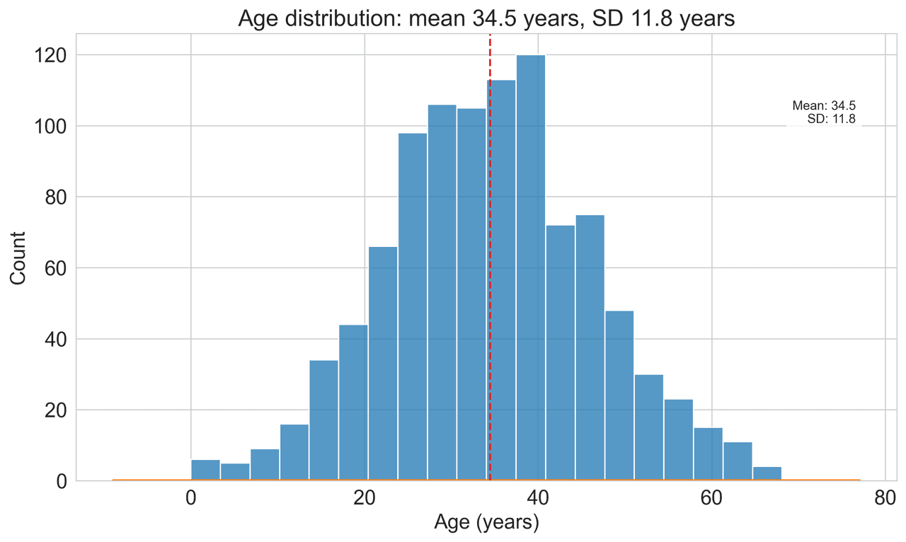
Histogram
Displays the distribution of numerical data by grouping values into bins.
Sample code / prompt
import matplotlib.pyplot as plt
import numpy as np
from scipy.stats import gaussian_kde, skewnorm

# Generate age data with slight right skew
np.random.seed(42)
ages = skewnorm.rvs(a=2, loc=42, scale=15, size=500)
ages = np.clip(ages, 18, 80)  # Clip to realistic range

fig, ax = plt.subplots(figsize=(12, 7))Build Publication Figures Now
Upload your CSV, describe your figure, edit the code, export at 600 DPI.
Related chart guides
Apply this tutorial directly in the chart gallery with ready-to-run prompts and examples.
Technique guides scientists read next
scipy.signal.find_peaks guide
Tune prominence and width parameters for robust peak extraction.
Savitzky-Golay smoothing
Reduce noise while preserving peak shape and position.
PCA visualization workflow
Move from high-dimensional measurements to interpretable components.
ANOVA with post-hoc brackets
Add statistically correct pairwise significance annotations.
Found this helpful? Share it with your network.
Experimental Physicist & Photonics Researcher
Hands-on experience in silicon photonics, semiconductor fabrication (DRIE/ICP-RIE), optical simulation, and data-driven analysis. Built Plotivy to help researchers focus on discoveries instead of data struggles.
More about the authorVisualize your own data
Apply the techniques from this article to your own datasets. Upload CSV, Excel, or paste data directly.