Export High-Resolution Figures from Matplotlib: Complete Guide

Your figure looks great in Jupyter - but the journal says it is too low resolution. Sound familiar? Getting matplotlib to export high-quality figures requires understanding DPI, file formats, and layout tricks.
This guide covers everything with live, editable code you can test right here.
What You Will Learn
0.Live Code Lab: High-Res Export
1.Understanding DPI
2.Format Comparison
3.Avoiding Clipped Labels
4.Multi-Format Export Workflow
5.Export Checklist
0. Live Code Lab: High-Res Export
This code demonstrates the complete high-resolution export workflow - setting rcParams, using constrained_layout, and calling savefig with the right parameters. Edit the code and run it to see results instantly.
1. Understanding DPI
DPI stands for dots per inch. It controls how many pixels are generated per inch of figure width. The formula is simple:
If you are exporting for journal submission, cross-check these settings with our Nature figure guideline reference.
pixels = figure_width_inches x DPI
A 5-inch figure at 300 DPI produces a 1500-pixel-wide image.
72 DPI
Default for screen display. Fine for presentations and Jupyter views. Never for print.
300 DPI
Minimum for print publications. Good for photographs and color images.
600-1200 DPI
Required for line art and graphs. Most Nature/Science journals expect this range.
2. Format Comparison
| Format | Type | Best For | DPI Matters? |
|---|---|---|---|
| .png | Raster | Photos, web, slides | Yes, set 300+ |
| Vector | Line art, graphs, charts | No (infinite) | |
| .svg | Vector | Web, editable graphics | No (infinite) |
| .tiff | Raster | Journals requiring TIFF | Yes, set 600+ |
| .eps | Vector | Legacy journal systems | No (infinite) |
Try it
Try it now: review your figure before submission
Upload your current plot and get an AI critique with concrete fixes for clarity, typography, color, and journal readiness.
Open AI Figure Reviewer →Newsletter
Get a weekly Python plotting tip
One concise tip each week for cleaner, faster scientific figures. Built for researchers who publish.
Quick Rule
Graphs and charts? Always use PDF or SVG (vector). Photos/micrographs? Use PNG or TIFF at 300+ DPI. Never upscale a low-res image.
Skip the export headaches
Plotivy exports publication-ready figures at any DPI in one click - PNG, PDF, SVG, or TIFF.
Free account required - export publication-ready figures instantly.
3. Avoiding Clipped Labels
The most common matplotlib export problem: axis labels or titles get cut off because the saved image does not include the full figure area. There are two solutions:
Option 1: bbox_inches
fig.savefig("fig.png", bbox_inches="tight")Automatically expands the bounding box to include all elements. Works 90% of the time. This is your go-to solution.
Option 2: constrained_layout
fig, ax = plt.subplots(constrained_layout=True)Better for multi-panel figures. Automatically adjusts spacing between subplots. More reliable than tight_layout for complex layouts.
Warning
Do not use both tight_layout() and constrained_layout=True on the same figure. They conflict. Pick one or the other.
4. Multi-Format Export Workflow
See the same data at 3 different DPI values side by side. This helps you understand why DPI matters and how to choose the right value for your use case.
5. Export Checklist
• Set figure size in inches to match journal column width
• Use constrained_layout=True or bbox_inches='tight'
• Export graphs/charts as PDF or SVG (vector)
• Export photos/micrographs as PNG/TIFF at 300-600 DPI
• Check that all text is 7+ pt at the final printed size
• Verify fonts are embedded (open PDF in viewer to check)
• Test colorblind accessibility (no red-green only encoding)
• Do not upscale low-res images - regenerate from code
Test these settings on real examples with the scatterplot and bar chart templates. For final QA before submission, run your figure through the Plot Reviewer.
Chart gallery
High-res export templates
Each gallery chart exports at publication quality by default.

Scatterplot
Displays values for two variables as points on a Cartesian coordinate system.
Sample code / prompt
import matplotlib.pyplot as plt
import numpy as np
from scipy import stats
import pandas as pd

# Generate sample data
np.random.seed(42)
n_samples = 200
height = np.random.normal(170, 8, n_samples)
weight = height * 0.6 + np.random.normal(0, 8, n_samples) - 50
Line Graph
Displays data points connected by straight line segments to show trends over time.
Sample code / prompt
import matplotlib.pyplot as plt
import numpy as np

# Generate temperature data for 3 major US cities over 12 months
months = ['Jan', 'Feb', 'Mar', 'Apr', 'May', 'Jun', 'Jul', 'Aug', 'Sep', 'Oct', 'Nov', 'Dec']
nyc = [30, 32, 40, 52, 65, 75, 82, 81, 74, 63, 50, 38]
miami = [65, 66, 70, 76, 82, 87, 90, 90, 87, 80, 72, 66]
chicago = [25, 27, 35, 48, 62, 72, 80, 79, 71, 60, 45, 32]

# Create figure with enhanced styling
Bar Chart
Compares categorical data using rectangular bars with heights proportional to values.
Sample code / prompt
import numpy as np
import pandas as pd
import matplotlib.pyplot as plt
import seaborn as sns
from scipy import stats

# Generate performance scores for 5 treatment groups
np.random.seed(42)
groups = ['Control', 'Treatment A', 'Treatment B', 'Treatment C', 'Treatment D']
n_samples = 30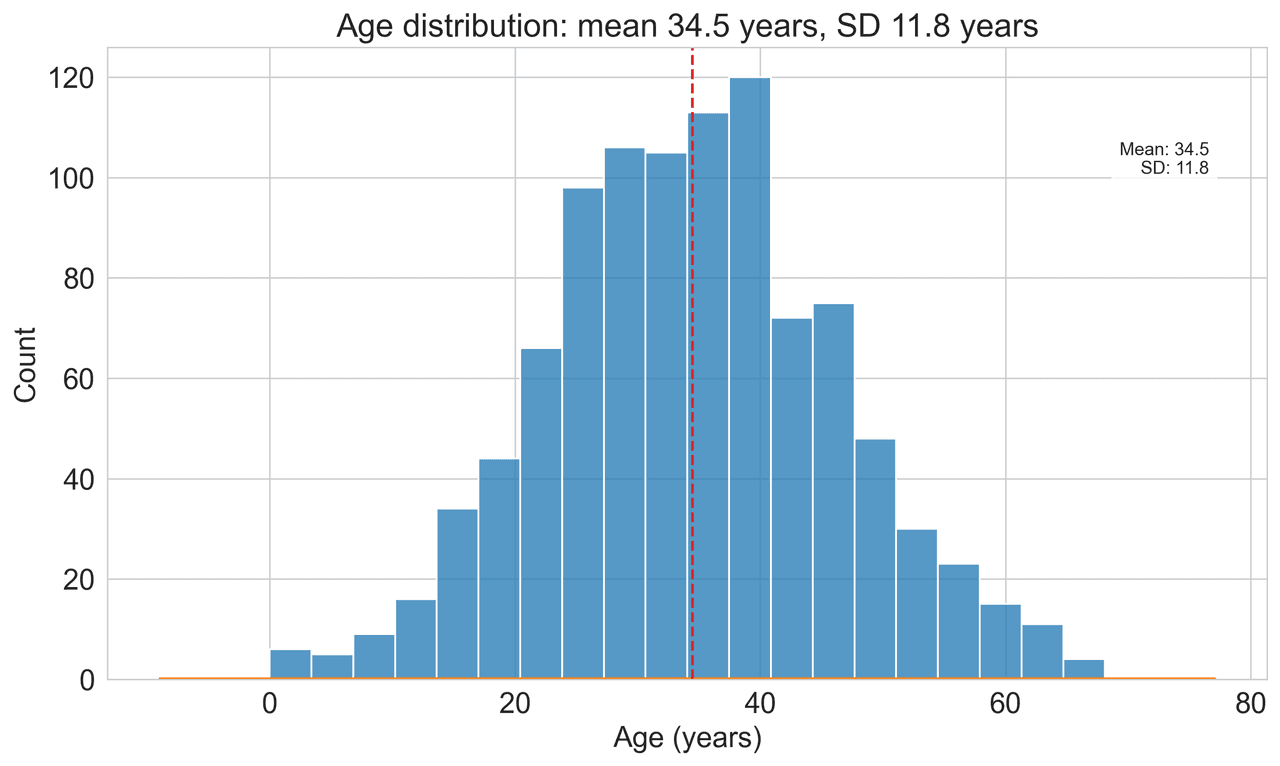
Histogram
Displays the distribution of numerical data by grouping values into bins.
Sample code / prompt
import matplotlib.pyplot as plt
import numpy as np
from scipy.stats import gaussian_kde, skewnorm

# Generate age data with slight right skew
np.random.seed(42)
ages = skewnorm.rvs(a=2, loc=42, scale=15, size=500)
ages = np.clip(ages, 18, 80)  # Clip to realistic range

fig, ax = plt.subplots(figsize=(12, 7))Frequently Asked Questions
What DPI should I use for journal figures?
Why are my matplotlib labels getting clipped when I export?
Should I export as PNG, PDF, or SVG for my paper?
How do I set the exact figure size in inches for a journal column width?
Why does my exported figure look different from the Jupyter notebook preview?
Skip the DPI Headaches
Plotivy exports publication-ready figures at 600 DPI by default. Upload your data, pick a journal style, and download in one click.
Free account required - launch Analyze instantly.
Related chart guides
Apply this tutorial directly in the chart gallery with ready-to-run prompts and examples.
Technique guides scientists read next
scipy.signal.find_peaks guide
Tune prominence and width parameters for robust peak extraction.
Savitzky-Golay smoothing
Reduce noise while preserving peak shape and position.
PCA visualization workflow
Move from high-dimensional measurements to interpretable components.
ANOVA with post-hoc brackets
Add statistically correct pairwise significance annotations.
Found this helpful? Share it with your network.
Experimental Physicist & Photonics Researcher
Hands-on experience in silicon photonics, semiconductor fabrication (DRIE/ICP-RIE), optical simulation, and data-driven analysis. Built Plotivy to help researchers focus on discoveries instead of data struggles.
More about the authorVisualize your own data
Apply the techniques from this article to your own datasets. Upload CSV, Excel, or paste data directly.